 |
New York
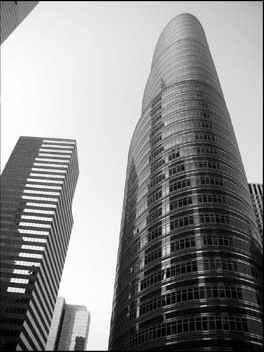
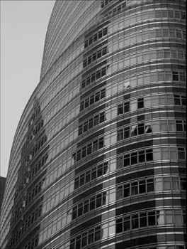
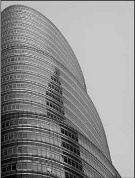
Architecture Images- Midtown 885 Third Ave. "The Lipstick Building" |
||
|
architect |
Philip Johnson & John Burgee | ||
|
location |
885 Third Ave., |
||
|
date |
1986 | ||
|
style |
Post-Modernism | ||
|
construction |
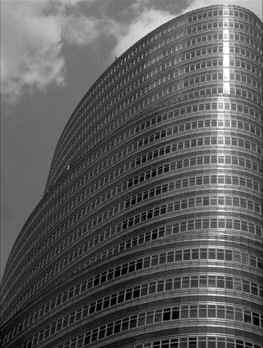
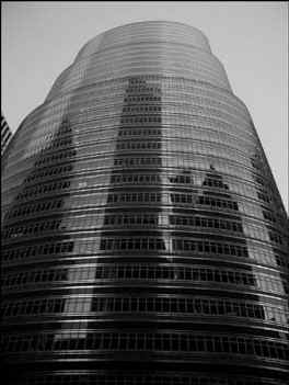
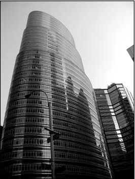
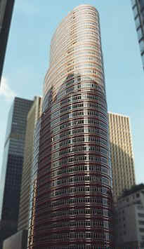
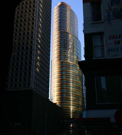
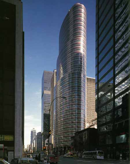
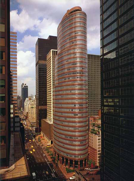
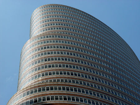
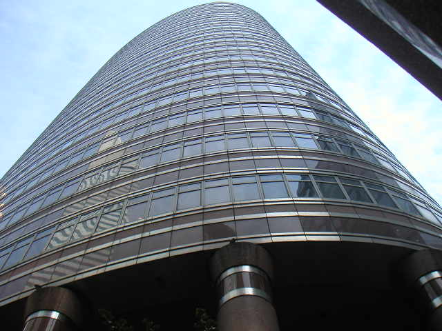
The 143 m tall building consists
of four oval-shaped cylinders placed above each other, each smaller in
diameter than the one below, creating the building a set-back appearance. On
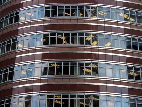
the 36-storey facade, red granite spandrels alternate with the shiny steel
of horizontal window bands. The elliptical lobby has a colonnade of steel-banded and round pillars along the glassed outer wall line, and the columns double on the outside, forming a narrow arcade there. |
||
|
type |
Office Building | ||
|
|
   |
||
   |
|||
|
images |
  |
||
  |
|||
  |
|||
 |
|||
|
|||
|
|
|||
|
notes |
Philip
Johnson, born in 1906, is one of the most talented and controversial
architects from the seventies to present. Such buildings -among many others-
like the IDS Center, Minneapolis (1972), breaking with the Miesan dictature,
the Pennzoil Place Bldg, Houston (1976), sharp and pure as a quartz crystal,
the Post Oak Central Bldg, Houston (1978), directly inspired by the rounded
Look Bldg's horizontal strips, the AT&T Bldg, NY (1984), genuine and
prodigious manifesto of the Postmodernism, the 33 Maiden Lane Bldg, NY, with
its pink medieval crenellated towers, or these incredible all-glass gothic
revivals that are the Pittsburgh Plate Glass Bldg and the NationsBank
Center, Houston (1984), certify the wild imagination, the humanism, the fine
intelligence, in a word -the genius- of this true visionary. Rounded,
elliptical or undulating shapes were not innovative when the Lipstick Bldg
was conceived [remember the famous Marina City, Chicago (Bertrand Goldberg,
(1964), the Lake Point Tower, Chicago (Schipporeit & Heinrich, 1968) or the
shiny John Portman's Peachtree Plaza Hotel, Atlanta (1976)], but it was, for
New York, a very unusual response to zoning requirements in a totally square
environment, breaking the orthogonal street grid. The tour de force resides
in the extreme simplicity of the shape -three diminishing and asymetrically
superimposed elliptical volumes-, and in the exterior polished treatment
-horizontal glass, red granite and thin aluminum strips. "Lipstick" is just
a nickname because the building has, effectively, a strong resemblance with
a retractable lipstick tube. Sometimes, it is compared to a Claes
Oldenburg's sculpture, but the reference is excellent. In the two-story
lobby, the elevators core is bordered by massive red granite, metal-stripped
columns. Special thanks to www.shabazzone.com |
||