 |
New York
Architecture Images- Midtown LVMH Louis Vuitton-Moët Hennessy Tower |
|
architect |
Pritzker-laureate Christian de Portzamparc |
|
location |
19 E57, between Madison and Fifth. |
|
date |
1996-1999 |
|
style |
Post-Modernism |
|
construction |
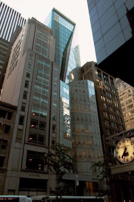
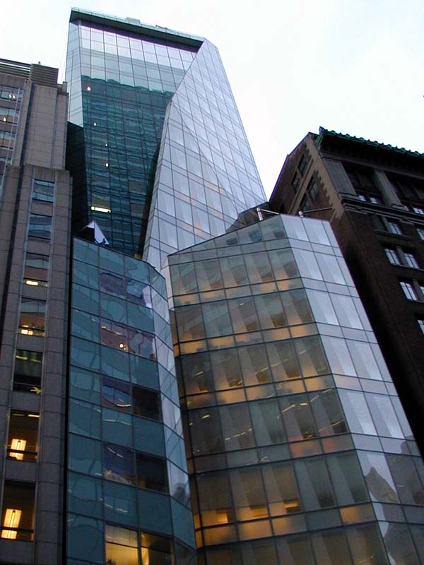
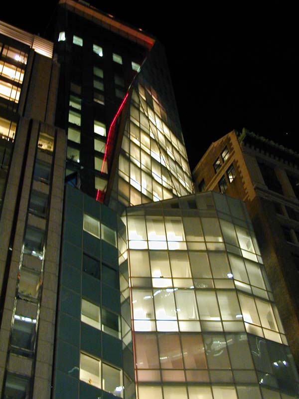
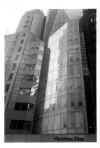
The tower is built of glass produced specially for façades, which is alternately transparent or translucent. A curtain wall of translucent white glass partially covers the body of the building, which is itself covered with transparent panes which filter the light. "This building is a body, not a façade. It is a crystal flower unfolding in the New York sky " said Christian de Portzamparc. |
|
type |
Office Building |
|
|
 |
 |
|
 |
|
|
images |
   |
|
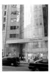
"The frequent comparison of the building to an unfolding flower is based on a misunderstanding, the architect said. He meant the reference to apply only to a box that sits on a setback halfway up the facade, a feature tinted blue to appease the chairman of LVMH, Bernard Arnault." New York Times "a rigorous piece of architecture that will have people making detours to gawk, admire, laugh at, love and debate over it for years to come" New York Times Appearing as a traditional skyscraper viewed through a broken glass bottle, the LVMH Tower is one of the skyscrapers that brings the 1990's bulge-and-bend style to New York. The building certainly complements its original owner, a Parisian maker of upscale cosmetics, perfumes, luggage, champagne, and assorted baubles. Much like a model on a runway, the LVMH Tower stands tall in graceful style while making the dark slabs that surround it look plain and boring by comparison. It has been compared to a lily in an alley. And like a model, it's more flash than reality. The building is only 23 stories tall, but makes use of its curving lines and gentle setback to create forced perspective and appear much taller. This illusion is enhanced by the fact that the building's lot if only 60 feet by 100 feet. A narrow base creates a slim line for the eye to follow. This is de rigeur in Europe, but a tight squeeze in the States. The original drawings for this building resembled a collection of perfume bottles. The design was refined repeatedly to get the Gehry-esque form we see today. But the voluptuous look isn't completely form -- function plays a big role. The architects discovered that if they curved the building backward they could meet New York City's setback regulations. But they were free to do whatever they wanted once those rules were satisfied, including bulging the building outward again. This way they were able to comply with the letter of the law and still create more space. That's why the building has a sort of bust line between the 11th and 18th floors. The tower uses two kinds of glass in its curtain. On the left side is green glass with a pattern of dots. The right side is clear glass with shadows traced in it. While this is pretty, this building's jewel is in its crown. Those in the know call it the "Magic Room." It's a 30-foot-high space encompassing the top two floors of the tower. You actually arrive on the second floor of this room and descend a grand stair to get to the floor. It is here that the fashion shows and parties are held to the delight of guests who marvel at the view of Manhattan and New Jersey. However, what the building boasts in style and opulence to the visitor it takes away in usability and comfort to the people who actually have to work there. The small lot size makes space a premium. There isn't even room for a separate freight elevator, and the ones that carry the office staff are described as, "vertical coffins." The unusual angles produce odd-shaped windows that in some offices restrict light to the point of distraction. The building is woefully undersized for the number of businesses, offices, staffers, and support squad who have to work there. Still, they can take comfort in the building's fire suppression system. In the event of flame, a cascading waterfall of water will slide down the interior windows to keep the flames from spreading from floor to floor.
|
|