CONTEMPORARY NY
New York Architecture Images- Midtown

Sony Building (originally AT&T Building)

architect

Philip Johnson and John Burgee 

location

350 Madison Ave., between E55 and E56.

date

1984

style

Post-Modernism  

construction


type

Office Building


images


The AT&T building was a commercially-well-timed reaction against Miesian modernism and its derivatives:

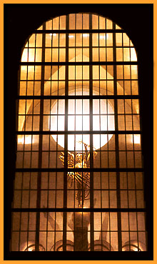
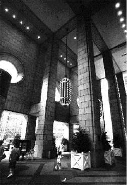
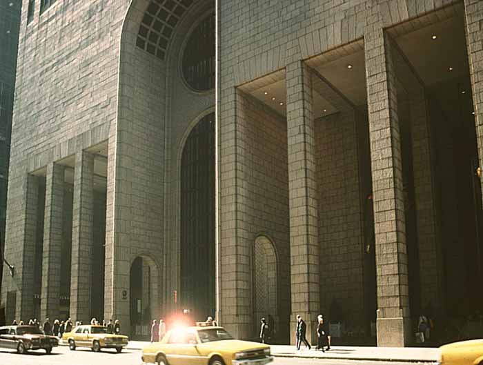
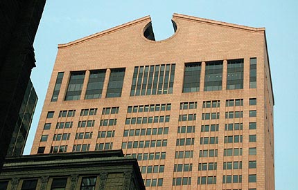
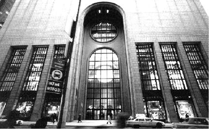
'It has a modernist body standing on classical feet and sports a large and variously defined ornament as a head. There is at once a referential anthropomorphism and a bond with the grand New York skyscraper architecture, exemplified by the Empire State and Chrysler buildings, which flourished before the nihilism of the Miesian box took over. The base, moreover, is modeled deliberately on that of New York City's Municipal Building created by the classicizing firm of McKim, Mead & White in 1908 - hence the large central arch... and the columned arcade. In addition, the architectural decoration of the base is densely evocative of sacred building types: the oculi recall the Duomo in Florence, the arcades... are reminiscent of San Andrea in Mantua, and the Carolingian lobby with its gilded cross vault and Romanesque capitals... fuse into a Pazzi Chapel centering on the hilariously kitschy, gilded statue of the Genius of Electricity... 

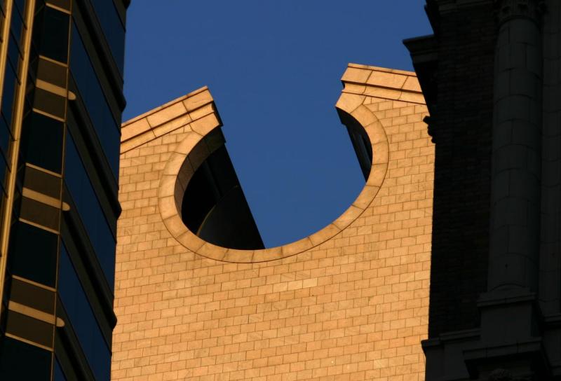
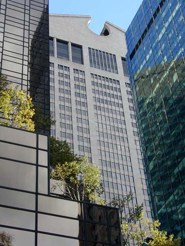
The pediment... culminates with symbolic references, depending on one's orientation, to car grilles, a grandfather clock, a Chippendale highboy, and as an in-joke, a monumental reference to the split pediment used earlier by Venturi for his mother's house... The building thrives on this very multivalency that despite all the carping... brought back the representational and historicizing architecture of New York's skyscrapers.'

Karl Galinsky , Classical and Modern Interactions, 1992

Carter Wiseman describes the building as 'a unique fusion of aesthetic rebellion and corporate commerce... less architecture than it was logo, less work of art than hood ornament.'

That the AT&T building was created by Philip Johnson, who brought the International Style to America in 1932 with his MoMA exhibition and designed such pure modernist forms as the Glass House in New Canaan, Connecticut is the first irony of this building. 

The second irony is that if the building was a logo, it was a totally unsuitable one for its client. As AT&T tried to rejuvenate itself in the late 1980s, the last thing it needed was a massive granite corporate headquarters with authoritative classical references. It left the building in 1992. 

Philip Johnson completed this building in the same year as PPG Place in Pittsburgh, a strikingly different but logically similar post-modernist approach. 


How to visit

The building is open during office hours, accessible from Madison Avenue at 56th Street. It is now occupied by Sony Music. For information call 
+1 212 833 8000.


notes

Originally built for AT&T, this office tower is perhaps the most well-known skyscraper of the 1980s. It was designed by Philip Johnson, one of the masters of 20th century architecture. In many respects, the building is a tribute to the indulgent corporatism that has given rise to the tall buildings vying for attention on the New York skyline. Certainly, in this sense, it is one of the most noticeable. In particular, the top of the otherwise bland, slab building is capped by a Chippendale pediment. Such kitsch, historicist references became associated with Postmodern architecture, a style that this building helped to popularize. Another characteristic of Postmodernism is the vertical banding on the facade that emphasizes the height of the building. This detail, reminiscent of Art Deco, calls attention to the steel structure which is hidden beneath a veneer of pink marble. More like early skyscrapers of the 20th century than the modern buildings of the post-war period, the facade has stone cladding rather than a glass and steel skin. The tripartite division of the facade is emphasized by a large entrance and pedestrian arcade at the base, a tall shaft with regular windows, and a wide band of windows just below the building's crown. The entrance is a grand, glazed arch surmounted by porthole-shaped openings. Originally, an open galleria at the back of the site contained restaurants, retail shops and an outdoor plaza carved out of the base under the shadow of the tower. The plaza never succeeded as a public space and it was converted into an enclosed retail store when Sony purchased the building not too long after its completion.

contact

nyc-architecture.com