 |
New York
Architecture Images- Midtown
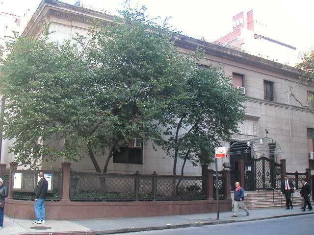
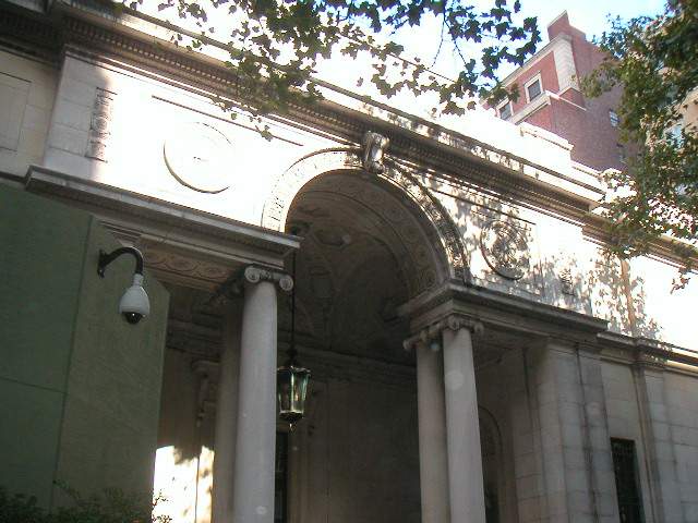
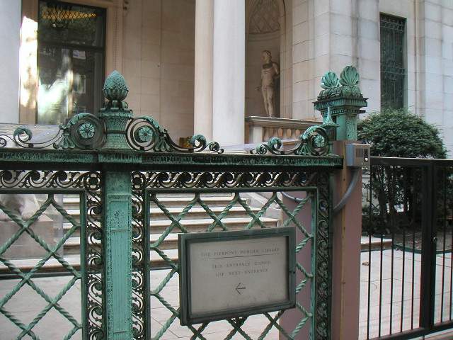
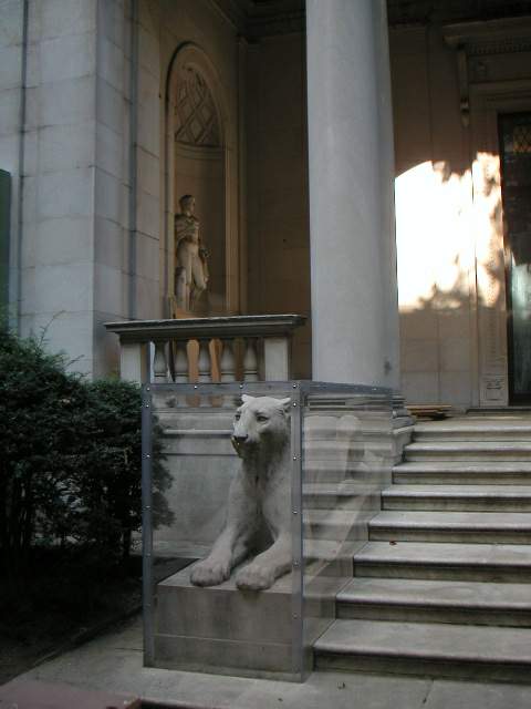
Pierpont Morgan Library |
|
architect |
|
|
location |
33 E36, bet. Park and Madison Aves. |
|
date |
c. 1910 |
|
style |
Beaux-Arts Renaissance Revival |
|
construction |
limestone cladding |
|
type |
Library |
|
|
 |
 |
|
 |
|
 |
|
 |
|
 |
|
|
|
|
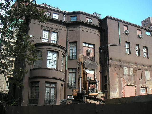
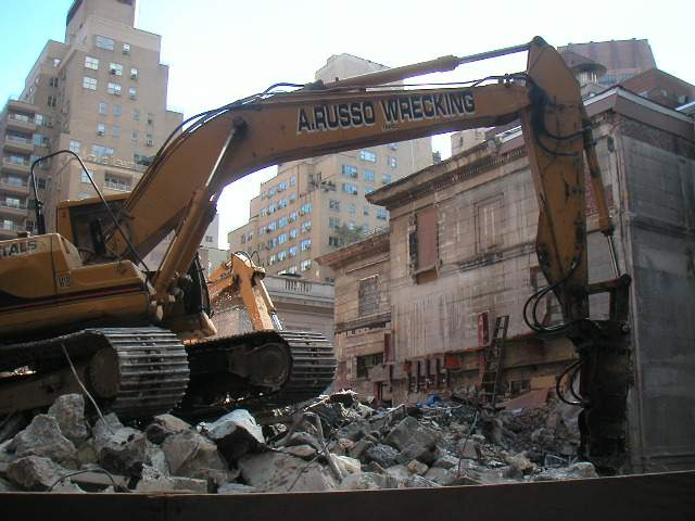
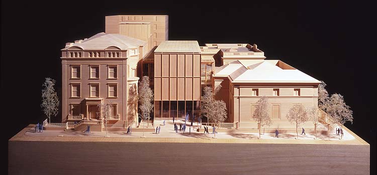
NYTIMES: A Plan Unfolds for a $75 Million Morgan Makeover By DAVID W. DUNLAP The Pierpont Morgan Library, an exquisite cultural treasure chest in Murray Hill, would reorient, expand and draw together its campus of historic buildings with three unmistakably modern steel-and-glass pavilions designed by Renzo Piano. The project is so ambitious it would require the Morgan to close for two years. Under a plan presented yesterday to the Landmarks Preservation Commission, the Morgan would move its entrance from 36th Street to Madison Avenue, create a glass-enclosed piazza in the middle of the block, expand its gallery space, build a new auditorium and reading room, replace its office wing, sink a new vault deep into bedrock and add a cubic structure in the yard between J. Pierpont Morgan's original library and the later annex, both landmarks. "Since I became director of the Morgan in 1987, my chief goal has been to provide greater public access to both the buildings and the collections," Charles E. Pierce Jr. told the commission. He said Mr. Piano's plan achieved the goal with "remarkable subtlety and sensibility." The hearing adjourned without a vote by the commission on whether the expansion would be appropriate. The commission will take up the matter again next month. It is also expected to restore landmark status to the former J. P. Morgan Jr. house at Madison Avenue and 37th Street, which the library acquired in 1988. The Lutheran Church in America once had its headquarters there and fought successfully to revoke the landmark designation in 1974. The Morgan's expansion project is to begin in 2003 and may cost up to $75 million. ("We've just started to do serious fund-raising," Mr. Pierce said.) During the two years of construction, the library's collection of 350,000 objects — rare books, illuminated manuscripts, prints and drawings — will be stored elsewhere. The architects are the Renzo Piano Building Workshop of Paris and Genoa and Beyer Blinder Belle of New York. Mr. Piano likened his work to microsurgery. "The spirit of the scheme is not really to grow," he said. "It's more about rebalancing, rethinking the institution." Of the 69,400 square feet of new space, 43,300 will be underground, in an auditorium seating about 280 people and a vault hewn from bedrock. "There is no better place to preserve books forever than Manhattan schist," Mr. Piano told the commission. With most of the space underground, the pavilions can be held to the same scale as the older structures around them. The new entrance, set back from the avenue, would replace a swoop- roofed, glass-enclosed courtyard from 1991 by Voorsanger & Mills. Over the entrance would be a windowless facade of recessed steel panels in a large-scale grid, behind which would be a reading room and gallery. "Symbolically, what this building is about, above everything else, is the protection of art," Mr. Piano said, explaining the decision to use steel in the facade. Though no decision has been made yet on color, the architect said he was leaning toward the verdigris of weathered copper. Beyond the lobby would be an inner courtyard that Mr. Piano likened to a piazza. Standing in this space, at the heart of the complex, visitors would be able to orient themselves visually to their surroundings. On 37th Street, a small office building added in 1957 by the Lutheran Church would be replaced by a new four-story structure. On 36th Street, a faceted steel cube would be inserted between the original library of 1906, by McKim, Mead & White, and the annex added 22 years later by Benjamin Wistar Morris after the library opened to the public. Inside would be a 20-by-20-by-20- foot room whose "magical" proportions would lend themselves to the display of "a piece of the treasure house coming up from the vaults," Mr. Piano said. But Robert A. M. Stern, a prominent architect and architectural historian, told the commission by letter that he was concerned the cube "unnecessarily compromises the gardenesque setting that is key to the meaning of the two buildings facing 36th Street." Civic groups generally supported the plan, though some expressed reservations about adding the cube and moving the entrance. "We will miss the sense of having the privilege of entering a unique private space," said Sandra Levine of the Historic Districts Council. Earlier in the day, the commission created the Murray Hill Historic District, an irregular five-block swath between 34th and 39th Streets, Park and Lexington Avenues, filled with 19th- and early 20th-century row houses, as well as the Church of the New Jerusalem at 112 East 35th Street. Calling it a "remarkably cohesive enclave possessing a distinct sense of place," Sherida E. Paulsen, the commission chairwoman, confessed that she was surprised to learn last year that it was not already a historic district. |
|
|
A February 10, 2002 column in the Arts &
Leisure section of The New York Times by Herbert Muschamps
"Piano's design will replace three structures completed between 1962 and 1991. Roughly half of the $75 million project is to be underground. This will allow the design's visible portions to be lower than the rooflines of the library's existing buildings. Beneath grade, Piano proposes to cut into the bedrock of Manhattan schist on which the library sites. Into this cavity he will insert a four-story subterranean vault, containing stacks. These lead off from an atrium lined with metal stairs. A 250-sear auditorium, site of the spoken word, is also located here. The space is Piranesian, Borgesian, even Pythian. The design above ground is 'infill' architecture: a set of three new pavilions, acing into a glass-roofed courtyard, that will be inserted between three of the exiting buildings: the J. P. Morgan house the original library building and its subsequent annex. Since these structures differ in style, materials and relationship to the street, their context is one of contrast, scale and sequence. It is a context of time as well as space, in other words, one of adding to rather than fitting in which. Piano's design responds straight forwardly to this context. It adheres to the scale of the existing structures but departs from them in form, materials and proportions. The palette is glass and painted steel, the color as yet undecided. The forms are stark but not brutal. For example, the steel panels of the main facades sit flat on the ground but the panels are recessed within frames and grooved at the edges, to evoke the image of moldings. Stair towers are faced with glass, and the airy spring of the metal stairs again reveals Piano as architecture's great poet of circulation. The courtyard, however, ist he focal point of the design's circulation system. It replaces the inelegant Garden Court designed by Voorsanger and Mills and completed in 1990. But the architects of the addition were constrained by its relatively unambitious scope. With an overall plan that radiates from the center of the site to the three streets bordering it, the new courtyard will be integrated more organically into the new complex. The courtyard's glass roof is a refined version of the 19th Century engineering projects that inspired many architects in the early years of the 20th.The design doesn't fit the rancid image of modern architecture still held by many New Yorkers who should know better. No where is Piano's departure from the image more evident than in his design for a new gallery that will be inserted between the Morgan house and library facing 36th Street. A windowless steel cube, 20 feet on each side, the room is intended for displaying individual books of exceptional rarity. But its real function is to show off the beauty o classically proportioned space. If you are classically inclined, you are always on the lookout for the Good, the True and the Beautiful. As I see it, the Good means service to others; the True means truth to self; and the Beautiful articulates the continuous union and separation of selves and others over time. Piano's design is as complete a rendition of these virtues as New York has seen since the Seagram building. It s most classical aspect is that it is a work of connective tissue, not an independent object free-floating in space. Service to others is the critical issue raised by this project. Piano is an outsider, and therefore vulnerable to attack by local architects who shy away from criticizing one another. Robert A. M. Stern, objecting to elements of the design in a letter to the Landmarks Commission, adopted the tone of a great Beaux Arts master admonishing a callow apprentice. This was predictable. Stern represents a brand of theme park design that has misrepresented itself as classicism - as architecture, for that matter - for three decades. The brand was built on a false polarity between Classicism and Modernism, the latter taken to be a 'style' developed in the 1920s and 30s. The brand's stock, which has been tumbling in recent years, stands to fall still further as work like Piano's alerts people to the flimsiness of its underlying premise. This is not the first time a New York project by Piano has been targeted by a local architect. In 2000, at a symposium organized by the Museum of Modern Art on the subject of pragmatism, Peter Eisenman caused a slight commotion by showing a slide of Piano's design for a 52-story headquarters for The New York Times on Eighth Avenue opposite the Port Authority Terminal.Eisenman offered the crudely rendered image as self-evident proof that the design, and therefore the philosophy, were objectionable.All the ideological posturing simply reinforces the creative stalemate that has gripped New York architecture in recent decades. What may have once resembled intellectual positions are now just sales positions: marketing tricks. These architects are only serving their own brands. Because of them, the public has come to regard most architects as preening egos. Piano's design may cause some of them to reconsider. It should also remind people that truth to oneself and service to others are not incompatible.In recent decades, the city has been excessively vigilant in rooting out architectural individuality as if it were a crime against the people. Piano's design for The Morgan Library shows us that the street runs both ways. There are times when the public should surrender a portion of its collectivity in order to have the sense of community restored to it, at a higher level by an architect of exceptional talent." |
|