 |
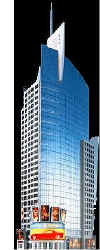
New York Architecture Images- Midtown Reuters Building |
|
|
architect |
Fox & Fowle Architects | |
|
location |
3 Times Square, bet. W42 & W43. | |
|
date |
2001 | |
|
style |
Post-Modernism | |
|
construction |
curtainwall of stone and glass | |
|
type |
Office Building | |
  |
||
|
|
  |
|
  |
||
 |
||
|
images |
   |
|
|
|
||
| pic- www.wirednewyork.com | ||
 |
||
  |
||
|
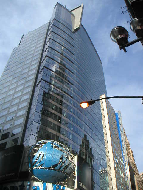
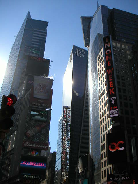
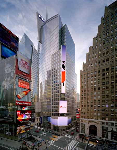
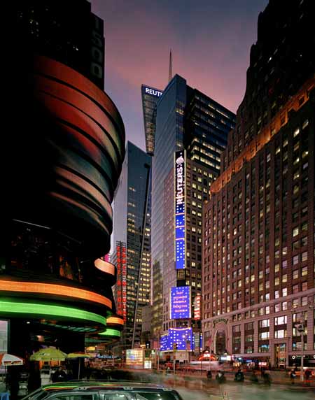
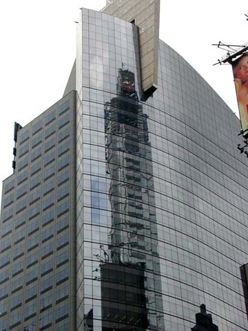
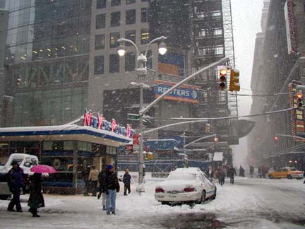
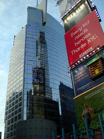
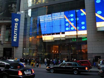
Reuters new headquarters is to the north of
the 42nd Street, adjacent to the 1 Times Square and Paramount Building.
The building (like the 4 Times Square, also designed by Fox & Fowle)
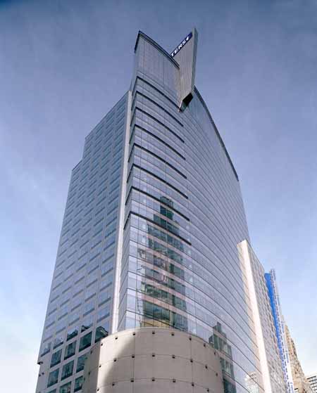
features, along with the facade with square-grid openings, also a large,
curving glass wall facing the corner of 42nd Street and Seventh Avenue. Tishman is serving as Construction Manager for this 32-story, 855,000 square foot office tower in Times Square at the corner of 42nd Street and Seventh Avenue. The building's design incorporates energy-conserving technology. The facade, a curtainwall of stone and glass with metal panels, will let in natural light while blocking most heat energy.
Architecture Review
Acing the Deuce
Fox & Fowle transformed 42nd Street by
defying convention with exuberant Times Square towers for Condé Nast and
Reuters;
Multiple personality in a building is not a disorder but a quality, especially when it comes to Times Square, where, as they say, worlds cross, and the scissoring avenues cut open the street grid, releasing geysers of urban energy. Erupting with people, signs, cabs, hotels, theaters, restaurants, offices, subways, and buses, Times Square resists fusing into a single, settled form and identity. Chaos is glory. But how does an architect take that state of perpetual disequilibrium and turn it into a building? What kind of high-rise really fits in this anti-classical context?
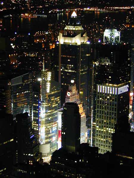
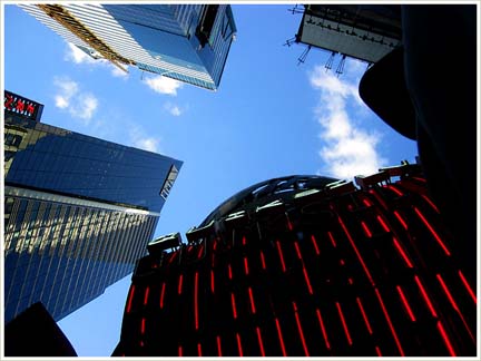
Several years ago, New York architects Fox & Fowle offered the first credible reinterpretation of Times Square: the Condé Nast tower at 4 Times Square. Channeling the multiple personality of Times Square, the architects broke down the massive 1.6 million-square-foot tube, layering together a composite building of many parts that perform different roles in different directions. Along Broadway, the kinetic signage spells entertainment, but around the corner, on 42nd Street, the dressed stone means business. The top of the building, with a high-tech radio spire, salutes its neighbor, the Empire State Building, while the base caters to pedestrians. Fragmenting the box so that the building isn't a solid cornerstone but an indeterminate mass dissolving in its own reflections, the architects surf and retransmit Times Square's energy. Developed by the eco-friendly Durst Organization, one of the rare architectural patrons working at this commercial scale, this hyperurban location has been turned by the architects into an ecologically responsible environment whose air quality inside rivals rural Vermont's. The architects have followed up their Condé Nast success on the opposite corner at 3 Times Square with the new Reuters Building, where, by an informal count, there are some six or seven buildings rolled up in a single tower, all with different façades that blend into, and add to, the diversity of Times Square. With a two-story granite-faced store, a neon marquee pointing out the subway entrance, a drumlike structure with terra-cotta columns turning the corner, and a curved glass wall sailing high between gridded façades, the 850,000-square-foot building changes top to bottom, side to side, front to back. In the upper reaches, the sail rounds the front Seventh Avenue façade, opening up Times Square to 42nd Street, borrowing needed space and featuring the dynamically splayed corner of the next high-rise going up across the street. Inside, the curved façade fans the upper floors toward the southern views, and interior architects Swanke Hayden Connell draw the signature curve back into office layouts. Edwin Schlossberg has mounted huge LED signs on the northeast corner of the building and inside the monumental lobby, and information flows past the door into the building. The building fits seamlessly here because Fox & Fowle has opened the normally closed skyscraper form to a part of the city that's already layered in short and tall, new and old buildings. The Reuters Building does not strive to be a perfect whole but is a fuzzy, indeterminate figure that blends into a context from which it takes its cues. The concept is best understood from the Port Authority Building at Eighth Avenue and 42nd Street, where, in a kind of spatial collapse, the Reuters and Condé Nast buildings merge into a single composite of some twenty apparent buildings, as in a Renaissance veduta -- those scenes once imagined by architects clustering disparate buildings into the same view. Manhattan has many twinned buildings on opposite corners that perform as uptown-downtown gateways, but Reuters and Condé Nast here act as fraternal rather than identical twins. The idea of a building collaged from many parts may not be original to this project, but it is original and appropriate within Times Square. Developed by Reuters and the Rudin Company, the Reuters Building does not pander, like the entertainment architecture down 42nd; it does not patronize the area, like the mansarded buildings Philip Johnson proposed for the same sites in the eighties; and it does not hide behind a mask of signs. At night, the lighted windows may reveal that the building is basically a generic tower wrapped around an elevator core, but by day the commotion and movement of this omnidirectional building sustain the tumultuous urban performance along the street. The design is not a one-liner but rather deft architecture that shows seismographic sensitivity to its dynamic context. Reuters is doing a riotous break dance with the city. |
||
|
Architecture;
Signs of Times Square: LEDs light up "The Crossroads of the World"
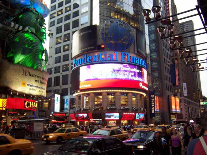
Lighting Dimensions, July, 2000 by William L. Maiman Times Square in New York City is now home to some of the world's most spectacular signs incorporating innovative, cutting-edge technology. Going beyond steam representing hot coffee or a lit cigarette, today's signage incorporates everything from fiber optics to strobe lights in a quest for attention. The use of billboard-sized video screens has increased in the past few years, and recently LEDs have been adapted into the mix of lighting sources found. The massive advertisements that dotted the cityscape in the movie Blade Runner are now a reality. NASDAQ, with its seven-story LED sign, and the E-Walk movie/ entertainment center on 42nd Street, with its five-story Loews sign, are two of the more illuminating examples attracting millions of tourists. Early users of new technology are often challenged by unforeseen snafus, such as manufacturing problems, construction delays, and the weather, not to mention skepticism by many. The project team associated with the Loews E-Walk theatre complex in Times Square certainly had these problems, and more, to be concerned with and ultimately to be successfully resolved. "This sign can be seen from Second Avenue [near the easternmost edge of Manhattan], and while driving on the West Side Highway. The usage of [Color Kinetics] LED technology fulfills the intention of a Times Square-type sign to be big, bright, and attract attention," says Teddy Asero, project manager for the Rockwell Group, the architectural/ design team for the entire theatre, including the conception of the sign. Asero continues, "Actually, the usage of new technology was originally suggested by our lighting designer, Paul Gregory of Focus Lighting. We knew we wanted something different, something to get noticed, and it had to be more dynamic than light bulbs dancing around." The results of the collaboration between the Rockwell Group and Focus Lighting is a 60'-tall by 8'-wide (18x2.4m) blade-type sign utilizing a quarter-million red, blue, and green LEDs spelling out LOEWS. It is attached to the building above a traditional marquee. Carmen Aguilar, Rockwell senior associate, designed the building facade above the marquee to be reminiscent of a proscenium arch (five stories high) and the vertical sign plays an important role in being a link to the "grand movie palaces of the past," adds Asero. "This sign is an icon indicative of the large theatres of yesteryear." The picture gallery located inside the complex shows a multitude of theatres of the 1930s and 40s, many in an Art Deco style, all adorned with the trademark blade sign. Clearly, the challenge was to give the familiar a new look. "What separates us from all of the other LED signs in Times Square is we started from scratch, not wanting to create video images. We wanted to create bright, high-contrast, colorful geometric shapes and sequences, and because of that we could approach the whole problem differently, not having to worry about adding display processors and such. That allows us to use traditional control and to develop interfaces that a lighting designer is more comfortable with," says Fritz Morgan, director of engineering for Color Kinetics. Gregory notes, "The LED is very specific in the way it emits light." Morgan clarifies, "It also meant we could explore the viewing area of the sign, since without displaying video, the sign did not need to be viewable over a wide range and have a consistent image displayed across it. For example, the NASDAQ sign is by far one of the best ones out there, but the problem for an engineer is that the image needs to be viewed from all the way around Times Square. If instead all you were trying to convey was large pixels of color, you can focus the LEDs differently and use narrower ones to create a much brighter, much more impactful sign, and that's what we went for. We chose very narrow-beam LEDs, 20 degrees as opposed to the ones for the Sony Jumbotron which are 100 degrees or 120 degrees. We focused the LEDs up and down 42nd Street so that we can attract attention. We could approach the problem differently from both an engineering and a control standpoint." Agilent Technologies, formerly a division of Hewlett Packard, provides the red LEDs, and Nichia provides the blue and green LEDs for Color Kinetics. Nichia also provides LEDs for the NASDAQ sign. Focus Lighting chose the Color Kinetics digital color-changing LED system which allows for the intelligent control of colors and sequences via DMX. Project designer Brett Andersen, also of Focus, offers additional background: "We had proposed just about everything one could think of for Times Square signage: incandescent lights, PAR lamps, neon. We even explored light pipe, and fiber optics, but nothing was really spectacular--the owner wasn't thrilled about anything. I was aware of a company called Color Kinetics that had won a product of the year award at LDI." [The C-Series self-contained color-changing LED fixture was LDI97 Architectural Lighting Product of the Year.] The kinetic nature of the source, to borrow from the company name, just tends to grab more attention and we were naturally drawn to that. Based on other experiences, I was able to see the power of doing those kinds of changes and patterns. Maybe there were three people in the company [Color Kinetics] at that point, but we knew the source was right, it had long lamp life and the ability to change colors, and there was just the problem of figuring out how to do it from there." "There" meant designing a circuit board that could be cut on a bandsaw to fit the shapes of the letters. Morgan explains, "Each board is divided into three pixels, or three controllable squares, and each square has 120 LEDs on it. The same board is replicated for the different letters. You set a DMX address for it, store it in EPROM; you have nine channels of DMX control for that board: three for each pixel, one for red, one for green, one for blue, for each of the three pixels." This arrangement simplifies control and "you don't need as many LEDs in the sign, which makes fabrication easier, simpler, and less expensive. In addition, a traditional sign fabricator can be used. In this case, Universal Unlimited of Long Island did the fabrication, with Empire Erectors providing the rigging and attachments." LEDs require heat management, and that means ventilation. Andersen explains how: "It required ingenuity to create spaces for the fans and then to keep water from getting into the sign. That was a whole new thing to consider." A system of sensors automatically triggers fans within the sign. If the temperature continues to climb, LEDs are gradually switched off to lessen the heat load. As the temperature decreases, the sign returns to normal operation. "The whole sign consists of six DMX universes, and that runs back to a Strand 510i show controller. Essentially, it's their top-of-the-line 500 series console squished down into a box. The DMX is distributed through a Pathfinder from Gray Interfaces, and Belden cable was specified for the DMX," Andersen adds. "One of the reasons to specify the Strand 510i show controller was the ability to interface with the Panja control system (formerly AMX), and so what we've done is use a 10" touch panel display which gives the theatre management an easy-to-use, straightforward interface to the 510i. The manager would probably not know how to program the Strand to make the sign red, so we've canned the programming into multiple cues, and loops of effects, and he simply accesses the Panja panel, places the sign into manual mode, and selects red, for example, and the LEDs turn red, until the system is returned to normal mode, a randomly running sequence of patterns and colors. Among the manual cues are about 15 colors: red, blue, green, magenta, cyan, yellow, purple, lime, lemon--a good mix. Originally being theatre lighting designers, we used standard gel-type color names, so the colors are labeled as bastard amber, steel blue, or congo, names like that," says Andersen. The programming was done by Jaie Bosse and Will O'Halloran of Focus Lighting, with Sepp Spenlinhauer as the control system designer. Visibility, especially during the day, was a key issue and many people were skeptical. Morgan says, "A letter was placed in a mock-up, and Sol Sachs, the senior vice president of design for Universal Unlimited, exclaimed, 'It's brighter than the sun.' " Along with the LEDs, neon, a Times Square favorite, is still featured. Andersen notes, "There is an outline in white on each letter, and blue neon behind the letter to give it a halo effect, plus yellow, which runs the outline of the entire sign in a double band for accenting and definition. If you didn't ring the letters with neon, they would be lost. Now it reads as LOEWS no matter what color pattern is running across it--it defines it much more."
|
||