 |
New York
Architecture Images- Midtown  Westin Hotel |
|
architect |
Arquitectonica |
|
location |
43rd Street and Eighth Avenue |
|
date |
2002 |
|
style |
Post-Modernism |
|
construction |
glass curtain wall |
|
type |
Hotel |
|
|
  |
 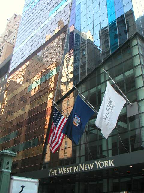 |
|
  |
|
   |
|
 |
|
|
October 20, 2002
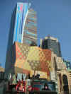
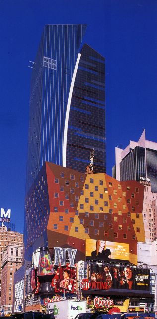
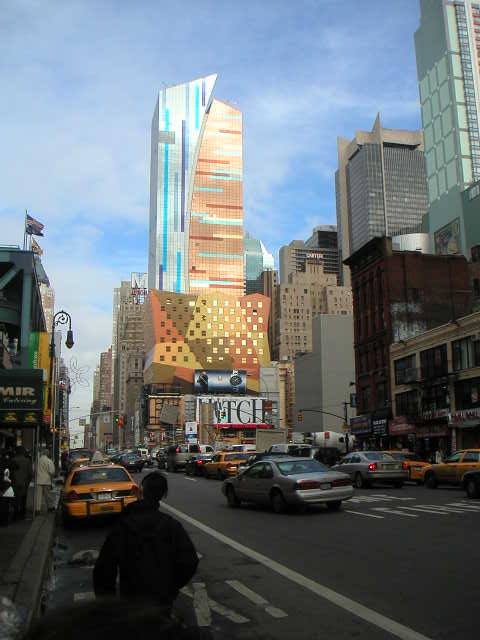
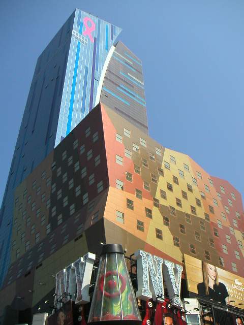
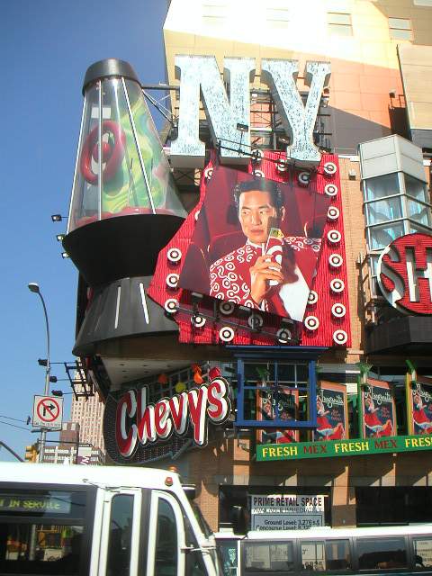
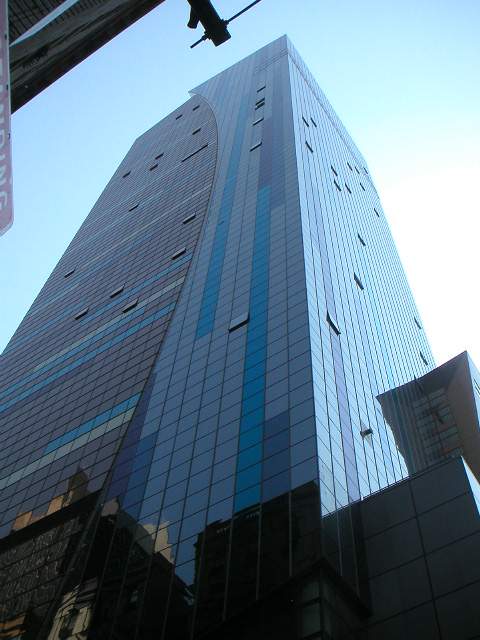
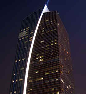
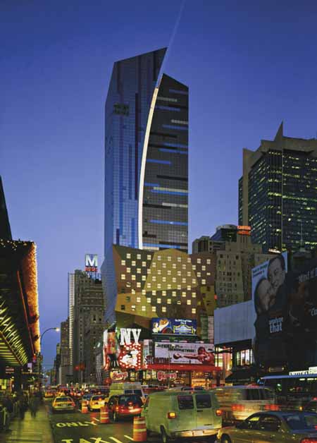
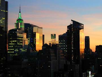
A Latin Jolt to the New York Skyline By HERBERT MUSCHAMP  The new 45-story Westin Hotel at Eighth Avenue and 42nd Street was designed by a Miami-based firm, Arquitectonica. The redevelopment of Times Square has finally produced a building worth talking about: the new Westin Hotel on Eighth Avenue between 42nd and 43rd Streets. And people are talking about it for a welcome reason. The Westin has raised a flag over the issue of taste. Translation: many people find it ugly. Hideous. The very embodiment of beauty's evil twin. Look up, people. This is New York. We live in one great ugly town. Not being too hung up on beauty is what makes life here possible, even thrilling. In exchange for surrendering refinement, we get a kind of urban poetry that is the envy of the world. Sometimes it takes outsiders to see it. Often, outsiders introduce new rhymes. The beauty resides, in some sense, in staying an outsider. The Westin is the consummate outsider's hotel. Developed and owned by Tishman Realty and Construction Company, the 800-room Westin is the first major New York hotel to open since the Four Seasons in 1993. The building is a sign — a bill-ding board, in Robert Venturi's phrase — and the sign says: Welcome to Nueve York. Latin American architecture is here! It is the first completed New York project by Arquitectonica, the Miami-based firm led by Bernardo Fort-Brescia and Laurinda Spear. Mr. Fort-Brescia, who was born in Lima, Peru, and Ms. Spear were the first architects of the baby boom generation to win large-scale commissions. The Spear House in Miami, designed in 1977 with Rem Koolhaas, was one of the most photographed houses of the late 20th century. Influenced by the Mexican architect Luis Barragan, the design introduced the firm's carnivalesque vocabulary of crisp, brightly colored, geometric forms. Among the first of their large-scale commissions were three residential high-rises on Miami's Brickell Avenue that were instrumental in defining a new identity for the city. By then, Miami had largely ceased to be a city of the south. It had become a metropolis of the north, a magnet for people and capital from throughout Latin America. The influx of Cuban refugees had been superseded by waves of vibrant cosmopolitanism to which the Brickell Avenue buildings gave a strong public face. The Latin strain is moving farther north again. North Americans are long accustomed to it in music, theater, film, literature and dance. It has been a presence in New York architecture, too, but is seldom grasped as such. We have work by Latin American architects here, but not, thus far, an easily discernible Latin American architecture. This is changing. The city's shifting demographic is one reason our architecture seems destined to become increasingly Latinized in the years ahead. A more important reason stems from the exhaustion of the northern European version of the Western tradition. That linear, 19th-century view of history has fallen apart as a measure of urban architecture. Post-modernism, a movement that tried to extend that line beyond its natural span, had the opposite effect of running it into the ground. One tradition does not fit all. There are other routes back to the Mediterranean, paths that do not take us through London, Paris and Berlin. And the future of New York architecture may well represent the further unfolding of southern routes from the Old World to the New. If so, the Westin Hotel is a pivotal building. Like it or not, the building signifies an important shift in the history of taste. Arquitectonica has acquired two additional New York commissions since work on the hotel began: a large residential project in Long Island City, Queens, and, with the New York office of Cooper Robertson & Partners, an urban design plan for the Penn yards site on the west side of midtown Manhattan. The hotel's 45-story tower rises behind a 10-story base. The base, which itself appears to float above the four-story E Walk entertainment complex, is the weakest part of the design. The base's corset silhouette is comely. Its painted surface goes flat. The base is an improvement on the original design, which envisioned a vast and redundant mural of New York City tourist attractions. That has been replaced by an abstract domino of punched-up masonry colors. But the colors don't hold their own with the design-controlled signage that wraps the base along 42nd Street. And the abstract patterns unhappily recall the two-dimensional public art projects of 30 years ago. If the owners take my advice, they will redo the base with a stylized version of Calvin Klein billboards. A folded photomural. Black and white pictures of pouty young people. Some slashes of color for accent, perhaps. An homage to the street's unsanitized, John Rechy, Russ Meyer past. (The graphic designer Tibor Kalman would have known how to do it.) The tower is erotic enough. You might take it for a New York 21st-century version of the Victorian Cupid around which Picadilly Circus revolves. The tower is, in any case, the first of the area's new buildings to project a clear sense of place into the Midtown skyline. It is as if the libidinous energies driven underground by "the New 42" have found momentary release. The glass skin of the tower is post-modernized Mondrian: Broadway Samba. A shallow arc, extending the full height of the tower, splits the southern façade in two. Blue glass predominates on the western half, pink-orange on the east. The skin is accented with stripes of contrasting colors that evoke the movement of traffic on uptown and crosstown streets. Beep-beep. Toot-toot. Joris Karl Huysmans, author of the fin de siècle classic "À Rebours" ("Against Nature" ), considered blue and orange the most decadent of all color combinations. The tones here fit that description. They remind me of the strange pink patina acquired by mid-century navy blue American sedans after too many harsh scourings and hours in the sun. The tower's lop-sided crown is one of the larkiest on the skyline. Instead of one more Art Deco retread, it forgoes symmetry for syncopation. At regular intervals, lights recessed within the vertical arc perform a blast-off number, shooting up the façade of the building and far into the night sky. Inside, the colors fade to quieter pastels, combined with wood and metallic finishes. Two atrium spaces, both of irregular contour, are housed within the base, which also contains a business-class section that can be used for small conventions and private events. Arquitectonica custom-designed the interiors. Elegant and efficient, the 863 rooms are executed in a nearly monochrome palette in pleasing contrast to the exterior's carnival skin. That skin is the main target of the sidewalk superintendents' wrath. It is indeed garish. None of that Vuitton Tower subtle-veil surface treatment here! Last summer, I saw the tower from Richard Meier's window. I felt his pain. Yet a more refined facade would not have drawn so much attention to the pressing issue of taste. The truth is that beauty and ugliness have been up for grabs for some time, and not just on 42nd Street. There's a crisis in evaluation going on all over town. It's one of the reasons discussions of the future of the World Trade Center site have been going around in circles. People can't agree on directions, movements or styles. It is daunting to contemplate the strong possibility that we may have to judge buildings without recourse to such familiar frameworks. Yet that likelihood must now be faced. If the ruckus over the Westin is loud, that is partly because such a reckoning is overdue. It has been a decade since state officials relaunched the Times Square redevelopment project. The youngsters for whom the place was initially conceived are now old enough to rent X-rated movies. There have been other changes. Ten years ago, New York architecture was still tyrannized by a protectionist retro ethos. That tyranny has lost its grip. The city has worked up a healthier appetite for change. Still, change isn't supposed to be comfortable, and even at the best of times architecture is a conservative art. Those with long memories will recall a similar controversy that erupted in 1961 with the completion of the Summit Hotel (renovated by Loews and renamed the Metropolitan) on Lexington Avenue and 51st Street. The hotel was designed by Morris Lapidus, also of Miami, a big-time architectural outsider of his day. The hotel's theme was Latin America. The curvilinear building, clad in green and turquoise tile, recalled Brazilian housing blocks of the 1950's. Palm fronds waved at the door. Inside, guests seeking refreshment could choose from the Gaucho Room, the Carioca Lounge and the Casa de Café. Beneath skull-shaped light sconces, they sat surrounded by fake pre-Columbian ornaments. The critics hated it. One of them, Russell Lynes, at least had the wit to turn his revulsion into confessional social comedy. "We are snobbishly intolerant in New York of the subculture of Florida," Lynes wrote, "and we wish they would keep everything but their pompano and oranges down there where it belongs and not foul our nest with their taste. Ours is bad enough already; we need no help from the provinces." But there was a note of bigotry beneath some of the rumblings over taste. "Too far from the beach," wrote one critic, a remark that, in 1961, could be read as code for "too Jewish." And I suspect that for many who liked the Summit, including myself, the Jewishness, not the ersatz South Americana, helped account for the appeal. Why shouldn't the Fontainebleau have an East Side pied-à-terre? The Westin is too Latin. It's Almodóvar. A building on the edge of a nervous breakdown. Over the edge, even. One might see that arc of light as a gauge of urban anxiety level. Here comes another crackdown on something: sex, smoking, loud noise, loud colors, whatever. Anything that sticks out. The Summit's negative reception shows that New York's intolerance of outsiders is nothing new. But I envy the confidence with which Lynes could describe Lapidus as a provincial. In 1961, that was a simple statement of fact. Thirty years later, the tables had turned. Only now are we beginning to emerge from a period in which New York's architecture became the most inbred, the least cosmopolitan of all world-class cities. I leave to intrepid future historians the task of sorting out the sordid details of the process by which a deeply provincial protectionism tightened its grip in the 1970's and 80's. Suffice it to say that the city of Russell Lynes found room for work by Frank Lloyd Wright, Mies van der Rohe, Eero Saarinen, Walter Gropius, Pier Luigi Nervi, Marcel Breuer and other outsiders. Even Lapidus made return engagements. Though the work of these architects sometimes fell short of expectations, their creative ambition boosted the city to the level of architectural history. No comparable record of receptivity exists for the 1970's and 1980's. And the local firms who flourished in those years were gazing into rear view mirrors. They were as out of touch with architectural developments internationally as they were with social and cultural currents here at home. It's catch-up time. New York has never truly known what it's like to build outside a northern European framework. And the city has ceased to be a northern European province. There is, in other words, a gap between who we are and how we build. New York is a Western city, but there is more than one way to be Western. New York has many. But we are just starting to trace alternative architectural paths. Enrique Norten's planned addition to the Brooklyn Public Library, for example, will do more than enlarge the architectural prospects for New York's future. It will also help to uncover a different Western past. Arquitectonica's residential project for Long Island City, which is still in design development, could expand the New World beyond the cheerless vision of lost New York. Yet it may well require more "ugly" buildings before the city's builders begin to recognize the magnitude of the shift taking place beneath our noses. The change is more momentous than the cosmetic swings we have lately seen between modernism and tradition. It involves the understanding that there are many modernisms, each with its own set of traditions, all of them with deep historical roots. The difficulty of adjusting to this idea is only part of the crisis in evaluation facing those uncertain about how to build. But the most promising and accessible way out of the impasse may lie with outsiders. A revised critical framework will be needed to interpret their contributions. It will not exclude such values as beauty or ugliness, good taste or bad. But such terms will be recast within an outline of difference and sameness, of fusion and separation, bridges and boundaries, proximity and distance. Such frameworks already exist. They have enabled us to appreciate the dynamic interaction between the creative process and the social contract. Until one is assimilated by New York architecture, aesthetic evaluation will amount to little more than glorified police profiling. * 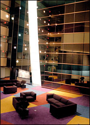 The atrium of the new Westin Hotel. 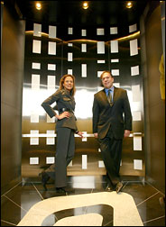 The hotel's designers, Laurinda Spear and Bernardo Fort-Brescia of Arquitectonica, in an elevator. Copyright The New York Times Company
FROM NEW YORK TIMES
http://www.nytimes.com/2002/11/28/nyregion/28PROF.html November 28, 2002 For Yin and Yang Architects, Heat in a Work of Light By JOYCE WADLER A NEWCOMER has planted itself off Times Square, a jazzy, colorful, irregularly shaped Westin Hotel, which shoots a light beam into the night sky. Some love it, some hate it, and one prominent critic wondered if it might be the ugliest building in New York. Not the sort of thing an architect wants to hear, although Bernardo Fort-Brescia and his partner and wife, Laurinda Spear, of the Miami-based firm Arquitectonica, have no trouble defending their work. "This building is a very precise interpretation of 43rd and 42nd Streets and Eighth Avenue," says Mr. Fort-Brescia, so full of energy he gestures like a conductor. "It wouldn't work anywhere else in the whole entire city. It's not on Park Avenue. It's not on Wall Street. This is a hotel in the theater district." Ms. Spear, the more reserved of the pair, said: "This building was the result of a design competition. One of the other finalists incorporated a giant apple with a huge clock on the top. The other was plastered with billboards from top to toe." Mr. Fort-Brescia, jumping in: "They were all dramatic, exuberant. There is such as thing as potentially losing the spirit of the place. People come to New York to be surprised and amazed." They're a design team, albeit one with 80 architects and offices around the world, but he does most of the traveling. She stays at home in Miami and drops the younger kids (there are six, ages 10 to 21) at school before going to work. Married 26 years, they keep a pied-à-terre in New York. Mr. Fort-Brescia, 51, was educated at Princeton and Harvard. He will not talk about his Peruvian family. "Businessmen," he'll say, vaguely. (In fact, with mining, banking, and real estate interests, the Brescia family is one of the wealthiest in Peru.) He is the more openly emotional. Ms. Spear, 52, the daughter of a prominent thoracic surgeon in Miami, was educated at Brown and Columbia. She puts in the dry, pointed comment or commentary. His look, with the glasses, is rumpled, professorial. The Westin New York, he says, has provided "a polemic." She, rushing into the Westin lobby, astonishingly lean, dressed in stretchy close-to-the body black, looks like a Prada professional. But a fellow of the American Institute of Architects, who gets up at 3:20 every morning and has left sick children at home, is not going to discuss something as inconsequential as clothing. "My clothes are so old," Ms. Spear says, sitting beside her husband on a suede lounge. Is her outfit designer? "I don't know. I'm just not a fashion person." ASKED to indulge in that intrusive New York practice of checking the label, Mr. Fort-Brescia moves obligingly toward his wife. She shoots him a look that could stop a tank, and that's the end of that. Arquitectonica, started with three friends in 1976 in Mr. Fort-Brescia's garage apartment, has long been recognized for bold, bright, postmodern design. One early attention getter was the Atlantis condominium in Miami, a royal blue skyscraper with a four-story hole in the middle, in which was planted a single palm tree. In 1995, Arquitectonica submitted its design for a hotel on the corner of Eighth Avenue to the city and state agencies responsible for the redevelopment of 42nd Street. Responding to criticism that the building is jarring, vulgar, Ms. Spear recalls a conversation with the architect Robert A. M. Stern, today the dean of the Yale School of Architecture, who was drafting the guidelines. "There were moments in the designing experience, we experimented with facades," Ms. Spear says. "There was one point Robert Stern said, `Now listen, you don't have to retrench and get really tasteful on me now.' He was joking, but there was an exuberance he was talking about. The redevelopment group did not have the intent of making this building look like everything else." What of the critics, the scathing review by Paul Goldberger in The New Yorker? "I do get hurt," Mr. Fort-Brescia says. "I felt hurt. I gave him the tour. I had no sense of where he was coming from. I did not expect those choice of words. They were hard." Ms. Spear suggests stoicism. "Anyone designing in the public eye has to be sort of thick-skinned about the response," she says. "Otherwise you could go into a corner and cry." She runs for the evening plane; Mr. Fort-Brescia walks along 43rd toward the jumping, jiving lights of Times Square. Out it comes in a rush. "I love New York, the energy! Forty-second and Eighth, my gosh, that's the site where I came out of the bus terminal when I was going to Princeton, wondering if I'd make it across 42nd Street to the Princeton Club, and I thought if some day I could build something here." What's with the light that runs the length of the building and shoots into the sky? "We look at New York, just the tops of buildings light up, the crown," Mr. Fort-Brescia says. "But in Times Square, with the billboards, the lights move up the building. We made the whole building the billboard." And off he goes into the neon night.
|
|
|
By Elias Wolfberg October 16, 2002 Even for the "new" Times Square, where McDonald's boasts exposed brick walls and what now passes for a peep show is a glassed-in, street-level TV studio, the new 863-room Westin New York opening today on 43rd Street and Eighth Avenue will almost certainly cause passersby to do a double-take. Some may think the $300-million hotel is the ugliest structure, others the most eclectic or just the funkiest new addition to an altered old neighborhood. Already, the New Yorker's architectural critic, Paul Goldberger, panned the luxury, 45-story hotel for making Times Square "vulgar in a whole new way." Its multicolored exterior and modernly minimalist interior, together with a cube-like section that hangs above the E-walk movie and shopping arcade complex, has inspired both supporters and detractors to say the Westin New York successfully blurs architecture and entertainment. "In this case, the market has asked for all this gaudy, eclectic stuff on 42nd Street," said Lynne B. Sagalyn, a professor of business administration at Columbia University, and the author of "Times Square Roulette: Remaking the City Icon" (MIT Press). "Are they supposed to build a hotel like what you have on Park Avenue?" Certainly, the largest hotel to open in Times Square in nearly 20 years is unique. It has 8,000 different shapes and sizes of glass on its exterior, all in the hotel's blue and rust motif. A 40-story curved white line - which separates the aqua colors from the rust-like hues - runs the length of one facade and will light up at night - once the hotel officially opens - in different computer-controlled patterns. A huge spotlight on the roof will work in concert with the light patterns on the building to shoot into the sky. Inside, most rooms will cost between $299 and $399, and six suites at $1,500 a night feature elegant, minimalist touches such as slate bathrooms, two-headed showers and double- to king-sized beds. But what has several critics who have already reviewed the hotel up in arms is the hotel's departure from the staid and classically elegant - or at least old - architecture of neighboring large buildings. The renovated New Amsterdam Theatre on 42nd Street, and the Milford Plaza Hotel, a half a block up from the Westin New York, are imposing, traditional Times Square buildings with classical features, and facades in mostly uniform white or beige. They differ markedly in flavor and tone from the Westin, whose designer, the Miami-based Arquitectonica, gained international fame after the TV series "Miami Vice" featured one of its buildings in its opening credits. The Milford Plaza was built during Times Square's original hotel boom in 1928 and was named the Hotel Lincoln at that time. It was built to attract what at the time was essentially the same crowd the Westin New York targets today - an upscale group of executives and upscale vacationers. Still, with rooms now starting at $109 and a clientele a pay grade or two below the corporate demographic of the Westin, the matronly Milford, with 1,300 rooms and suites, is publicly welcoming its eccentric new neighbor. "We appreciate the construction of a new and expensive hotel because it will help lift the area and improve Eighth Avenue," said Max Eisen, a spokesman for the Milford Plaza. Nevertheless, in a neighborhood with a quarter of all Manhattan's hotel rooms - about 15,000 rooms are available in Times Square - the Westin New York's occupancy will reach 75 percent to 85 percent by year end, said manager John Sweeney. John Fox, a senior vice president at PKF Consulting, which advises the hotel, said the average occupancy rate in Manhattan since January has been 74 percent. But Sweeney said he expects the Westin to outperform other city hotels because of its location near Broadway and the Javits Convention Center, and its international name recognition. Despite pot shots from critics, the Westin's opening is being watched closely because of its size and ambition, and for its unusual look. And in Times Square, with scores of names in large, multicolored lights, notoriety - throughout the ages - has always been a hard thing to come by. "We felt we really had to build something edgy in Times Square," Sweeney said. "And we think we have." |
|
|
NEW YORK TIMES. February 6, 2002
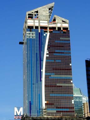
Designed to Stand Out in a Crowd By JOHN HOLUSHA The builders and operators of the new Westin Hotel, which is scheduled to open this November at Eighth Avenue and 43rd Street in Manhattan, wanted to draw attention to the building. So they commissioned the Miami firm of Arquitectonica to design a building that would cry look at me even over the profusion of brightly lighted signs in Times Square. The firm responded with a design for a 45-story tower enclosed in multicolored glass and split top to bottom by a curving beam of light that appears to burst into the sky. The eye catching facade design presented difficult engineering problems for Tishman Realty and Construction, the developer and owner of the $300 million 860-room hotel. It will be operated by Starwood Hotels and Resorts, the real estate investment trust that owns the Westin, W and Sheraton brands. In most modern construction, the outer walls bear no weight and are simply attached to the steel or reinforced concrete structure of the building. These curtain walls are there to keep the heat and air-conditioning in and the weather out. They also establish the look of the building. Because of the curves on the north and south facades and the selection of multiple colors of glass, very few of the aluminum-encased glass panels are alike, complicating both the manufacture of the facade and its installation. "In a typical building you will have about 50 different types of panels," said David Horowitz, a Tishman vice president who is overseeing construction of the hotel. "Here we had 1,200 to 1,300 unique panel types." To handle the project, which is now nearing completion, Tishman assembled a multinational group of designers and fabricators to come up with a skin for the building that met the architect's design requirements and could still keep out the wind and the rain of the worst storm that would be likely in a century. Beginning in early 1998, Viracon, a glass manufacturer based in Owatonna, Minn., sent dozens of samples of glass to Arquitectonica, which selected 10 base colors: copper, gold, bronze, orange, white, silver, violet, green, blue and aqua. Viracon would ultimately produce 8,000 glass sheets in those colors, and in clear glass panels, for the 184,000-square-foot outer wall of the hotel. Then, as usual, the architects turned their conceptual designs over to an engineering company to figure out how to build the panels. The company selected was Permasteelisa Cladding Technologies, a company in Northern Italy with an assembly plant in Windsor, Conn. The outer frames of the panels were designed to hold a clear inner pane of glass and a colored outer one separated by five-eighths of an inch of air space for insulation. Once the design was completed and approved, the frames were formed by extrusion, in which aluminum alloy is driven through a die with great force to form the desired shape. Because of the complexity of the project, each piece of the facade, including the glass, was marked with a bar code to help workers with the assembly. Once formed, the frame pieces were sent to a painting specialist in the Netherlands to receive a highly durable coating of sliver or copper color, depending on its position in the facade. (The project was actually even more international than it appears, Mr. Horowitz said — the engineering team was mostly Croatian.) Once formed, painted and cut to length and machined, the parts were crated and shipped to the plant in Windsor where they were assembled into panels and the glass installed. Most of the panels are about 5 feet wide but the height ranges from 9 to 18 feet, depending on the floor where they are to be installed. Attaching the panels to the concrete structure of the building involved advanced planning. Before pouring each floor, crews embedded U-shaped metal channels that will be held in place by the hardened concrete. Metal anchor plates are bolted to the channels and then the panels are set onto clips attached to the anchor plates. Permasteelisa's crews began installing the facade in mid-May last year and reached the 45th floor by December. Installation of levels above the 45th floor is expected to take several months longer because of the difficult logistics of lifting the panels from the 45th floor to higher levels of the building. The elaborate facade is limited to the tower part of the project. The low-rise part of the hotel, which is above Tishman's existing E Walk entertainment, retail and restaurant complex on 42nd Street, will have metal facade panels that will present a smooth aluminum face to the exterior, interrupted by square windows. This lower part of the building runs from the 5th floor to the 17th floor of the main building along Eighth Avenue. It was originally designed to be operated by a separate company and to be aimed at leisure travelers and families, as distinct from the business travelers more typical of Westin's guests, but it is now fully integrated with the hotel. There will be internal access from the 200,000-square-foot E Walk complex to the hotel — officially the Westin New York at Times Square. |
|
|
From New Yorker Magazine 2002-10-07 MIAMI VICE by PAUL GOLDBERGER Is this the ugliest building in New York? Guests at the new Westin hotel, which stretches between Forty-second Street and Forty-third Street on Eighth Avenue, will have a pretty good view of one of the most revered modern skyscrapers in New York, the bluish-green McGraw-Hill Building, half a block to the west. A short walk in the other direction will bring them to what is probably the most beloved skyscraper anywhere, the Chrysler Building. When the McGraw-Hill Building was finished, in 1932, it was dismissed by the architecture critic of this magazine, George S. Chappell, as "a stunt and not a particularly successful one." Chappell, who wrote as T-Square, said that the Chrysler Building had "no significance as serious design." Lewis Mumford called it "a series of restless mistakes . . . this inane romanticism, this meaningless voluptuousness." The Westin will probably be received in pretty much the same way, but I doubt that history will reverse the verdict. The building is not ahead of its time, like the McGraw-Hill Building, which is an early International Style tower. And it is certainly not the contemporary equivalent of a graceful exercise in Jazz Age syncopation, which is how people came to view the Chrysler Building. The forty-five-story Westin is the most garish tall building that has gone up in New York in as long as I can remember. It is fascinating, if only because it makes Times Square vulgar in a whole new way, extending up into the sky. It is not easy, these days, to go beyond the bounds of taste. If the architects, the Miami-based firm Arquitectonica, had been trying to allude to bad taste, one could perhaps respect what they came up with. But they simply wanted, like most architects today, to entertain us. This is less a building than a concept, and you can imagine its being pitched to the developer, Tishman Realty & Construction, the way producers pitch a television show to network executives: Audiences now don't want plain towers that go straight up, and they're not going to be satisfied with just a fancy top, so we've come up with a way to make the whole building into a vibrant, dynamic object. The developer bought this, and ended up with a skyscraper split down the middle by a big, swooping white line on its north and south sides. To the east of the swooping line, the building is sheathed in a vaguely copper-colored, pinkish glass, set in horizontal panels. The west side is covered in blue glass, set vertically. The notion, according to Bernardo Fort-Brescia, who, along with his wife and partner, Laurinda Spear, heads Arquitectonica, is that the east side of the tower is "earthbound, anchored to the ground"—hence the horizontal lines and the warm color—while the blue-toned, vertical-lined side, which is taller, is "skybound." Well, O.K. This is no more superficial than the reasoning that goes into plenty of other buildings today. And I have to admit that the Westin looked rather sexy in the renderings that were shown around in 1995, when Arquitectonica and the developer won a competition, sponsored by the government's 42nd Street Development Project, to build a major hotel in the "new" Times Square. But, just as Hollywood concepts have a way of evolving, the Westin that has gone up bears only a slight resemblance to the drawings. It is both shrill and banal, less a piece of architecture than a developer's box in drag. The Westin forces you, as no piece of architecture in this city has in a very long time, to come to terms with exactly what makes a building so strident that it enthralls in the way a gruesome accident does. The main problem isn't the shape, which, while self-conscious, isn't awful. In fact, from a couple of blocks south, on Eighth Avenue, where you can see the tower in full profile, the mass of the building is striking. No tower meets the sky quite like this one. The blue section swoops over the pink one as if it were slicing into open space. At night, the white line will be lit up on the Forty-second Street side of the building, and spotlights on the roof will pick up the motif and shoot a ray of light into the sky. But it makes no sense to design a single building to look as if it were two different, clashing buildings. The two parts aren't different structurally and they aren't doing different things inside. There is no logical reason to split a skyscraper vertically with a curving line, or to make one section play at hugging the ground and another section play at reaching to the sky. It's all pretense—not the kind of pretense that brings us fake Georgian or fake Renaissance but the pretense that the hoopla is somehow connected to a meaningful architectural idea. Everything Arquitectonica has done here is as superficially decorative as if the building had been sheathed in classical columns and pilasters. Fort-Brescia told me that the line just came to them. "Laurinda and I literally took a drawing and slashed a line across it," he said. "There is a rational side to our profession, but there is a lot that is intuitive." I could live with the zooping and swooping if it weren't for the way the shape of the building is covered. The glass must be the ugliest curtain wall in New York. Make that the two ugliest curtain walls in New York, since the pink section and the blue section are ugly in different ways. They are both unpleasant to look at—tawdry colors, gaudy finishes. As if that weren't enough, the architects have decorated each section with stripes in darker tones that they call "brushstrokes," but which do not succeed in making the building look even remotely like a painting. It's as if Fort-Brescia and Spear had no faith in the shape they made, and could not stop themselves from tarting it up. The tower marks the northwestern boundary of the Times Square redevelopment project, which includes four office towers around Times Square itself, as well as new movie houses, stores, and a few restored landmark theatres along Forty-second Street. The main entrance to the hotel is through a blessedly ordinary modern base of clear glass on Forty-third Street. Things are quite different on the south side of the Westin, however, the side that faces Forty-second Street, where the redevelopment project's planners insisted that the hotel have a big, boxy base to tie it into the so-called "entertainment zone"—the open-air suburban mall, in other words—that Forty-second Street was in the process of becoming. The base, which the architects refer to as the building's bustle, is a seventeen-story-high box that contains a thirteen-screen multiplex, stores, restaurants, and eight floors of hotel rooms. The bottom floors are covered in advertising signs, and you have never been more grateful for the excesses of capitalism. (As in most of the new Times Square, the best architecture isn't bricks and mortar but moving lights and electronic images.) On the upper floors of the bustle, the architects could not hide behind flashy signs, and their solution for a façade yielded one of the strangest attempts at decorating a box that you are ever likely to see: plain, double-hung windows set into yellow, orange, and copper-colored metal panels in large, geometric shapes at slightly tilted angles. The façade is eerily like a child's drawing, complete with crooked lines, little boxy windows, and strange colors. What it does not look like is a wing of a three-hundred-and-seventy-million-dollar commercial project in the center of New York City. I'm not saying that a building in Times Square ought to look like a building at Rockefeller Center. Fort-Brescia told me that he wanted to respond to the atmosphere of Times Square. "We wouldn't do this on Wall Street," he said. "But Times Square is the entertainment district of New York. The building is performing. It has to be somewhat histrionic." Fort-Brescia is enthusiastic and engaging, and it's obvious why he is able to sell his designs to business people who want a little more pizzazz. Arquitectonica has an unusual history. It was established in the nineteen-seventies—Fort-Brescia and Spear are both fifty-one—and it grew very large very early, thanks mainly to the fame of a single building, the Atlantis, a waterfront condominium on Biscayne Bay in Miami. The Atlantis is a twenty-story slab with a square, four-story hole cut out of the middle. The cutout, in which a single palm tree grows, became the most famous void in contemporary architecture. It showed up in the opening sequence of "Miami Vice," and it expressed perfectly the way Miami wanted to see itself: daring, brash, and glittery. Now the building has been there so long it is practically as much a part of Miami's history as the Fontainebleau, and it looks almost quaint. But when the Atlantis was built, Fort-Brescia and Spear were barely past thirty, and the combination of pragmatism and exuberance that marked their work was unusual. They suddenly found themselves among the small group of architects whom developers seek out because their names add to a building's value. The cachet of the celebrity architect is familiar today, when condominiums by Richard Meier in the West Village sell for more than many Park Avenue apartments, but it wasn't the norm in the late nineteen-seventies and early eighties. Arquitectonica helped to create the architectural culture of this moment, such as it is, which is no small accomplishment for a young firm. And Fort-Brescia and Spear have had a singular effect on Miami, where they more or less created an architectural vernacular that mixes Latin energy and sensuousness with classic modernism. But I wonder if they haven't been hurt by too much success too soon. Michael Graves designs housewares for Target, there are Charles Gwathmey dinner plates, and condos created by Robert A. M. Stern, but those architects earned their stripes in the realm of more ambitious architecture before they went so heavily commercial. Big-time commercial work almost invariably involves big-time compromises, and Arquitectonica has often appeared a bit too eager to play the game. For all the promise of its early work, the firm didn't build up a big enough roster of serious architecture to leaven its participation in the culture of architectural celebrity, and now the thinness shows. It's not easy to do architecture as entertainment. You see a building again and again and the jokes get old. That is not to say that architecture has to be stolid and dull to have staying power, but it does mean that it's harder to get away with being slick and superficial, even in a place like Times Square. The special qualities of Times Square as an urban space don't come from its architecture. The older buildings in the neighborhood, like the Paramount Building on Broadway or the Candler Building on Forty-second Street or the long-gone Astor Hotel, weren't all that different from buildings in other parts of town. The lights and the signs, the applied glitz, made the difference. Now, thanks to a new generation of technology, the lights and the signs are more spectacular than ever, and I wonder if we wouldn't be better off if architects recognized this, and let the new buildings recede even more than the old ones did. Why try to upstage the electronic spectacle that defines Times Square? Arquitectonica had a much firmer sense of how far to go inside the hotel. The lobby reminds me a bit of the big entry hall at the United Nations General Assembly Building, which is one of the most underappreciated nineteen-fifties rooms in New York. Many of the details, like the elevator cabs with curving, backlit metal panels, are splendid. Because the bustle is so deep—it fills the entire front half of the site—there is a lot of leftover space in the middle, and the architects have filled it with an atrium, which is enclosed on one side by the lower floors of the tower. Thus some of the elements of the façade, including the bottom end of the swooping white line that runs all the way up the south side of the building, are elements of the atrium, too. As much as I dislike that white line on the exterior, I like seeing it close up. In the atrium, it operates in a very different way than it does on the façade. It reveals how the building is made, and is completely engaging. The hotel rooms themselves are appointed in a kind of mass-market Ian Schraeger manner, and they're not a bad example of that design sense: slate bathrooms with stainless-steel sinks; sleek furniture. I had assumed that, in addition to providing an environment of reasonable sophistication and comfort, the rooms would have the virtue of being the one place from which you could not see the exterior of the building, but when I looked out the window of one of the westward-facing rooms, I was confronted with a projecting side of that damn bustle. There is no escape from the outside of the Westin, even inside it. |
|
|
2002 HOSPITALITY PROJECT OF THE YEAR The Westin New York at Times Square Development Team ARCHITECT & INTERIOR DESIGNER: Arquitectonica, Miami and NYC PRODUCTION ARCHITECT: HKS, Dallas STRUCTURAL ENGINEER: Ysrael Seinuk, NYC MECHANICAL, ELECTRICAL & PLUMBING ENGINEER: Jaros Baum & Bolles, NYC GEOTECHNICAL ENGINEER: Langan Engineering and Environmental Services, Elmwood Park, NJ EXCAVATION & FOUNDATION CONTRACTOR: Laquila Construction Inc., Brooklyn, NY SUPERSTRUCTURE CONTRACTOR: Sorbara Construction Corp., Lynbrook, NY CONCRETE DETAILER: Recon, Elmsford, NY CURTAIN WALL CONTRACTOR: Permasteelisa Cladding Technologies, Windsor, Conn. CONSTRUCTION MANAGER: Tishman Westside Construction LLC., NYC HOTEL OPERATOR: Westin Hotels & Resorts, White Plains, NY OWNER & DEVELOPER: Tishman Realty & Construction Co. Inc., NYC From its design to its site to its construction, the $300 million Westin New York hotel in Manhattan's Times Square is anything but typical. First, its design incorporates a more theatrical approach to its facade because of its Times Square location. Second, the site for the 45-story, 667,000-sq.-ft., 863-room hotel consists of a 17,000-sq.-ft. parcel located on West 43rd Street and Eighth Avenue between a subway and the Carter Hotel and on top of the four-story, 200,000-sq.-ft. retail and entertainment complex known as E Walk. Third, construction has taken place during the height of the region's labor shortage with inclement weather and on a fast-track schedule. By the end of summer 2001, development team members reported the project was as much as four months ahead of schedule. At $300 million, the project was also below budget. Not bad for an environmentally responsible building that will feature 4,500 prefabricated curtain wall panels containing 20 different colors of glass in a myriad of dimensions. The focal point of the Westin New York at Times Square is its design. The building's design directly relates to the West 43d Street and Eighth Avenue portion of the site because of its small footprint for the hotel tower. The design also places the lobby level on the second level and not the ground floor. In addition, the public spaces are organized vertically above the lobby. Therefore, to take visitors to and through these spaces, a five-story glass atrium with escalators was created in the corner of the building on West 43rd Street and Eighth Avenue. The building also has a square plan with rooms centered around a central core of elevators. This creates a full-perimeter hallway so guests don't sense the distance from the elevator to their room. This square plan led to the creation of the facade design. To achieve the desired look, the building was "sliced" on the exterior to create the appearance of two buildings coming together. To do this, a recess was created. This recess contains a light effect that rises to the entire height of the building, taking on a curved shape that results in two unique forms rather than a box. At the top of the building the two forms are separated with a beam of light that shoots up to the sky between the two forms. And between the two distinct colors of the two faces of the facade will be multi-colored glass panels that add brush stroke accents to the facade. These "brush stroke accents" were created using hundreds of different dimensions of glass to make an endless combination of colors in the spandrels. The half-block site for the hotel tower is located between the Eighth Avenue subway and the Carter Hotel. Site logistics was also a challenge. These included a high-trafficked pedestrian corner at West 43rd Street and Eighth Avenue, rock removal adjacent the Carter Hotel and supporting the excavation adjacent the subway. To support the excavation adjacent to the subway line, 7-in. dia. mini-piles were drilled 11 ft. to 12 ft. into the rock below the subway invert. These mini-piles helped to facilitate construction by allowing a crane pad to be supported. In addition, the design of the Westin New York hotel calls for a building that sits on top of the E Walk building. The hotel comes up along the side about 100 ft. and cantilevers over the top of the E Walk entertainment complex, comprising a section of the building called a bustle. This is the eighth floor of the hotel where it cantilevers over and goes up to the 17th floor and breaks back in so the tower can continue to go up. Supporting the concrete bustle of the hotel was also difficult. The roof of the bustle goes from floors 8 through 17. The conventional way would have been to put up a separate building with an expansion joint. Use of an expansion joint was ruled out because of the maintenance required for it. Instead, the project's structural engineer recommended a Dynamic Isolator. This device is a seismic isolator used to dampen earthquake loads for buildings. It allows free movement in any horizontal plane and it is very stiff so it does not deflect on the vertical load. The hotel's sloped roof was also an issue. The solution was a very complex structural slab that required extensive engineering with regard to the form work, false work, scaffolding and outriggers. The jury noted that the project's challenges were many and difficult and that the project team provided creative solutions to these project challenges while focusing on safety throughout the project. |
|