 |
New York Architecture Images- Midtown
Time Warner Center |
|
architect |
David Childs of Skidmore, Owings & Merrill LLP |
|
location |
10 Columbus Circle |
|
date |
2003 |
|
style |
Late Modern (International Style III) |
|
construction |
Height: 750 ft (229 m) Floors over ground: 55 |
|
type |
Office Building |
  |
|
    |
|
    |
|
   |
|
  |
|
 |
|
 |
|
 |
|
  |
|
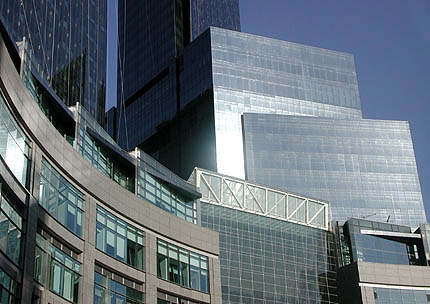
In the Wall Street Journal, Ada Louise Huxtable describes it as "exactly what a New York skyscraper should be--a soaring, shining, glamorous affirmation of the city's reach and power, and its best real architecture in a long time. Its two tall towers rise from symmetrical lower sections rotated in a bow to the Circle, where the huge building morphs into pedestrian shops and restaurants at ground level. But the wonder is the delicacy, the elegance, of these perfectly calibrated, glittering glass facades, the suave, sharp-edged precision that is amazingly subtle and refined for a structure of this enormous size." In the Los Angeles Times, Nicolai Ouroussoff describes it as "a somewhat generic vertical mall whose interior would look at home in an international airport terminal." This is not just out-of-town jealousy; some New Yorkers, while admiring the scale and welcoming the investment, question whether the building's character is really New York - especially midtown.
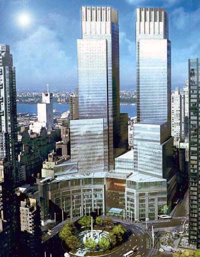
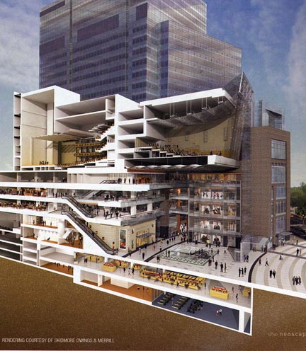
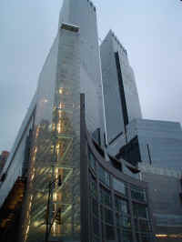
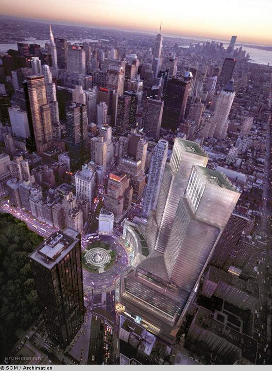
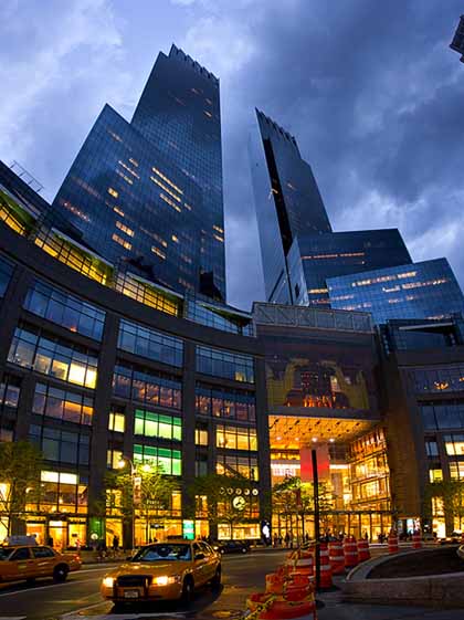
The complex has an interesting geometry derived from its site, its concave front facing onto the curve of Columbus Circle (at the southwest corner of Central Park), and its dominant twin towers shaped as parallelograms, their shorter sides aligned with the streets in the Manhattan grid, and their longer sides with Broadway, cutting obliquely through the grid from Columbus Circle. Its scale is huge: a $1.7 billion investment bringing a major upscale shopping mall, a 5-star hotel, offices for 1,700 Time Warner employees and other companies, television studios, a jazz concert hall, residential apartments and more. The sense of scale and power is exacerbated by the unplanned significance of raising new twin towers in New York so soon after September 2001. The location and the power are exhilarating, though the forms of the buildings themselves, and the detailing, are all quite underwhelming.
It is hard to see the Time Warner Center as beautiful, or elegant, or inspiring architecture - although some do. It is an impressively large project completed on time, which will succeed as the landmark it seeks to be because of its technical credentials, and the scale of the new amenities it offers in a terrific site in New York's midtown.
How to visit The Time Warner Center is on the west side of Columbus Circle, between 58th and 60th Streets, on Eighth Avenue and Broadway - the southwest tip of Central Park. Areas open to the public including the shopping mall (entrance from Columbus Circle) and 35th floor lobby of the Mandarin Oriental hotel (entrance from 60th Street). |
|
 |
|
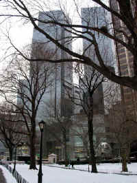
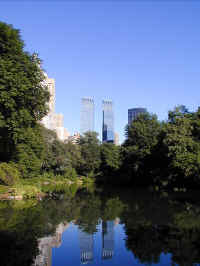
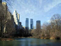
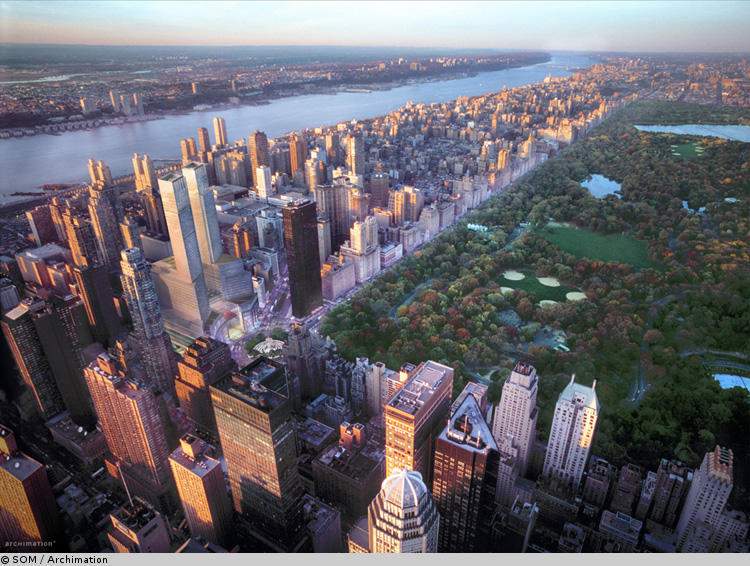
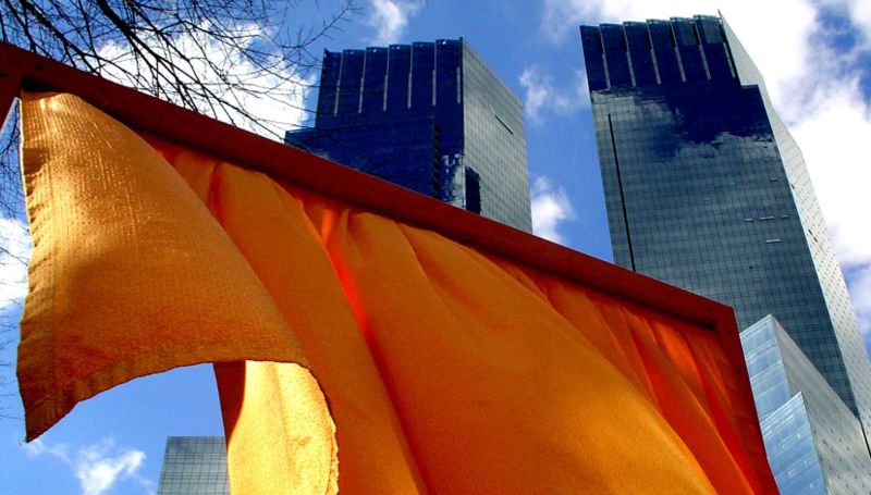
| Time Warner Center taken from Central Park during The Gates exhibit in 2005. | |
| The New Coliseum
project was designed (yeah, right..)by David Childs of Skidmore, Owings &
Merrill and developed by the Related
Companies LP and Apollo Real Estate Advisors, LP, the $1.6 billion block
will house 232,300 m² of space. The 750 feet, twin-towered multi-use
complex, named Columbus Centre (or AOL Time Warner Center), will house the
AOL Time Warner World Headquarters, a 250-room/suite luxury hotel (the
Mandarin Oriental, New York) spaces for retail, entertainment, restaurants
and offices, 225 luxury apartments, as well as CNN live broadcast production
studios and a 12,500 m² concert hall for the use of Jazz at Lincoln Center.
AOL Time Warner will house and own one-third of the complex. The incorporated hotel will have the "first" floor of its public areas located over 75 meters above ground and feature a spa and a health club. A 500 m² ballroom will overlook Central Park. The cost for the hotel is estimated as $200 million. The building plot was purchased from the Metropolitan Transport Authority for $357 million. The complex is due for completion in late 2003 |
|
|
The Time Warner Center is a mixed-use skyscraper developed by The Related
Companies in New York City. Its design, by David Childs and Mustafa
Kemal Abadan of Skidmore, Owings & Merrill, consists of two 229 m (750
ft) towers bridged by a multi-story atrium containing upscale retail
shops. Construction began in November 2000, following the demolition of
the New York Coliseum, and a topping-out ceremony was held on February
27, 2003. It is the property with the highest-listed market value in New
York City, $1.1 billion in 2006. Originally constructed as the "AOL Time Warner Center," the building surrounds half of Columbus Circle in Midtown Manhattan. The total floor area of 260,000 m² (2.8 million ft²) is divided between offices (notably the offices of Time Warner Inc.), residential condominiums, and the Mandarin Oriental hotel. The Shops at Columbus Circle is an upscale shopping mall located in a curving arcade at the base of the building, with a large Whole Foods Market grocery store in the basement. The complex is also home to a 1,200 seat theater for Jazz at Lincoln Center as well as CNN studios, from where Anderson Cooper 360° and Lou Dobbs Tonight, among other shows, are broadcast live. CNN's Jeanne Moos, known for her offbeat "man on the street" reporting, frequently accosts her interview subjects just outside the building. In 2005, Jazz at Lincoln Center announced a partnership with XM Satellite Radio which gave XM studio space at Frederick P. Rose Hall to broadcast both daily jazz programming and special events such as an Aartist Confidential show featuring Carlos Santana. Design and construction The Time Warner Center was the first major building to be completed in Manhattan after the September 11, 2001, terrorist attacks, although it was already under construction in 2001. While some New Yorkers noted the uncanny resemblance of the Time Warner Center to the fallen Twin Towers, the building's developer disclaimed to the press any intentional similarity.[4] The building drew publicity in 2003 when Mexican financier David Martinez paid $54.7 million dollars for a penthouse condo, then a record for New York residential sales. The building’s street address is officially 10 Columbus Circle, but the developers use the name “One Central Park” to promote the residential units. The address One Central Park West, meanwhile, belongs to a tower across the street owned by Donald Trump. Upon the completion of the Time Warner Center, Trump made a “little joke” at the Time Warner Center’s expense by hanging a large sign on his building gloating, “Your views aren’t so great, are they?” The design of Time Warner Center pays homage to the streets of New York: The curvature of the base helps frame Columbus Circle, the angle of the two towers aligns with Broadway, and the space between the towers gives the illusion that 59th Street passes through. In addition, the rectangular patterns on the glass curtain wall overlooking Columbus Circle suggest the Manhattan street grid. The Related Companies The Related Companies is one of the largest developers in New York City with division companies across the nation and partner companies world-wide. References ^ "Property Values in New York Show Vibrancy." New York Times. Jan. 13, 2007. ^ "XM Satellite Radio to Open New Studios at World-Renowned Jazz at Lincoln Center in New York City." Jazz at Lincoln Center press release. May 19, 2005. ^ "Santana - XM & Jazz at Lincoln Center." All About Jazz Nov. 10, 2005. ^ Inside the Time Warner Center, Newsday, Feb. 19, 2004 ^ Caroline Overington. "Gotham agog as plutocrats stage battle of the towers." The Sydney Morning Herald, Nov. 29, 2003 |
|
|
THE INCREDIBLE HULK by PAUL GOLDBERGER A behemoth rises up in Columbus Circle. The New Yorker The new Time Warner Center, at the southwest corner of Central Park, isn’t a bad piece of urban design. The base of the building reflects the curve of Columbus Circle in a sumptuous, even graceful arc, and it gives the circle a monumentality that it never had before. If you don’t look up, you could like this building. Columbus Circle is one of New York’s few true roundabouts, and almost every building put on it has ignored the architectural potential that the shape holds. Edward Durell Stone’s sweet but hapless marble museum at 2 Columbus Circle made a gentle nod to the curving street, but you hardly noticed it when the monolithic New York Coliseum loomed on the site that the Time Warner Center now occupies. The tall glass stick that is the Trump International Hotel doesn’t help much, either. It may be going overboard to say that the curved base of the Time Warner Center is reminiscent of John Nash’s glorious façades on Regent Street in London. A better comparison, perhaps, would be to a fine New York building that is often overlooked—the old Standard Oil headquarters at 26 Broadway in lower Manhattan, by Carrère & Hastings, which has a tower set atop a convex base. The façade of the base reflects the shape of Broadway as it passes Bowling Green. The tower is aligned with the straighter grid of streets to the north, and thus can be seen from a distance. For the Time Warner Center, David Childs of Skidmore, Owings & Merrill (who is more famous at the moment for being at loggerheads with Daniel Libeskind over the shape of the Freedom Tower at the World Trade Center site) designed two huge glass towers that are positioned to be seen not just from Central Park but from along the axis of Fifty-ninth Street and Central Park South. The building hunkers over Fifty-ninth Street and blocks it, but the towers have been placed on either side of the atrium, where the street would be, so that as you view the building from afar the open space of the street appears to continue. Childs added a striking sculptural fillip at the southern end of the base, which has a transparent glass skin under which you can see the steel frame. Alas, the building itself is so big that Childs’s well-intentioned gestures mean very little. The best you can say is that they prevent it from being worse than it is, or as bad as earlier versions, which date from the nineteen-eighties. The architecture above the rounded base is dull and conventional. The towers are nicely shaped but banal, and the glass is far too dark. (Strangely, the towers look brighter from across the Hudson River in New Jersey, where the afternoon sun gives their back side a light, glistening tone that the morning sun never seems to confer on the front.) Childs did add some small glass fins that project from the tower façades and provide a bit of texture, but they are not enough to give any real panache or dignity to the place. The Time Warner Center is a hodgepodge, a sort of Rubik’s Cube, with a luxury hotel, offices, condominium apartments, a big retail atrium, restaurants, and space for cultural events all thrown together. It is a theme-park version of a sophisticated urban building, slickly packaged to make city life seem attractive to people who aren’t accustomed to it—the sort of thing you would expect to find on North Michigan Avenue in Chicago but not in a city that is as fully defined by its street life as New York is. The condos have spectacular views, but some of the rooms are oddly shaped, which isn’t surprising, given that the towers aren’t rectangles but parallelograms, designed to align the building with the angle of Broadway. The two-hundred-and-fifty-room Mandarin Oriental hotel was the first tenant to move in, with guests being officially accepted on November 15th. The retail space and the restaurants will open early next year, which is more or less when the two hundred condominium apartments will be finished. They are being marketed now, those in the south tower under the address of One Central Park (which sounds more chic than Columbus Circle), and those in the north tower as the Residences at the Mandarin Oriental. One unit has reportedly been sold to a London financier for forty-five million dollars. The interiors of the hotel were designed by Brennan Beer Gorman, and six other architects—including the eminent Rafael Viñoly, who designed performance spaces for Jazz at Lincoln Center at the top of the atrium—were involved in various parts of the building. David Childs had to cope with all of them while he wrestled with the problems of making a decent piece of commercial architecture in the middle of New York City. Viñoly seems to have made the most of the building’s strong points. The firm of Elkus/Manfredi, which was put in charge of the atrium’s retail space, has turned what might have been a stunning, curving arcade into something unpleasantly close to a suburban mall, full of fussy decorative columns. The hotel interiors are conventional—lots of marble and swirling decorations that are intended to distract the eye from the spaces, which are often cramped and awkward. The Time Warner Center has a long and tortured history. In the early nineteen-eighties, the Koch administration and the Metropolitan Transportation Authority started talking about selling off Robert Moses’s wretched old Coliseum, which was owned by the M.T.A. The Coliseum stood on one of the most prominent, and valuable, sites in New York, and city officials must not have thought too much about the fact that the more money a developer paid for the site the bigger the skyscraper he would have to build there, simply to justify the cost. Bigger was thought to be better. And, anyway, city planners of the time were enamored of the idea that new skyscrapers jump-started renewal in otherwise down-at-the-heels neighborhoods. Thus we got, or almost got, Columbus Center, a pair of hulking towers designed by Moshe Safdie in 1985 for the developer Mortimer Zuckerman, whose firm, Boston Properties, offered the city four hundred and fifty-five million dollars for the Coliseum site, which it planned to turn into the headquarters of Salomon Brothers, an investment-banking firm that exemplified the eighties boom. Safdie’s design was widely thought to be grotesque, and it caused an outcry the likes of which New York hadn’t seen since Marcel Breuer was commissioned to design a tower to go on top of Grand Central Terminal. The Municipal Art Society argued that the Safdie building would block the light on Central Park, and hundreds of people, including Jacqueline Kennedy Onassis, got together to hold black umbrellas along the outlines of what was purported to be the shadow it would cast. Zuckerman fired Safdie and replaced him with David Childs, who redesigned the building as an imitation of Central Park West architecture of the thirties. Childs apparently assumed that if the building seemed familiar enough, people wouldn’t mind that it was also enormous, although the protests faded only slightly. The urban theatre provided by the people with the umbrellas was memorable, but, in the long run, a suit brought by the Municipal Art Society against the city was probably more effective. The society claimed that by selling off the site to the highest bidder, and granting zoning concessions, the city was in effect selling zoning rights, which is illegal. The society won, and the project was scaled down. Then, in 1987, the stock market crashed, and Salomon Brothers withdrew. The real-estate market collapsed a couple of years later, which put plans on hold. The Time Warner Center is Columbus Center by another name. Mort Zuckerman is gone, and David Childs is now working with Stephen Ross of the Related Companies and William Mack of Apollo Real Estate Advisers, who won a competition for the project that the Giuliani administration initiated in 1996, early in a new real-estate boom. Ross and Mack paid less for the site than Zuckerman had offered, and the building is a little smaller than the eighties versions, but it’s still too big by half. Although Childs moved from Retro Central Park West to Anywhere Corporate Glass Sleek, the basic elements of Columbus Center remain. It’s a mixed-use building with two large towers and shopping at the bottom. The most important addition, a nod to the Giuliani administration’s demand that the project have a public component, is the performance spaces for Jazz at Lincoln Center. Giuliani had wanted a hall in which opera could be performed, and one of the spaces is outfitted to accommodate elaborate sets, just in case. The jazz spaces will not open until late next year, but even now, in their half-constructed state, they look terrific. A jazz hall with spectacular city views almost, but not quite, justifies the whole overblown venture. The center originated when the government decided to sell off a piece of public land to private developers. A really big building would pay for a lot of subway cars. But that isn’t the way to construct a city. Government should act as a referee in the game of real-estate development, and not as a player. Traditionally, it sets the rules, which is what zoning laws are. Developers are supposed to push for the maximum—after all, making money is their job—and the city is supposed to say no when a project threatens the public interest. But when the city joined forces with the M.T.A. to squeeze as much money as it could out of Columbus Circle the balance between public interests and private interests was endangered. The equilibrium of the development process was thrown out of whack. The city wasn’t regulating the feeding frenzy; it was leading it. The people who protested the sellout, who went head to head against the forces with the money, did something important. But the fact that the city pulled in the reins a bit and agreed to take a little less money and have a slightly smaller building didn’t change the story much. Money usually wins in this town |
|
|
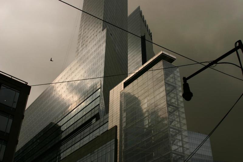
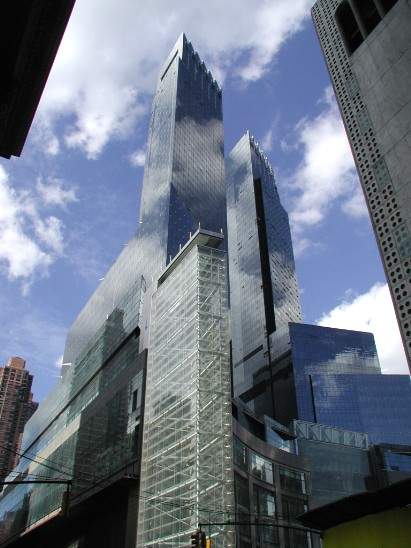
Costliest Building Ever? By Justin Davidson Staff Writer November 13, 2004 Only in Manhattan could a battleship-gray colossus rise 750 feet into the sky and go largely unnoticed by the people at its feet. For two years, drivers and pedestrians have been picking their way through Columbus Circle, so preoccupied with the shifting construction barricades that they paid little attention to the cause of all the disruption: the Time Warner Center, a pair of 80-story glass towers jutting asymmetrically from a two-block base that curves like a cutlass blade. Now, suddenly, the building is there, and as the leaves thin, it will be visible from much of Central Park - just as, to the delight of investors and real estate brokers, the park is the centerpiece of the towers' wide-screen views. The building, a ritzy vertical campus that will shelter a daily population of thousands, is opening in staggered stages. The Mandarin Oriental Hotel, which occupies floors 45 through 63 of the north tower, comes first - guests begin checking in on Saturday. The shopping mall will hold its ribbon-cutting early next year, and tenants gradually will move into offices and the breathtakingly expensive apartments throughout the spring. The final piece is the cultural kernel: Jazz at Lincoln Center, designed by Rafael Viñoly and inserted into the wedge between the towers, will open in the fall of 2004. It is hard to get around the raw fact of the complex's bulk. As you approach it from the north, its sheer glass cliff hulks menacingly over Broadway, two ungainly slabs merging into a single, formidable silhouette. Upper West Siders who bemoan each new construction fence as a sign that the neighborhood is being converted into a thicket of high-rises will see this view daily, and loathe it. One Columbus Circle turns its coldest, thickest shoulder to the folks uptown. But it has a more flattering profile, too, one that brings out the syncopated rhythms lurking in its oversized frame. Stand on the corner of Eighth Avenue and 58th Street, and the oblique angles pile up toward the clouds, jauntily linking the city's converging geometries. The building's base, a four-story shopping mall, wraps itself around Columbus Circle. The towers stand askew, lining up along the diagonal of Broadway. The gap between them continues the westward path of Central Park South, as if the street had become airborne and merged with the sky. The Time Warner Center, at $1.8 billion the most expensive single building ever planted in American soil, was designed by New York- based David Childs of Skidmore Owings and Merrill. But behind that simple statement of fact is a 17-year history of false starts, grandiose ambitions and vertiginous risks. At various times during construction, a forklift driver died in an accident, winds battered the site, killing a worker and injuring pedestrians with flying debris, and a fire broke out inside the frame. Nothing about this project has been easy. When the Javits Center opened in 1986, New York stopped needing its Coliseum, a stale white loaf of a building thrown down where 59th Street used to be. The city put the site up for sale and from the beginning, developers thought on an imperial scale. The architect Moshe Safdie, working for Boston Properties, proposed a thick bundle of structures, the tallest of which would have reached 925 feet high - almost 20 more stories than the current building. Critics fumed and the Municipal Arts Society deployed protesters carrying black umbrellas to show how the building's shadow would darken Central Park. Safdie's design was yanked, the economy curdled, the site's price plummeted and Boston Properties eventually withdrew. The project did not really begin to move again until the late 1990s, when two things happened: The developer Steve Ross persuaded Time Warner that the company, nicely ensconced at Rockefeller Center, needed an urban icon to call its own; and then- mayor Rudolph Giuliani decreed that the new building would have to carve out some space for the performing arts - specifically, the first auditorium built expressly for jazz. Ross landed the deal and turned to an architect who already had floated a handful of rejected designs for the project: David Childs. Childs had to pack a lot of uses and requirements into one big building, and he did so by paring the design down from the earlier tapering clusters he had proposed. He reduced the number of layers in his cake to three: the curved galleria, a pair of crystalline pedestals and the towers, rotated away from the street grid and twisted into rhomboids, so that the whole building seems to twirl upward. It's ironic that Childs is now locked in battle with the Ground Zero master planner Daniel Libeskind over the shape of the future Freedom Tower - Libeskind apparently insists on his hip origami shapes, while Childs is holding out for a more straitlaced, Brooks Brothers skyscraper. The Time Warner Center is not unconventional in spirit, but it is based on a quite Libeskind-like play of oblique and acute angles. (The resulting corners provided Ismael Leyva, who laid out the apartments, with an opportunity to set bathtubs into narrow, windowed nooks overlooking the Hudson River.) The difference is that Libeskind uses angles, tilted roofs and canted walls for their aesthetic appeal, while Childs cautiously doles out asymmetry as the solution to an urbanistic problem: How to get a massive building to fit in at a complicated intersection where it doesn't really belong. The complex, which stands astride the border of corporate midtown and the residential Upper West Side, struggles with the balance between neighborliness and capitalist triumphalism. Childs has nestled the circular plaza in a streetwall of masonry and store windows, and the shops open onto the sidewalk as well as the atrium, which means floor traffic circulates freely between indoors and out. The powerhouse lobbies (Time Warner, Mandarin Oriental and the hyper-luxury apartments) have been discreetly relegated to the side streets. But in fine Parisian style, the building also acts as the terminus of a grand boulevard, Central Park South, and its glass gates align with the statue of Christopher Columbus. Childs would have Columbus Circle be our Place de la Concorde. There is, to be sure, something anticlimactic about proceeding down this grand way and arriving, finally, at a kitchen aids store (Williams-Sonoma). But architecturally, the mall is merely scaffolding for the keystone: the shimmering, see- through curtain of a floating jazz club. That's how far jazz has come in its 100-year history: from flypaper honky- tonks to the sixth-story glass-covered centerpiece of a mammoth corporate headquarters. Here, jazz is not about roots, but about respectability. The amounts of money involved in erecting this structure were enormous, and those figures trickle down to the street. It still costs only a $2 subway fare to emerge into the renovated station, but everything else here seems to have been priced in another planet's currency. An overnight stay in a suite with a park view at the Mandarin Oriental costs $1,600, and the fancier suite is $12,000 - although, for those travelers in a more austere mood, a nice little room goes for a mere $595. The penthouse apartment in the south tower was recently sold for $45 million, and while the price of sirloin at the Jean-Georges Vongerichten steakhouse in the galleria hasn't been set, it seems likely to be princely. The only completed interiors for now are in the hotel, which is an orgy of expensive materials. At the bar, plunk your beer down on a counter of hammered nickel and leather trim, or take it to a booth of stone carved with Asian motifs. The spa's shower stalls are made translucent by sheets of what is described as "rice- paper glass." Every surface has been ruthlessly beautified. It's not just the hotel, but the center as a whole that represents a gamble on epic luxury (not to mention the future fortunes of its troubled corporate namesake). The building is unmistakably meant to impress: It has the sleek, glazed mass of a bodybuilder-turned-movie star. But Childs has also attempted to endow it with something like quirkiness or bonhomie. Most important skyscrapers have a signature crown; this one has a disappointing row of overlapping blades on top, which gives it the look of a high-tech razor. But Childs draws the eye around the front, rather than up to the spires. The most appealing feature is not the mast, but the "prow," an empty, transparent six-floor shaft that serves no obvious purpose, but reaches out to the virtually windowless Huntington Hartford Museum across Eighth Avenue. The prow is Childs' folly - a blank slate for a laser show, a glass billboard, a refreshing breath of ambiguity in a building crammed with purpose. Copyright © 2004, Newsday, Inc. |
|