 |
New York
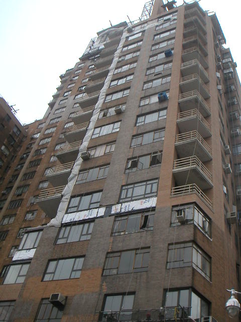
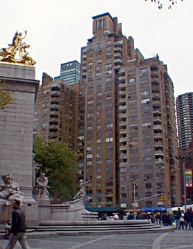
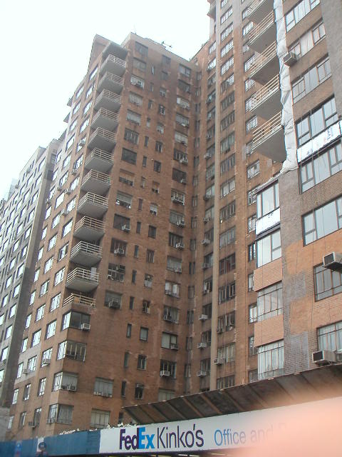
Architecture Images- Midtown 240 Central Park South |
|
architect |
Mayer & Whittlesley (Mayer & Whittlesley were also co-designers with Skidmore, Owings & Merrill on Manhattan House at 200 East 66th Street in 1950.) |
|
location |
240 Central Park South |
|
date |
1941 |
|
style |
Art Deco |
|
construction |
28 stories 321 apartments |
|
type |
Apartment Building |
|
images |
 |
|
|
  |
 |
|
|
"the first Manhattan apartment house to make
extensive use of balconies." The authors noted that this building
replaced the "Dalhousie (1884), a pioneering apartment house." "New York 1960 Architecture and Urbanism Between The Second World War And The Bicentennial," (The Monacelli Press, 1995),Robert A. M. Stern, Thomas Mellins and David Fishman. "The era's last example of the courtyard apartment house was 240 Central Park South. Despite the limitations of the courtyard, the contextually responsible design was a superb restatement in Modernist terms of the River House parti. [It] occupied a complex point of transition in the city, fronting Central Park South, Columbus Circle, the diagonal of Broadway, and West Fifty-eighth Street, each of which had its own distinct character ranging from one that can be likened to the Champs Elysées at the Etoile to another resembling a quiet backwater at the edge of a big city. It was not its bland facades that lent 240 Central Park South distinction but rather the shaping of its two towers, particularly the northern one, in response to the complex perimeter of the site. Aspects of the courtyard apartment building were combined with those of the skyscraper apartment building to establish both a horizontal and vertical reflection of the city's composition. Terraces began only above the level of the trees in Central Park (high enough to be free of the fumes from the street); roofs were set back not only to conform to zoning requirements but also in consideration of solar orientation and views; and chimneys and mechanical equipment combined with the penthouse suites to produce a lively skyline. At the street level the building respected the varied nature of its local: a deep, planted courtyard on Central Park South creates an elegant pocket of shade, while a vigorous one-story commercial strip along Broadway used curved corners to define the diagonal of the street. The building succeeded not as a tour de force of dazzling aesthetics but as an exemplar of humane values applied to the problem of high-density city living and as a finely tuned instrument of urbanism. Both a fragment of the city's fabric and a notably individual statement, it was a synthetic work that was at once infill and icon." "New York 1930 Architecture and Urbanism Between The Two World Wars" (Rizzoli International Publications Inc., 1987), Robert A. M. Stern, Thomas Mellins and Gregory Gilmartin |
|