| New York
Architecture Images- Recent Tower Verre aka MoMA Expansion Tower and 53 West 53rd Street |
|
| Please note- I do not own the copyright for the images on this page. | |
|
architect |
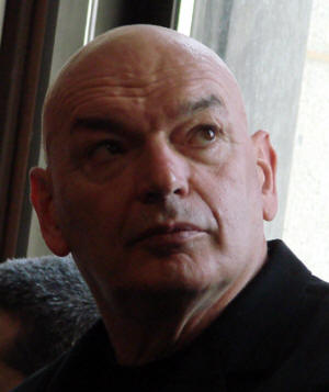
Jean Nouvel |
|
location |
MoMA's Proposed Expansion |
|
date |
On hold. Fantastic building. Wish it was built. |
|
style |
Deconstructivism |
|
type |
Apartment Building |
|
construction |
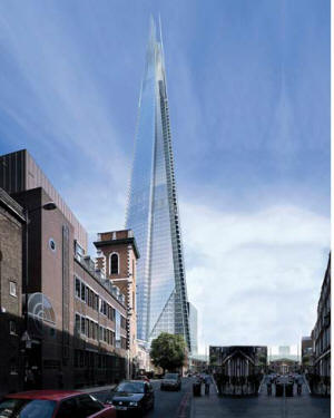
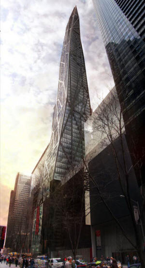
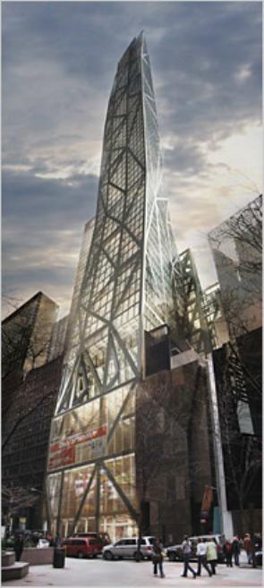
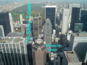
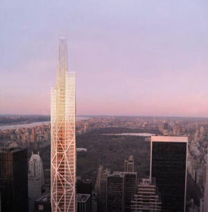
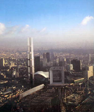
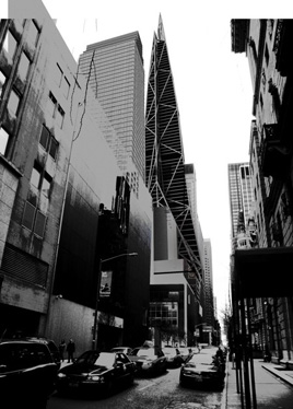
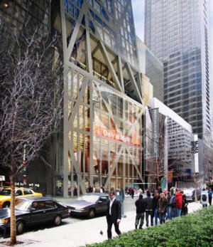
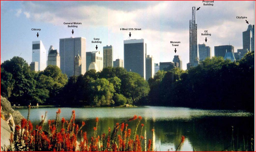
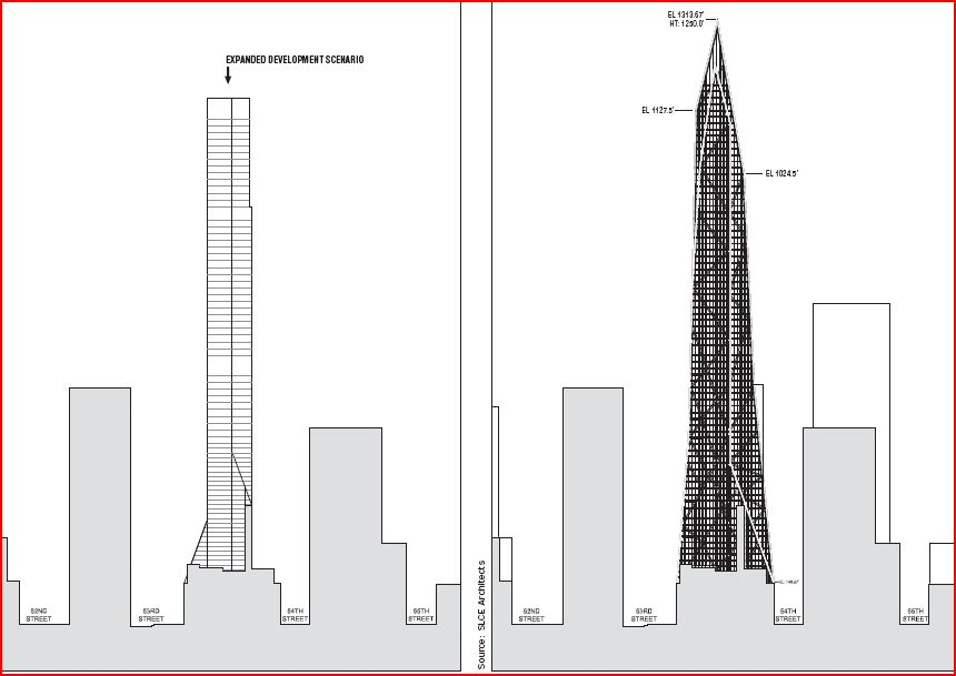
Radical 75 Storey Tower. The building, designed by Jean Nouvel, initially was proposed to stand 1,250 feet (381 m) tall (the same height as the Empire State Building below its mast) and contain 75 floors. The building's skin would contain a faceted exterior that tapers to a set of crystalline peaks at the apex of the tower. Due to this, the project is said to be one of the most exciting additions to New York's skyline in a generation. |
   |
|
   |
|
   |
|
 |
|
 |
|
 |
|
|
notes |
Tower Verre, also known as the MoMA Expansion Tower and 53
West 53rd Street, is a supertall skyscraper proposed by the real estate
company Hines to rise in Midtown Manhattan, New York City adjacent to the
Museum of Modern Art. The building, designed by Jean Nouvel, initially was proposed to stand 1,250 feet (381 m) tall (the same height as the Empire State Building below its mast) and contain 75 floors. The mid-block building has run into considerable opposition focusing on fears that it would cast a shadow over Central Park during the winter and that its mid-block location would create traffic problems. Further the building does not have financing. The building bought air rights from the University Club of New York and St. Thomas Church. 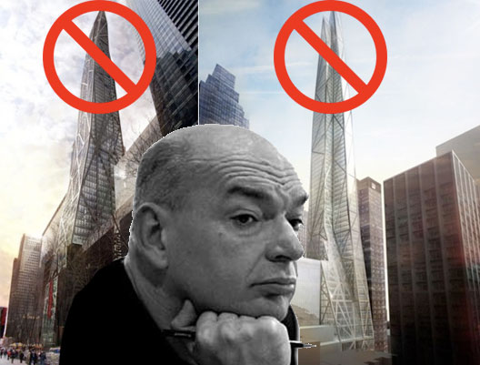 On September 9, 2009, the New York City Planning Commission said the building could be built if 200 feet were clipped off the top. The City's decision not to approve Tower Verre as proposed was greeted with disappointment and derision by several prominent architecture critics. The 1,050 foot version, was approved by the City Council on October 28, 2009 in a 44-3 vote. The building's skin would contain a faceted exterior that tapers to a set of crystalline peaks at the apex of the tower. Due to this, the project is said to be one of the most exciting additions to New York's skyline in a generation. The building would host Galleries, a 5 star hotel, and 8 star residential apartments. Each floor has 17,000 sq ft (1,600 m2) starting with 40,000 sq ft (3,700 m2) of space at the base. It will use wind power and rain water for everyday needs. MOMA, which owned the building's 17,000-square-foot (1,600 m2) lot and completed a renovation in 2005, sold the lot to Hines for $125 Million in 2007. 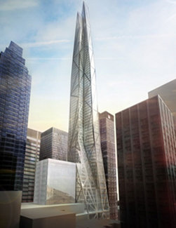 -------------------- MoMA's new architect by Walter Robinson *From artnet.com: February 3rd, 2002 In keeping with its global vision of the 21st-century art museum, the Museum of Modern Art has chosen Japanese architect Yoshio Taniguchi to design its new expansion and renovation. Tanaguchi's design will reshape the entire museum, moving the main entrance around to 54th Street, restoring the museum's famous garden to its original proportions and adding a new grand stairway and entrance atrium. Major new construction will include the addition of a seven-story annex structure for painting and sculpture galleries on the present site of the Dorset Hotel. The redesign makes the garden central to the museum's reconfigured ground floor spaces, and also brings the lines of Cesar Pelli's 52-story museum tower down to grade level, emphasizing the "urban character" of the museum, as MoMA architecture curator Terry Riley put it. The project calls for underground excavation on both the Dorset Hotel site and under the garden to create a new theater and an expanded department of video and film. The Goodwin-Stone facade, presently entrance to the museum proper, will be restored as the entrance to the film center. And MoMA's original "Bauhaus" staircase will once again become an integral connection between the galleries. Taniguchi's plan expands MoMA's present 86,000 square feet of gallery space to 133,000 square feet. But additional design refinements are expected in the coming months, according to MoMA director Glenn Lowry. What's the expansion's pricetag? The museum isn't saying yet, but it will "be less than the Getty," joked MoMA chairman Ronald Lauder at the press conference, in reference to the $1-billion J. Paul Getty Center opening this week in Los Angeles. When will it be finished? MoMA professes similar uncertainty as to the exact date, but Lauder has challenged Lowry to have it done in time for the museum's 75th anniversary in 2004. "What's great about this plan, nobody can explain," said the architect Philip Johnson, who designed MoMA's first expansion in 1951. "You will walk in and be smitten by art." This project is Taniguchi's first in the U.S. He has done a number of museums in Japan, including the Nagano Prefectural Museum (1990), the Marugame Genichiro-Inokuma Museum (1988-81), the Toyota Municipal Museum of Art (1991-95) and the Gallery of the Horyuji Treasures now under construction at the Tokyo National Museum. The two other finalists in MoMA's competition were Columbia University architecture dean Bernard Tschumi and the Swiss architectural team of Herzog and de Meuron. The museum's architect selection committee consisted of MoMA trustee Sid Bass, who served as chairman, plus Lauder, museum president Agnes Gund, MoMA chairman emeritus David Rockefeller, Marshall Cogan and Jerry Spier. WALTER ROBINSON is editor of ArtNet Magazine. |
|
|
|
|
|
The Point of the Skyline Why they should let Jean Nouvel build every inch of his arrogant tower, and other thoughts on what makes a cityscape great. By Justin Davidson Published May 2, 2010 A skyscraper is not a metaphor. It’s what happens when a team of cost analysts, insurers, engineers, architects, developers, investors, and lenders makes a collective determination that math, physics, and market forces, fused in one enormous hunk of a building, will probably yield a profit. But all those calculations merge with a set of deeply irrational instincts. Manhattan’s skyline was wrought by the single-minded pursuit of profit and boosted by a spiritual lust for height. To erect a tall building is to proclaim one’s faith in the future, and the skyline embodies that confidence multiplied many times over. It’s a seismograph of optimism. 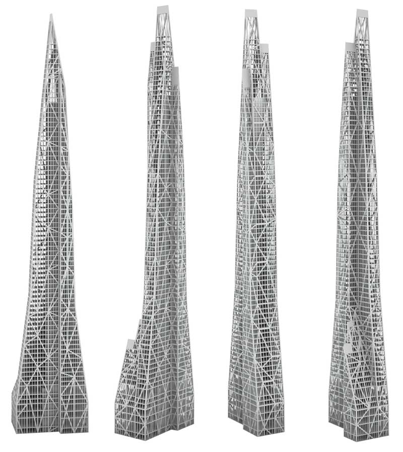 That’s what’s so disappointing about the city’s timid decision to lop 200 feet off the slender needle that Jean Nouvel designed for the site abutting the Museum of Modern Art. At the proposed height of 1,250 feet—the same as the Empire State Building sans antenna—Tower Verre, a condo and hotel incorporating three floors of new MoMA galleries, would have encapsulated that quintessentially New York collusion between capital and caprice. The design offered an exuberant counterpoint to the relentless three-dimensional matrix of midtown. Slashing upward as if trying to catch a particular cloud on the fly, its musculature of asymmetrically slanted beams visible against a taut glass skin, Tower Verre would have been New York’s most lithe, athletic skyscraper. Perhaps a redesigned, shorter version can still punctuate the city’s silhouette with a graceful exclamation point. But it will no longer demonstrate that New York’s skyline has yet to reach its upper limits, or that it can tolerate another totemic presence. The Empire State Building won a frenzied rush to the sky; the idea that some thought it excessive or disrespectful now seems downright bizarre. Approving the design of Tower Verre while lowering the height was not a compromise but an example of curatorial caution run amok, an attempt to turn midtown into an architectural preserve. New York is not Paris, besotted with its glory days and dozing in beautiful senescence; it reconstitutes itself almost daily, nourished by a regular supply of invention. The inspiring arrogance of Nouvel’s tower should never have been quashed by timorous bureaucrats. When Henry James referred to skyscrapers as “monsters of the mere market,” he worried that they would swallow the city. He misperceived the real source of their addictiveness: not greed but ego. New York revealed the efficiency of verticality, yet some of its tallest towers soar well above the point of diminishing returns. The Rutgers economist Jason Barr has quantified the “status effect”—how much higher some skyscrapers rise than the profit motive would justify. The Empire State Building, Barr estimates, is 54 stories taller than pure accounting suggests it should be. The race to erect the world’s tallest skyscraper endowed the Chrysler Building with 37 extra stories and its rival, 40 Wall Street, with 29. Barr doesn’t follow his reasoning to the logical conclusion: If money alone shaped the skyline, we would have a stumpier city. Instead, the mine-is-bigger-than-yours quest for stature has produced an ever more spectacular skyline, a dynamic work of collective genius. In our great-grandparents’ childhoods, the spire of Trinity Church pricked the soft blur of the horizon, dominating the landscape the way churches all over Europe did. By the beginning of the twentieth century, the first commercial towers boasting steel frames and elevators had hemmed the steeple in, replacing celestial aspirations with commercial ones. New Yorkers must have wondered how long those offenders against gravity could stay aloft. But the towers remain, or some do, anyway; it’s the sky that’s gone. Each era’s giants are made puny by the next. “Sky-scrapers are the last word of economic ingenuity only till another word be written,” James wrote in 1906. He was right, except that the “other word” turned out to be taller skyscrapers. Alarmed by the prospect of a high-rise forest, the city began regulating the skyline in 1916. The law funneled sunlight to the sidewalk by allowing greater height on wider streets and requiring buildings to recede as they rose. Hugh Ferriss, the architect whose brooding renderings made him the Piranesi of New York, understood the ambition and romance embedded in those limits. Because new towers would rise above the four- and five-story undergrowth, he wrote, “architects will design buildings, not façades. That is to say, architecture comes into her own.” Ferriss saw the regulations not as a check but as a liberating force, and in 1929, he used them as a template when he published The Metropolis of Tomorrow, a meticulously conceived, elaborately illustrated, and utterly horrific fantasy, complete with pedestrian skyways and rooftop landing pads. The real New York skyline is always more fantastical than the imaginary ones. It recounts a saga of utopian quests, inspired gambles, benign neglect, aesthetic dead-ends, and historical accidents. We have the Depression to thank for the way the silhouette dips low south of 34th Street. Midtown’s office towers record the city’s economic fluctuations as clearly as a bar graph. The tip of Manhattan lays out the stratified chaos of history, as the eighteenth-century James Watson House rubs up against the curving glass pillar of 17 State Street from the 1980s, and Gilded Age white palazzi crescendo to the void left by the Twin Towers. This sublime jumble defies grandiose urbanism, and when September 11 presented New York with a clean slate, it threw planners into years of confusion. We have a messy, malleable system for making decisions about the skyline. Over the decades, the zoning code has metamorphosed from a simplistic citywide policy into a catalogue of block-by-block variations. In the end, most planning decisions affecting the skyline come down to an emotional response. Bold ideas are tossed into a cauldron of traffic studies, environmental-impact statements, community-board meetings, and landmark hearings, a broth that tends to boil good architecture down to a glutinous pulp. Picking away details at the neighborhood level winds up diluting a design just as effectively as the top-down politics that screwed up ground zero. One World Trade Center, the 1,776-foot emblem of recovered pride formerly known as the Freedom Tower, will thrust 2.6 million square feet of office space onto a market that doesn’t know what to do with so many cubicles and conference rooms. The design is a monument to ambivalence: a technologically advanced symbol of liberal democracy that boasts new standards of security and egress. If the beacon becomes an inferno, at least it will be relatively easy to get out. The safest move would have been not to put up this tower at all, but New York wasn’t built by the circumspect, and the steel frame has already reached past the twentieth floor. Just 80 or so more, and New York will have its newest, hugest icon of pragmatism and lunacy. A skyscraper born of horror and designed in chaos and compromise may someday come to be the star of the skyline. To some people, each new tall building is another oppressor, banishing the sun, barricading views, crushing brownstones, and dumping more hordes on crowded subway platforms. Skyscraper hatred is no more rational than skyscraper love, but it disguises itself as a form of sober preservation. Actually, the skyline’s upper layer can thrive without much management. The costs and controversies involved in super-tall buildings have done a pretty good job of keeping the stratosphere from getting crowded. New York has only fifteen buildings that top 800 feet; most are well designed, and none of them is awful. The real danger to the skyline lies in letting it choke in a weedy blight of medium-high-rises, appalling in their ordinariness. Those blah 30- and 40-story towers leave the city’s summits untouched, but they ravage neighborhoods and raise the horizon, flattening out the skyline from below. Take a look at 808 Columbus Avenue, a broad, ungainly 29-story tower that anchors Columbus Square, near 97th Street. Neighbors howled about its bulk, but it’s the design that makes it monstrous. A graceful skyscraper twice the size would have been half as offensive. Somehow, this vertical city has acquired a fear of height and felt the powerful undertow of nostalgia. We look back in fondness, ahead in apprehension. Even One World Trade, which will be America’s tallest tower, feels less like a herald of the future than a restoration of the past: Lower Manhattan will get a glassy spike to replace the two it lost, and the Empire State Building will continue its midtown reign. But a city can be smothered by too much reverence for its past. The skyline must keep acquiring new peaks, because the day we consider it complete and untouchable is the day the city begins to die. Source- http://nymag.com/arts/architecture/features/65759/index1.html ---------------- Manhattan $10 Million Housing Market Has No Bargains By Oshrat Carmiel and Ashley Lutz June 24 (Bloomberg) -- It took Stephane Melloul three days to learn he’d need about $50 million for the New York home of his dreams: four bedrooms, a terrace and Central Park views. Melloul, president of London-based credit rating company Notalia, started this week expecting to spend as little as $20 million. He raised his target after seeing just five Manhattan properties that met his criteria. “I thought when I came here that the prices would be more compelling and more attractive, and actually they weren’t,” Melloul said, speaking in French in a telephone interview. Real estate broker Charlie Attias, a senior vice president of New York-based Corcoran Group, interpreted. Manhattan’s super-luxury apartments, those sold for $10 million or more, outperformed the rest of the city’s housing market in the first quarter. The median price of the most expensive cooperatives and condominiums climbed 6.4 percent from a year earlier, compared with an 11 percent drop across all price ranges, according to an analysis of data provided to Bloomberg News by New York-based appraiser Miller Samuel Inc. “There is always going to be demand for those units in the sense that they’re hard to come by,” said Gregory Heym, chief economist for Terra Holdings LLC, owner of property brokers Brown Harris Stevens and Halstead Property LLC. “Park and Fifth avenue buildings, the rarity of getting an availability in them, make them very desirable.” New Neighborhoods Leonard Steinberg, a managing director at New York-based Prudential Douglas Elliman Real Estate, said he sold two properties this year for more than $10 million and is working on another two. Buyers who once limited their search to the Upper East Side are now spending equivalent amounts in the city’s TriBeCa, Greenwich Village, SoHo and Chelsea neighborhoods, he said. “The market has done a 180 from last year, when you had it drop pretty dramatically,” Steinberg said. “Buyers need confidence to buy, not money, and confidence has returned.” The median price of 77 apartments sold for $10 million or more in 2009 was $12.8 million, according to the analysis of Miller’s data. So far in 2010, 28 units sold for a median of $13.2 million. Two Buildings The median price of apartments in the $10 million-plus range has been pretty steady, between about $12.5 million and $13.6 million since 2002, with the exception of 2007 and 2008. In those years, the median hit $14 million, an anomaly set by sales at the Plaza and 15 Central Park West, two buildings that opened at the same time and together more than doubled the typical number of $10-million-plus transactions in Manhattan. Of the 240 sales above $10 million in 2008, 30 percent were at 15 Central Park West and 10 percent were at the Plaza, said Sofia Song, vice president of research at property website StreetEasy.com. “There was nothing like it before those two projects and nothing like it after,” Song said. Resales now make up the bulk of transactions above $10 million, she said. At 15 Central Park West, the condominium towers that rock star Sting and Goldman Sachs Group Inc. Chief Executive Officer Lloyd Blankfein call home, a 25th floor unit sold for $13.7 million in January. That’s more than double what the previous owner paid in 2007, according to city records. Central Park Views Apartments in the building, designed by architect Robert A.M. Stern, include some with panoramic views of Central Park and all originally featured herringbone wood floors and six- burner Thermador ranges. At nearby Time Warner Center, where owners share services with the Mandarin Oriental Hotel, a three-bedroom condo just went into contract for $5,400 a square foot. It marks the second-highest amount paid by that measure for any unit in the complex, said Elizabeth Lee Sample, president of the building’s board and a managing director at broker Brown Harris. “We have nothing to sell,” Sample said. “It’s just completely limited inventory.” Melloul, 43, is helping his company open a New York office and would like to move from Paris with his wife and two daughters as soon as possible, he said. He saw a “perfect” unit at 15 Central Park West for about $50 million, he said. He declined to be more specific. Inventory Drop Inventory in the general luxury market, defined by Miller Samuel as apartments of more than $2.87 million from March 31 through June 15, declined 13 percent in that period to 1,302, company president Jonathan Miller said. Overall city inventory rose 1.6 percent to 8,157 properties. “The first quarter of 2010 was when in my view the luxury market really woke up,” said Miller. “The pace of growth wasn’t because of appreciation, it was because of the shift in the mix to larger units.” Leighton Candler, a senior vice president for Corcoran who works exclusively on the Upper East Side and around Central Park, said her 25 years in the business have taught her the key to a healthy high-end market is property owners being willing to list their homes. “In a bad market, the buyers aren’t looking, but just as important, the owners aren’t selling,” she said. To contact the reporters on this story: Oshrat Carmiel in New York at ocarmiel1@bloomberg.net; Ashley Lutz in New York at alutz8@bloomberg.net Last Updated: June 24, 2010 15:46 EDT Source- http://www.bloomberg.com/news/2010-06-24/manhattan-s-10-million-apartment-market-outperforms-rest-of-new-york-city.html |
|
|
|
|
Opponents of MoMA Tower Accuse it of Brooding, Being Tall The war of petitions over Jean Nouvel's shrinking Tower Verre continues, and a tipster passed along the challengers' attorney's latest memo in the case. One of the biggest problems for the MoMA tower's opponents all along has been the developers' environmental impact statement, which they say ignores the real effect of the tower's height on residential buildings in the neighborhood. The most recent memo is a response to the city and developers' legal paperwork, so here, a few of the locals' key arguments against Nouvel's building: 1) The building is tall! Almost four times as tall as the structure previously approved for the same spot: "The differences in terms of (1) blocked views, (2) shadows, (3) consistency with the existing scene and, to be poetic, (4) the brooding omnipresence of the Tower are self-evident." Brooding omnipresence, huh? What else ya got?! >> 2) The building is really, really tall! "We emphasize that the Hines Tower is not just 'another tall building' among many. As approved at 1,050 feet, it would be the third tallest building in New York City...It would be almost double the height of the next tallest building in the study area." 3) "The Hines Tower would not only be very tall—it would also be very large." 4) The city did not, its opponents say, pick the world's best example to support the MoMA tower when it cited One Madison Park as a successful recent example of a tall and slender building: "What 1 Madison Park does illustrate is how incompatible and damaging a tall, slender modern tower can be to the surrounding neighborhood." (Though fitting in has really been the least of One Mad Park's problems.) Your move, Jean Nouvel! Is all this just support for the starchitect's theory that New Yorkers are afraid of verticality? Source- http://ny.curbed.com/archives/2010/06/18/opponents_of_moma_tower_accuse_it_of_brooding_being_tall.php |
|
|
|
Burdened! Jean Novel Tower Expected to Feel Planning
Commish’s 200-Foot Chomp By Eliot Brown, September 8, 2009 DCP. Amanda Burden. Amanda Burden apparently doesn’t want to get Ratnered by MoMA. Burned by a post-approval architect swap at Bruce Ratner’s Atlantic Yards project—the Brooklyn developer dropped Frank Gehry and his iconic basketball arena earlier this year—the chairwoman of the City Planning Commission is going to new lengths to see that she’s not the victim of a future bait-and-switch. The first to experience this new approach are MoMA and Texas developer Hines Interests, which are planning a slender, pointy, 1,250-foot skyscraper adjacent to the West 53rd Street museum. Designed by Jean Nouvel, the tall, bald, soft-speaking French architect who last year received architecture’s Pritzker Prize, the much-praised tower would soar above midtown with hotel rooms and ridiculously pricey apartments filling its Empire State Building–like height. But the design needs the assent of Ms. Burden’s Planning Commission. And, on Sept. 9, it’s slated to take some major actions on the building. Most notably: Ms. Burden and her colleagues are expected to take a gigantic 200-foot bite off the height of Mr. Nouvel’s baby, and, according to an executive involved with discussions, layer on a set of regulations aimed at handcuffing the developer to its current design. Generally, developers receive approvals for a building’s basics—density, height and massing—but they are typically not held to their specific designs or architecture. In the case of Mr. Ratner, after he went before Ms. Burden for her assent in 2006, he had only to follow basic “design guidelines” that called for items such as some glass walls along the street. (This was a state process in which Ms. Burden had a more peripheral role.) Thus, when he dropped Mr. Gehry earlier this year, Mr. Ratner was free to dramatically change the Nets basketball arena to a cheaper, more functional design. The swap was said to have incensed Ms. Burden, who is known to approach many projects that come before her with a heavy, detail-focused hand. Indeed, with regard to the MoMA tower, she said at a July hearing that the issue of potential design change was “bedeviling” her. “You have an extraordinarily talented architect and a very dynamic and, for me personally, a thrilling design,” she said, according to a transcript. “However, what is to assure me and the commissioners and the city that this glorious design isn’t going to turn into the as-of-right massing, which would be a calamity?” As for the 200-foot chop, it seems Ms. Burden and her staff were less than thrilled about the looks of the air conditioning and other mechanicals atop the tower in the current design. Per a City Planning statement issued Sept. 8, the top, with what would be the city’s highest occupied floors, was marked by “highly visible mechanical equipment”—apparently enough to cost the developer the super-tall crown. ebrown@observer.com Copyright The New York Observer. Source- http://www.observer.com/2009/real-estate/burdened-jean-novel-tower-expected-feel-planning-commish%E2%80%99s-200-foot-chomp Editor note- This is what you call a failed system. It embodies so many of the characteristics of any failed system, be it a political system or a business system or a computer system: 1) Different rules for different objects, even when those objects are for all intents and purposes of the same class 2) Openness to abuse-by-tinkering 3) In need of constant fixing NY is definitely in need of an overhaul of its zoning regulations that would create a more auto-correcting system and do away with the absurdities that allow McSam to build urinals across the city but prevent Nouvel's tower from rising, or allow an extra 200' of height in exchange for a streetlevel-destroying windswept plaza ... as if it's a benefit to the city. Oh, and moving zoning from being based around height restrictions to something based around girth/width restrictions, as ablarc has advocated, would be an important first step. (from http://wirednewyork.com/forum/showthread.php?t=7800&page=10 ) |