 |
New York
Architecture Images-Soho Prada Flagship Store |
|
architect |
Rem Kooklhaas (OMA) |
|
location |
575 Broadway, at Prince St. |
|
date |
2001 |
|
style |
Late Modern (International Style III) |
|
construction |
|
|
type |
Shop |
|
|

$40 million for 23,000 square feet of retail space? Even by New York City standards, the sum was certainly large enough to create a great deal of interest in Prada's flagship store well before it opened. For a company $785 million in debt, and that has tried unsuccessfully going public on three different occasions, opening this store was certainly meant to be an attention-getting device. Rem Koolhaas' design for the store, which opened in December 2001, had an opening event that featured celebrity guests and even the then New York City Mayor Rudolph Giuliani - and thus it would seem the design did at least partially what Prada wanted.
Upon entering the store, which previously housed the SoHo branch of the Guggenheim Museum, visitors are met with a largely vacant space dominated by an oversized, round elevator. OMA is said to have spent two months of research "investigating ways to reinvent the retail experience." Perhaps as a result of this, the ground floor only has a small amount of merchandise, relegating the majority of merchandise and actual shopping activity to the basement level, which feels cramped and lacks appropriate lighting.
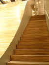
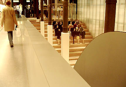
The store's main design component is the half pipe-like wooden curve that connects the two floors visually. On the Broadway side, the curve has steps and serves as a place for clothes to be shown. According to OMA, this portion of the half pipe also serves as place for people to try on shoes, though in reality the shoe department is under the stepped side of the curve, and seating is provided there for shoppers. The other side of the half pipe is a steep curve that leads the eye back up to the ground level, and has metal cages with merchandise hanging above it. Made of zebrawood, the large half pipe does not seem to be aging well, in particular its edges, which seem to have worn down prematurely. On the curved end, a stage can rotate out creating a performance space, thereby making the stepped end work as seating for such events. Koolhaas sacrificed a great deal of retail space on both floors in order to have what he refers to as a "big wave", and though its visual effect is strong, it seems to greatly impair the shopping experience due to it largely being unused space that impedes proper traffic flow in the basement level. Once shoppers descend into the basement level via wooden stairs that go alongside the "big wave", there are shopping spaces on either side; a small room off to the left and a larger space to the right, which is itself broken up into small rooms. Here Koolhaas decided to leave sheetrock bare, which serves as an interesting counterpoint to the technological gadgetry that dominates the basement level. Of these gadgets, the most interesting are those found in the changing rooms, which are so often used by sightseers rather than shoppers, that on my last visit they were closed off and used to display mannequins. The changing rooms have sliding glass doors made with SGG's Priva-Lite technology, a glass with liquid crystal film inside that becomes opaque when an electric current through the film is cut off. Much like a two-way mirror, the customer trying on clothing continues to see those outside, while they can't see the customer who is left to trust the technology while he or she strips down. Though the technology is impressive, the glass doors seem bulky and closely resemble your average suburban sliding glass door, aside from the fact that these can be closed by a foot-operated switch on the floor of the changing room. The store's design is more or less a round up of recent technological innovations which work with varying degrees of success in shopping environments. The large half pipe certainly works to connect both floors visually and keeps the space open, but as a result makes the basement level feel cramped and dark. The round elevator, which is large enough to hold at least 20 people, works as a novelty, but is often used not by shoppers but mannequins. Said to have cost somewhere in the millions, the elevator takes up crucial space near the front entrance, and only serves the purpose of slowly lowering shoppers one floor down. Thus design certainly seems to take backseat to technology, which in many ways fights the use for which it is intended within the store. Though some may object to the design of the store and its use of technology, it is perhaps suited precisely for the type of person who would willingly pay over $600 for a pair of shoes. The strongest component of the design is its ability to change, but this has not been taken advantage of thus far. One entire side of the store's ground level features graphics which are applied to the wall much like wallpaper would be. This would certainly serve as a potential for changing the store seasonally (perhaps having different designers contribute and rotating their work), but this has thus not been utilized as a way of making the store's design more active. It's missed opportunities like these that make Herbert Muschamp's review of the store for the New York Times seem particularly true:
Though Muschamp no doubt meant it as praise, in reference to the clothing as well as the high level of design and craft executed by Koolhaas and his staff, it also speaks volumes about the static quality that a space with such potential can have. How to visit The Prada flagship store is in Manhattan's SoHo neighborhood on the northwestern corner of Broadway and Prince. The easiest way to get to the store is by subway. You can take the N or R train to Prince St. or the For V train to Broadway-Lafayette. Store hours are M-F 11-7, Sundays 12-6. If you have any further questions, call the store at +1 212 334 8888. |
|
|
|
|
links |