 |
New York
Architecture Images-Soho Storefront for Art and Architecture |
|
architect |
Steven Holl |
|
location |
97 Kenmare Street (at Cleveland Place). |
|
date |
1993 |
|
style |
Late Modern (International Style III) |
|
construction |
|
|
type |
Shop |
|
|
 |
|
images |
  |
|
|
 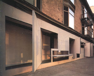 |
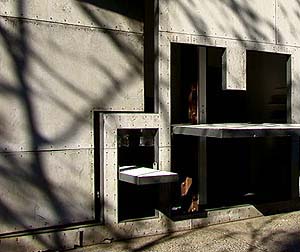
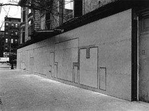
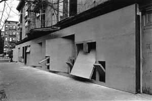
| Its ground floor facade, a collaborative project between architect Stephen Holl and conceptual artist Vito Acconci, is made up of irregularly shaped panels that turn on pivot points, swinging open to let light and air into the interior. | |
| Constructed in
1993, the facade renovation for the Storefront for Art and Architecture was
constructed on a budget of only $45,000. Architect
Steven Holl's concept for the project of inside becoming outside is
achieved by composing the facade mainly of revolving panels. Each panel's
unique shape, relation to other panels, and open or closed condition
creates, in effect, a different facade each day. The design takes its
concept and finds a clear solution within a small budget, but the project is
also indicative of much of Holl's work in its focus on creating space
through detailing, proportion, and the manipulation of light.
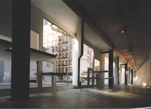
Pie-shaped in plan, the design opens to the street on one facade, the other walls part of the building the Storefront is encased in. The long wall is treated as gallery space, while the "fat" part of the plan is used for an office and storage. The narrow space of the gallery forces the visitor to confront the works presented. It is possible to glimpse the images through the exterior panels, but when inside one is caught in an ever contracting space. Experiencing the space it is easy to see why many artists and architects have decided to create installations specific to the Storefront. Being there it is difficult to decide between paying attention to the work displayed or the panels in their seemingly random juxtaposition. This randomness is anything but random though, in Holl's utilization of the golden section and other Renaissance-era rules of proportion. Although Holl's use of these rules does not contain the same meaning as when they originated, he carries a belief in the ability to fine-tune a design using these same rules, which many contemporary architects have abandoned. Although constructed on a minimal budget the Storefront contains a level of detail not found in much construction of equal cost. The exterior panels are a supraboard face with metal reveals, with the gallery space white gypsum board. Inside the remnants of the structure's old uses are found in the columns, floor and ceiling. Whether for budgetary reasons or effect, the decision creates a strong contrast between old and new, but also gives a hint of inspiration (for example the screw-heads of the exterior panels echo the bolts on the interior columns). The most dramatic effect of the design is its relation between the interior space and the exterior New York City street, of which light plays a great role. The different configurations of panels, coupled with the ever-changing exterior weather conditions creates unique vignettes of the city from the inside, while changing the framed glimpses into the gallery. The use of irregularly shaped openings has reappeared in much of Holl's work since, though not necessarily to stronger affect. Perhaps here he was given the most freedom, able to create a solution that does not completely control the building's influence and relation to the environment: a kinetic architecture. The total perception of architectural spaces depends as much on the material and detail of the haptick realm as the taste of a meal depends on the flavors of authentic ingredients. -Steven Holl
|
|
|
notes |
"The
interactive dynamic of the gallery argued for an inside-out facade, which
addresses insular art and turns it out to he public street. Hinged walls
rotate on both axes, which allows some to become tables and benches. The
body is linked to wall forms in the crude way that the shoulder is needed to
push space out or pull it in.
Rather than pure, minimal space, this space is crossbred. It can be exact and then suddenly change into dynamic combinative space. It can be severe or easygoing. When the facade is closed, it takes the typological form of a Manhattan triangular slice of a shop front. When it is open, it becomes drawn in to the city outside. The three dimensional volume can be disposed towards the four dimensional with changes in time. With this facade, the Storefront realized a new type of dynamic, urban interactive space... " -Steven Holl, 2000 With the Storefront for Art and Architecture, Steven Holl and Vito Acconi realized a space in which the reading of the work of art displayed is radically charged with its surrounding environment. Contents and context thus dialectically imply one and other. The 'framing' of the work of art in the normative context of the modern gallery is a condition of bracketing the work. Thus the work can be read as (work), isolating itself in the apparently neutral field of the white wall. With the condition of the Storefront, the work becomes an insertion into the dynamic field of inverted brackets. The work can now be read as )work(. |
|
links |