 |
New York
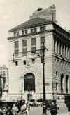
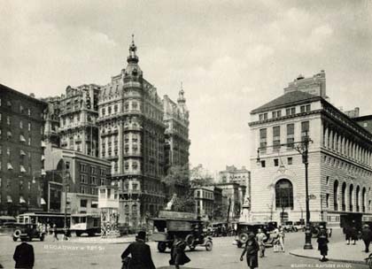
Architecture Images-Upper West Side Central Savings Bank Also known as Apple Bank for Savings |
|
architect |
York and Sawyer Moscowitz,Benjamin, Samuel Yellin (grilles, gates, lanterns, brackets, doors, windows, bank screens, mail box, signs (job #2750); revision to lock for safe deposit grille (job #2909) ) |
|
location |
2100-2108 Broadway at W73 |
|
date |
1927 |
|
style |
Renaissance Revival |
|
construction |
|
|
type |
Bank |
|
|
 |
|
images |
 |
|
|
|
|
STREETSCAPES/73rd and Broadway; At a Landmark Bank
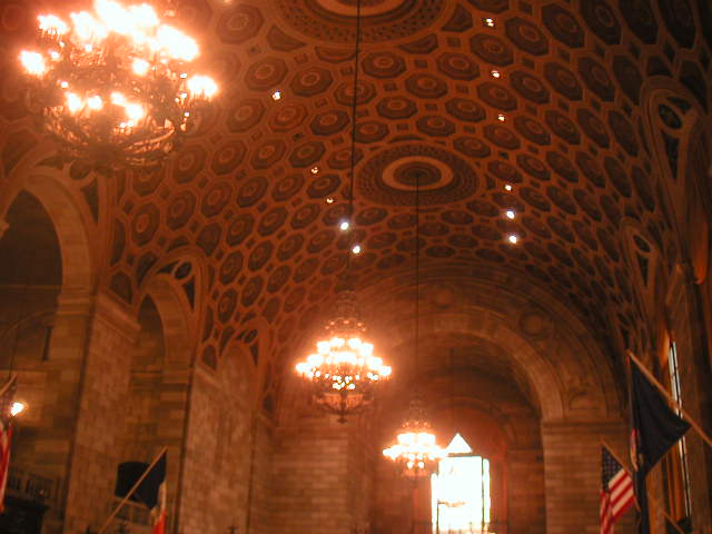
Building, Change Is in the Air By CHRISTOPHER GRAY Published: April 17, 2005, Sunday SINCE it was built 1928, the majestic Central Savings Bank building -- now home to the Apple Bank for Savings -- has been an astonishing place to make a deposit. It has also offered one of the most impressive office spaces on the Upper West Side -- its old-fashioned second through fifth floors, with their terrazzo floors, wide hallways and glass-paneled doors. Although you can still make deposits or withdrawals in the luxury of the landmark building's large and tall banking floor, change is coming upstairs. The building's architects, Edward York and Philip Sawyer, began their design partnership in 1898, just as the triangle of open space around 73rd Street and Broadway, at Verdi Square, was about to come into its own with buildings like the Ansonia, completed in 1902. Their earliest commissions were small but distinguished, but by the 1920's they had become one of New York's major firms, with works like the spectacular interior of the Bowery Savings Bank at 110 East 42nd Street (1926), the rich, medieval Academy of Medicine at 103rd and Fifth of the same year, and the august New York Athletic Club at Seventh Avenue and Central Park South (1927). York & Sawyer developed a specialty in bank design, especially after their monumental 1924 Federal Reserve Bank at Liberty and Nassau Streets -- a fortresslike Florentine palazzo. So when the Central Savings Bank planned a new $2.5 million building facing Verdi Square, it selected the firm. In 1926, Central Savings bought the north side of the square, a long, narrow trapezoid directly opposite the Ansonia. As if to reproach the Ansonia's Parisian frou-frou, York & Sawyer designed a sober limestone facade, with a lower section of deeply cut rusticated limestone blocks -- as large as 2 by 6 feet -- and an upper section, much less robustly detailed. The banking floor is perhaps a fifth the size of Grand Central Terminal but is just as astounding, a great vaulted space 65 feet high with huge windows, a coffered ceiling, rich ironwork and a multicolored marble floor. The bank building included four upper floors for rental offices, at some cost to the dignity of the Italian Renaissance-style structure. The plain, squarish lines of the colonnade on the third and fourth floors, with its regular window penetrations, detract from the rich majesty of the lower-floor limestone. The narrow front facing 73rd also creates an ungainly south facade, the principal one, facing Verdi Square. Because it is on the narrow end of the block, the wall looks flimsy, high and narrow, with empty space on either side. Thus George Chappell, writing as T-Square in The New Yorker in 1928, lamented ''the rather distressing aspect of the building from the south, where I had the feeling that it was intended to be square but had been pushed out of alignment -- but this is one of the hideous difficulties of our flatiron plots.'' Early photographs show not only the vast banking floor but also executive offices used by the bank on the mezzanine level. Decorated by the Barnet Phillips Company, the offices included double-height meeting rooms with large fireplaces flanked by iron torchères, beamed ceilings, wooden paneling and elaborate faux wall painting with imitation garlands and spirals of fabric. A company brochure by Barnet Phillips published in 1930 said that the ceiling design had been developed from one in the Davanzati Palace in Florence. Indeed, in 1929, a critic writing in Architecture magazine said that a colleague had come back from Europe impressed with everything he had seen, but, the colleague said: ''Florence didn't astound me so much. Everywhere I looked I saw a building by York & Sawyer.'' The real estate firm of Brown Harris Stevens currently occupies much of the mezzanine floor. The offices on the upper floors are much plainer but also evoke a more elegant time. Laid out around an irregular, trapezoidal, doughnut-shaped corridor, they have solid metal doors with inset panels and an upper section of frosted glass. The signboards are brass, as are heavy directional arrows indicating the location of certain room numbers, and walls are wainscoted with marble. There are no dropped ceilings, no sloppy strings of cabling or electric conduit, no heavy locks or ugly replacement units, and the doors have been carefully maintained over time, with the original brass hardware intact. The successive paint jobs have been careful and conservative, and the doors open and close without trouble, diminishing any incentive to dump them for so-called functional replacements. This is particularly evident on the inside, where a substantial brass handle operates a worm gear within the frame that opens and closes the glazed transom, which works with ease. The firm of Siris/Coombs Architects has one such transom, but not for long. Like many tenants, they are leaving this spring; the office floors already appear half empty. Peter Coombs says he moved in a quarter century ago with his wife and partner, Jane Siris. ''We moved in at $3 per square foot, and now the rents are $45 per square foot,'' he said. Permits for recent exterior repairs have listed the Apple Bank as owner, and Mr. Coombs says he has heard rumors of a residential conversion as soon as the space is emptied. Mitchell Jacobs, listed on the permits as a bank vice president, did not return repeated telephone calls about the building's future. Mr. Coombs has mused over what will become of the evocative office floors, the type where Garrison Keillor's hard-bitten character ''Guy Noir, Private Eye'' might rent space. With baths and kitchens added, the offices would make perfectly nice apartments, and could easily be combined into the larger apartments that seem to be in demand these days. But Mr. Coombs is concerned that the owners will eviscerate the floors, eliminating the 1920's character, in order to capture for apartment use a broad service core in the middle. Mr. Coombs hopes the conversion will preserve the precisely engineered brass windows in the building, as well as the scale and detail of the executive offices on the mezzanine. Siris/Coombs Architects will be moving to Chelsea in May, and Mr. Coombs and his wife will miss walking to work -- they live several blocks away. ''We approached the owners and asked them if they would sell us the space'' as an office condominium, he said. ''Their response was, 'You can't afford it.''' Copyright 2005 The New York Times Company |
|
|
February 6, 2005
SQUARE FEET From the Outside, They Still Look Like Banks By C. J. HUGHES 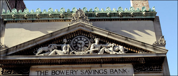 NOW BANQUET HALL The Bowery Savings Bank, 130 Bowery at Grand Street, designed by Stanford White in 1895, is now Capitale, site of bar mitzvahs and weddings. AFTER a two-and-a-half year absence downtown, Balducci's - the market that has hooked up generations of Greenwich Village foodies with everything from Asiago cheese to zucchini - is reopening in early summer. The new location, in a lofty 25,000-square-foot former bank on the northwest corner of West 14th Street and Eighth Avenue, will surely please those who thought the previous 6,000-square-foot store on the Avenue of the Americas, now a Citarella, was too cramped. The move may also thrill fans of Beaux-Arts architecture. The three-story bank, built in 1897 for the New York Savings Bank but for the past decade a carpet showroom, retains cream-colored pilasters under a blue-patterned ceiling. Rather than mute these historic details, Balducci's plans to call attention to them, so shoppers at the first-floor deli counter or in the second-floor restaurant can appreciate the craftsmanship. "Frankly, what we are about is selling classic foods, and here we are in a setting that is itself a classic," said Balducci's chief executive, Mark Ordan. "There's a lot of symmetry here." Balanced pairings of this sort seem to have caught on elsewhere. From Wall Street to Midtown, turn-of-the-20th-century bank buildings - somber, towering tributes to the power of capitalism, some designed by titans of American architecture - now house banquet halls, theaters, fashion boutiques, shoe stores and spas. Yet replacing teller booths with aromatherapy stations requires extensive remodeling, especially since the exteriors of many former banks cannot be altered. Some banks, like the one Balducci's is using, also have landmark status inside. Because of those restrictions, Balducci's will spend $2 million on improvements, including a cooling system for the refrigerator generators, Mr. Ordan said. Opening the safe in the basement cost $7,500, he said. Mr. Ordan would not disclose details of Balducci's lease, but a commercial broker said ground-floor retail rents in the area average $100 to $125 per square foot annually. Such renovations can introduce larger audiences to some remarkable buildings, which in turn can insure they stay protected, according to preservationists. "It's been a really positive trend of the last five years," said Charles Belfoure, architect and author of the book "Monuments to Money: the Architecture of American Banks," scheduled for release by McFarland in March. "Even if the reuse isn't very creative, it's better to get something in there rather than knocking any of it down." For banks whose appearance can be changed, owners sometimes choose to keep them looking institutional anyway, at least on the outside. "The grandeur makes it that much more special," said William Kim, development director for A. I. & Boymelgreen Developers, which is converting the former East River Savings Bank, a 15-story limestone edifice at 60 Spring Street designed by Cass Gilbert in 1927, into residences. After paying $37 million for the building in 2002, Boymelgreen spent $28 million replacing photography and artist studios with 42 luxury condos; all but one have been sold, Mr. Kim said. Now, the company is turning its attention to the 3,783-square-foot ground-floor space that it hopes to rent for $200 per square foot annually to either a fashion boutique or home-furnishings retailer, he said. But retailing is not always the best answer. Displaying refrigerators and air-conditioners was ultimately seen as a waste of unique space by the Haier Group, the Chinese appliance manufacturer that owns the former Greenwich Savings Bank, built in 1924 at 1356 Broadway at West 36th Street. After using the main hall of the building as a sales showroom for a few months, in August 2002 Haier renamed the cavernous 70-foot-high space Gotham Hall and began renting it out for exclusive private events like college fund-raisers and fashion shows. Why build such evocative Greek temples to begin with? To inspire confidence. When the United States economy collapsed in the Panic of 1893, many people blamed banks for the depression that followed and withdrew their money. So, banks built in that era (until the end of the Great Depression, when banks began to demystify themselves with glass-fronted branches) were meant to suggest strength, as if they had been there forever. The former Bowery Savings Bank at Grand Street, designed by Stanford White in 1895 with a glowing amber glass ceiling and a buffed terrazzo floor, is now the site of bar mitzvahs and weddings as Capitale, a banquet hall that opened in October 2002. "I think any reasonable person who looks at a building as historical as this would want to preserve it," said the owner, Seth Greenberg, who has spent $4 million to rehabilitate the 36,000-square-foot space. Farther uptown, at the old Union Square Savings Bank, created by Henry Bacon, who designed the Lincoln Memorial, is the Daryl Roth Theater. Its tall ceilings were ideal for the acrobatic troupe De La Guarda, which performed there from 1998 till last September. Now, after months of painting, polishing and rewiring, the theater is ready for a new play, probably by this summer. "It's funny these old buildings can work for you and against you," said the general manager, Adam Hess, citing how difficult it was to move equipment through the narrow doors. Although on a high-visibility corner and slightly elevated off the sidewalk, the Union Square bank draws attention to its function without much flash. Today, a bank branch can also be midblock, with a neon-bright marquee, mannequin window displays and shimmering glass and chrome fixtures. "It's all about colors and comfort levels," said Lee Carpenter, chief executive of Design Forum, which designed Washington Mutual's 30 Manhattan branches. "It was all about matching the physical experience with a corporate brand," one that emphasizes a casual, interactive experience, he said. Though older banks may be more formal, sharp-eyed commercial developers began to see their potential about a decade ago. In 1996, the Memorial Sloan-Kettering International Center moved into a well-scrubbed Art Deco berth, with a clock still ticking over its front door, at 1429 First Avenue, at East 74th Street. In the same year, Blue Water Grill opened in the former Bank of the Metropolis facing Union Square. With the trend catching on, the restaurateur Giuseppe Cipriani opened a 15,000-square-foot banquet hall in the old Bowery Savings Bank branch on East 42nd Street, opposite Grand Central Terminal, in 1999. The same year, developers added 11 condos upstairs at the old New York County National Bank, on the southwest corner of Eighth Avenue and West 14th Street, opposite Balducci's; its downstairs is home to Nickel spa for men. Uptown on Eighth Avenue, at West 43rd Street, the boxy 1927 Manufacturers Hanover Bank houses the Second Stage Theater, its ticket window tucked snugly into the basement safe. Still, time has not treated every old bank branch kindly. An unremarkable conversion of the First Federal Savings and Loan Association at 237 First Avenue, at East 14th , has left it with a series of pharmacies. And the former First National City Bank of New York, a prominent 1928 building at Canal and Broadway, is almost unrecognizable under a grab bag of shops selling cheap jewelry, berets and scarves. Maybe its best chance at salvation is to welcome back tellers. 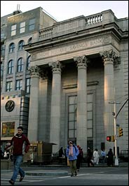 NOW A THEATER The Union Square Savings Bank, at 15th Street, was designed by Henry Bacon. It is now the Daryl Roth Theater. Copyright 2005 The New York Times Company
|
|
|
links |
|