 |
New York
Architecture Images-Seaport and Civic Center Jacob K. Javits Federal Office Building |
|
architect |
Alfred Easton Poor, Kahn & Jacobs, Eggers & Higgins |
|
location |
26 Federal Plaza. |
|
date |
1967 |
|
style |
International Style II |
|
construction |
179,0m / 588.8ft, 41 floors, glass
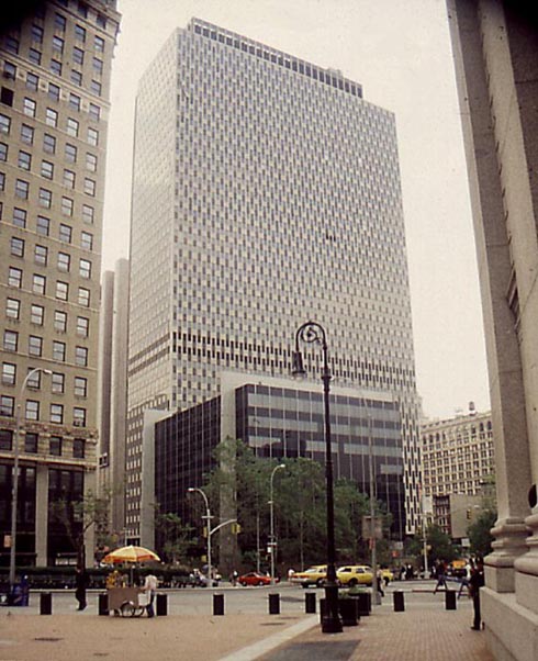
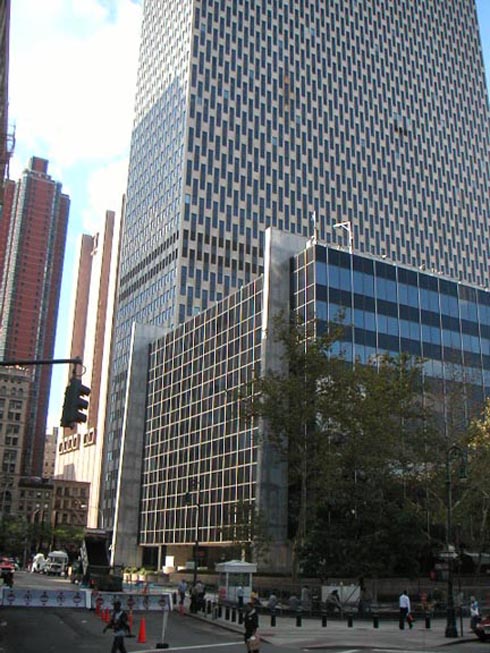
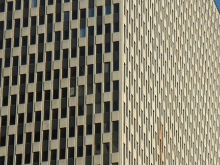
concrete This massive building has a 41-storey glass-walled slab facing east that is partly "wrapped" around a core that faces Broadway. Originally the facade facing Broadway was a windowless wall of exposed concrete, but in 1976 an extension by the same architects brought offices also to the western portion. The vertical window slits of the glass walls are misaligned so that all the adjacent windows are at a different height, forming an alternating zig-zag pattern on the facade. On the triangular plaza in front of the building is the eight-storey Customs Courthouse as a black glass cube that is elevated on two white vertical "plates" that slice through the cube. |
|
type |
Federal Office Building Government |
  |
|
  |
|
 |
|
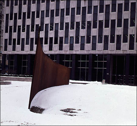
| "Tilted Arc" was installed in the plaza in 1981, but not without controversy : | |
|
The Jacob K. Javits Federal Building and Customs Courthouse, as the
complex's full name goes, was built in 1967 for the US Federal
Government as the only realized buildings, along with the nearby Family
Court Building, of the 1962 Civic Center general plan. At 179 m the Federal Building dominates the Civic Center at Foley Square along with the Municipal Building and the U.S. Courthouse. This massive building has a 41-storey glass-walled slab facing east that is partly "wrapped" around a core that faces Broadway. Originally the facade facing Broadway was a windowless wall of exposed concrete, but in 1976 an extension by the same architects brought offices also to the western portion. The vertical window slits of the glass walls are misaligned so that all the adjacent windows are at a different height, forming an alternating zig-zag pattern on the facade. On the triangular plaza in front of the building is the eight-storey Customs Courthouse as a black glass cube that is elevated on two white vertical "plates" that slice through the cube. The Plaza at the NE corner of the Javitz site once was home to "Tilted Arc", a massive Cor-Ten Steel sculpture by Richard Serra measuring 12 ft x 120 ft x 2 1/2 in. According to Serra, "The viewer becomes aware of himself and of his movement through the plaza. As he moves, the sculpture changes. Contraction and expansion of the sculpture result from the viewer's movement. Step by step the perception not only of the sculpture but of the entire environment changes." The sculpture generates controversy as soon as it is erected, and Judge Edward Re begins a letter-writing campaign to have the $175,000 work removed. Four years later, William Diamond, regional administrator for the GSA, decides to hold a public hearing to determine whether Tilted Arc should be relocated. Estimates for the cost of dismantling the work are $35,000, with an additional $50,000 estimated to erect it in another location. Richard Serra testifies that the sculpture is site-specific, and that to remove it from its site is to destroy it. If the sculpture is relocated, he will remove his name from it. The public hearing is held in March 1985. During the hearing, 122 people testify in favor of retaining the sculpture, and 58 testify in favor of removing it. The art establishment -- artists, museum curators, and art critics -- testify that Tilted Arc is a great work of art. Those against the sculpture, for the most part people who work at Federal Plaza, say that the sculpture interferes with public use of the plaza. They also accuse it of attracting graffiti, rats, and terrorists who might use it as a blasting wall for bombs. The jury of five, chaired by William Diamond, vote 4-1 in favor of removing the sculpture. Serra's appeal of the ruling fails. On March 15, 1989, during the night, federal workers cut Tilted Arc into three pieces, remove it from Federal Plaza, and cart it off to a scrap-metal yard. More on the case of "Tilted Arc" from the New York Times (May 19, 1985): ART VIEW; THE CASE IN FAVOR OF A CONTROVERSIAL SCULPTURE In recent years no work of art has been the source of as much controversy as Richard Serra's public sculpture ''Tilted Arc.'' Some of the most respected American critics believe it is a failure. Others, including this observer, believe it gives an incoherent, intractable space a focus and sense of possibility it did not have before. Many people who live with the work want it removed. ''Tilted Arc'' was commissioned in 1979 and installed in Federal Plaza in downtown Manhattan in 1981. It is a 120-foot-long, 12-foot-tall, unadorned slab of curved and tilted steel that expands toward the north, contracts toward the south and pulls together the Jacob J. Javits Federal Building, to the west, and the Federal Courthouse, to the east. The sculpture is almost adjacent to a large fountain and carefully set into the circular grid pattern of the pavement ... What also makes ''Tilted Arc'' appropriate to its site is its content. The work has a great deal to do with the American Dream. The sculpture's unadorned surface insists upon its identity as steel. The gliding, soaring movement recalls ships, cars and, above all, trains. As with many enduring works of American art and literature, behind the sculpture's facade of overwhelming simplicity and physical immediacy lies a deep restlessness and irony ... One thing that emerged from the hearing is that we have not yet begun to explore the meanings and possibilities of ''Tilted Arc.'' Another is that we are not even remotely in a position to make an irrevocable decision about a work of this complexity and imagination. |
|
|
Open Space Replaces 'Arc' NY TIMES June 15, 1989 A ''new art form - open space,'' will replace Richard Serra's sculpture ''Tilted Arc'' on Federal Plaza in lower Manhattan, in the words of William J. Diamond, the regional administrator of the Federal General Services Administration. The sculpture was removed from the plaza on March 17 after a bitter court battle in which the Government -which had commissioned the work through the General Services Administration - asserted it overwhelmed the site. ''We are installing 15 benches and planters with trees so that the public can enjoy the plaza again,'' Mr. Diamond said. ''We will rededicate it the first week in July. It's a revolution in our thinking - that open space is an art form in itself that should be treated with the same respect that other art forms are.'' He said ''Tilted Arc,'' disassembled into three segments and covered by a tarpaulin, would remain in a Government motor pool in Brooklyn, ''where it takes up eight parking spaces.'' Copyright 2006The New York Times Company |
|
|
This Plaza was re-designed by Martha Schwartz Partners of Cambridge, MA: In 1992, the Federal Government undertook the repair of the waterproofing for the underground garage beneath the Jacob Javits Plaza. Because the existing plaza would be demolished during the waterproofing construction, the opportunity was seen to revitalize the plaza. During the time that Richard Serra's "Tilted Arc" inhabited the plaza, this 14 foot high sculpture was an obstruction both visually and physically to pedestrians. After the sculpture was removed, the plaza remained vacant and disconnected from its context. The intent of the plaza redesign was to create a useable, lively open space in the heart of the city. Full art and landscape architectural design services were required for this transformation to take place. The new plaza is reconnected to its surrounding context and provides innumerable seating opportunities for people having lunch or just for watching other people. Large planters which formerly existed at the northwest and southeast corners of the site have been removed, as well as the long-empty fountain which had occupied the only sunny portion of the site. By opening up the plaza, the connections between the plaza and the street are reestablished, and the people who wish to sit can do so in either sun or shade. The seating for the site is provided on twisting strands of New York City park benches. The double strands of back-to-back benches loop back and forth and allow for a variety of seating - intimate circles for groups and outside curves for those who wish to lunch alone. With their complex forms and bright green color, these benches energize the flat plane of the plaza in the same way that the French used the parterres embroideries which were punctuated by topiary forms and whose edges were defined by trees and buildings. The bright green color of the benches was selected because its reflectivity helps to enliven a plaza, which for the most part, is in shade. At Jacob Javits Plaza, the benches swirl around the "topiary" or 6 foot tall grassy hemispheres that exude mist on hot days. Familiar lunchtime elements are provided such as blue enameled drinking fountains, orange wire-mesh trash cans, and Central Park lighting standards. While all of these elements are drawn from the Olmstedean tradition which maintains its hold in New York City, each element is tweaked slightly from its historic predecessor. These elements offer a critique of the art of landscape in New York City, where the ghost of Frederick Law Olmsted is too great a force for even New York to exorcise. The design itself offers a wry commentary on the fact that while New York remains a cultural mecca for most art forms, exploration in landscape architecture receives little support. |
|
| Following article with special thanks to Lofter1 of the Wired NY forum. | |
|
An in depth analysis of the Javits Federal Building Plaza at the NE
corner of the site (Lafayette & Worth Streets): PART ONE Jacob Javits Plaza: Reconsidering Intentions Text © John Hill
Written for Professor Setha Low's
Ethnography of Place and Space: Landscapes of Fear at The Graduate Center, CUNY
May 24, 2007
Jacob Javits Plaza is a public space in Lower Manhattan currently occupied by a series of bright-green, painted benches curling around six large mounds covered with small bushes. It is an eye-catching design that carries with it – unbeknownst to most visitors – the erased history of the site, a long-demolished Richard Serra sculpture called Tilted Arc. The success – or lack thereof – of the current plaza design in turn depends upon the minimalist sculpture that preceded it, as the benches and mounds designed by landscape architect Martha Schwartz are intentionally in total opposition to Serra’s artwork. This paper will attempt to determine the success of Jacob Javits Plaza through the framework of this historical relationship via a historical analysis, a three-part mapping analysis of the space (seating population, movement, and use), and using internet “discussions” about perceptions of the space and the plaza design. These analyses will follow a history of the Federal buildings that created the plaza; the selection, installation, and removal of Serra’s sculpture; the “in-between” period when temporary planters and furniture occupied the space; and the selection, installation, and reaction to Schwartz’s plaza redesign. 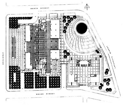 Fig. 1 – Plan of Federal Complex History The Jacob K. Javits Federal Office Building and Court of International Trade (later Customs Court) sit on a city block bounded by Broadway Avenue on the west, Lafayette Street on the east, Worth Street on the north, and Duane Street on the south. The complex was completed in 1969 from a design by Alfred Easton Poor, Kahn & Jacobs, and Eggers & Higgins. A western addition to the Javits Building, covering its 41-story, west-facing blank wall, followed in 1977, with the same players involved. The Javits Building “an ungainly checkerboard of granite and glass” (White 72), parallels Broadway, while the 8-story, glassy Customs Court sits in the Southeast corner of the site, linked to the former via a four-story bridge raised one story above the plaza level. Occupying the northeast corner of the site across from Foley Square is Jacob Javits Plaza (aka Federal Plaza, Fig. 1), a product of the 1961 Zoning Amendment that provided bonuses for plazas created via setting buildings back from the sidewalk. From the beginning, critical reception for the Federal buildings (Fig. 2) and their plaza was poor. Ada Louise Huxtable, architecture critic for The New York Times called the complex, at the time of its completion, “one of the most monumentally mediocre Federal buildings in history” (qtd. in Stern 163). Years later Paul Goldberger lamented that “Both are designed with the subtlety of an airport concourse…Foley Square…is hardly given coherence by a pair of clashing boxes,” (qtd. in Stern 163) while Time Magazine called the complex “One of the ugliest public spaces in America. Everything…begs for prolonged shiatsu with a wrecking ball” (Hughes 78). Retroactively discussing the plaza’s pre-Serra state, Goldberger – as Huxtable’s successor at The New York Times – managed to sum up the context the artist faced when he said in 1985: “in a city of bad plazas in front of bad skyscrapers, this is one of the worst. Federal Plaza is a dreary stretch of concrete, punctuated by a poorly placed and poorly de-signed fountain; it was no urban oasis by a long shot” (23). 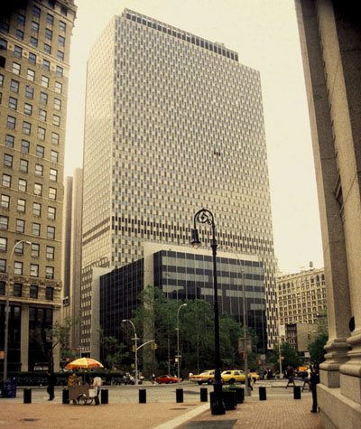 Fig. 2 – View of Federal buildings from the east Into this context walked artist Richard Serra in 1979, when the National Endowment for the Arts (NEA) recommended him to the General Services Administration (GSA) for a sculpture at Javits Plaza, as part of the GSA’s Art-in-Architecture program that set aside 0.5% of a Federal building’s budget for artwork. Six years earlier architect Easton Poor – as part of his Art-in-Architecture proposal – recommended an abstract sculpture in steel or bronze in the plaza (Senie 22); this and the GSA’s established practice of choosing large-scale, abstract sculptures for federal plazas by this time made Serra’s approval a relatively easy one. Regardless, the artist was required to submit concept sketches, which he did in 1980 and which the GSA shortly thereafter approved. This submittal and approval is important because it shows that the Federal government (the client) knew what to expect for the space, though no view was re-leased to the public before its installation. Also important is that the artist and the client made an agreement that commission would be permanent (Serra 4). On July 16, 1981 Tilted Arc was installed. Twelve feet high and 120 feet long, the 2-inch thick plane of Cor-ten (rusted) steel bisected the tapering plaza space in a gentle east-west arc which, as the name indicates, leaned in slightly at the top of the arc’s concave curve (Fig. 3). From the moment the sculpture was being installed the cries of protest began; Serra recalled the workers actually getting heat as they were installing it (Senie 25). Within a month of Tilted Arc’s installation, Judge Edward D. Re, who worked in the Customs Court, wrote two letters to the GSA requesting its removal. In the second letter, Re argued that the “120-foot wall effectively destroys not only the beauty and spaciousness of the plaza, but also the utility of the plaza, which has been used for ceremonies” (Weyergraf-Serra 26). Re’s comments were out of step with the critics who decried the plaza in its first incarnation, and he began a questionable argument (ceremonies) that lasted throughout the fight to remove the piece. 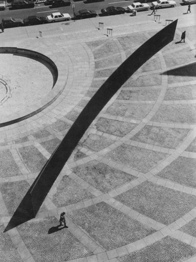 Fig. 3 – Tilted Arc from the Javits Building In the years after Tilted Arc’s installation and Judge Re’s letter-writing campaign nothing notable happened around the piece, (besides the occasional graffiti) as the initial outcry appeared to wane for good. But in late 1984 Judge Re began another letter campaign (Weyergraf-Serra 27), at a time when the GSA was under different, more conservative leadership in William J. Diamond, who stated that the sculpture “has made it impossible for the Federal and public community to use the plaza” (Senie 28). As the GSA’s Regional Administrator, Diamond called for a public hearing concerning the relocation of Tilted Arc to be held on March 6, 1985, a hearing he chaired and for which he appointed the four panel members (Senie 29, Fig. 4). This highly questionable arrangement did not stand in the way of the hearing being held in that form over three days, in order to hear 122 people speak against and 58 people in favor of relocation. Even though the former outweighed the latter by more than 2 to 1, the panel recommended by a vote of 4 to 1 to relocate the piece (Senie 30). 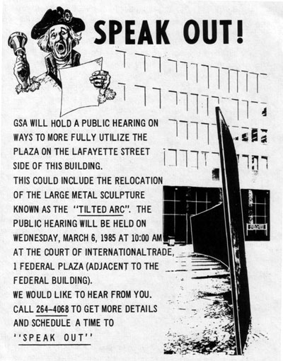 Fig. 4 – Poster for March 6th hearing But how does one relocate a site-specific artwork, if at all? And what entails a site-specific installation? This issue will return with discussion of Schwartz’s plaza, but for Serra, site-specificity is not limited to the physical and environmental nature of the location but also addresses the social and political context in which the work is made and situated. Serra addressed the physical context by simultaneously blocking views to and from the Federal buildings (Fig. 5) and extending the arc towards the old court buildings across Foley Square (Fig. 6), though he maintained that the line of the arc allowed the prevailing foot traffic across the plaza (Serra 4). In this last point, he seems to be concerning himself with the public’s needs, though his cutting off of site lines is more confrontational, an overt commentary on the Federal buildings and notions of safety in urban situations, especially New York City. Politically, Serra is quoted as saying it is the sculptor’s obligation to define their art, “not to be defined by the power structure that asks you…because their notion of beauty and my notion of…sculpture are always, invariably, at opposite ends” (qtd. in Senie 24). This statement, while reinforcing the popular split between contemporary artists and the public, situates Serra’s art in opposition to its physical and political context, in this case an unimpeded open space with a Federal client. Furthermore, due to Serra’s treatment of the sculpture as site-specific, and the agreement with the client that the piece would be permanent, the artist saw its relocation as synonymous with its destruction (Serra 5). 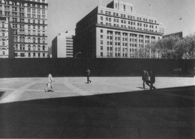 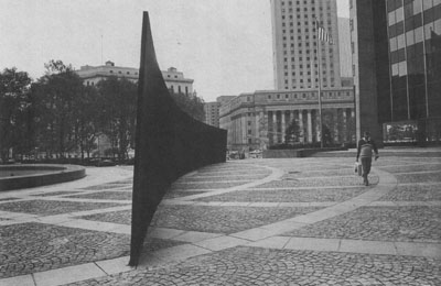 Fig. 5 (top) – Tilted Arc, looking north Fig. 6 (bottom) – Tilted Arc, looking east Although Serra attempted to use the legal system (a lawsuit, appeals) to save Tilted Arc, it was removed on March 15, 1989. Shortly after its removal, the GSA filled the plaza with standard-issue planters and benches and reactivated the long-dormant fountain (Fig. 7). The plaza was rededicated on July 6 and used for a summer concert series celebrating the GSA’s 40th anniversary, though this ceremonial use of the space would be short-lived (Senie 96). 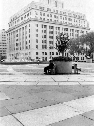 Fig. 7 – Plaza shortly after removal of Tilted Arc In 1992, the GSA undertook the structural and waterproofing repair of the parking garage that sits under the plaza, deciding to redesign it given the considerable demolition required. Even while Tilted Arc was in place landscape architect Martha Schwartz was contacted by the GSA about potentially reworking the space, though nothing came of this relationship until 1993 when the GSA’s director of arts and historical preservation Dale Lanzone announced the plaza’s redesign (Senie 98). He said, “The plaza will be treated very much as a work of art, but it will be a usable space, the antithesis of Serra’s treatment” (Vogel 23). While the artistic merit of Schwartz’s design will be discussed later, suffice to say here that her solution was definitely the antithesis of Serra’s Tilted Arc. Removing all existing site elements, she covered the site with a curling maze of bright-green benches (about 1,700 linear feet of them) that snaked around six grass-covered mounds emitting steam in the warm months (Fig. 8). Since the plaza’s completion in 1997, the grass on the mounds has been replaced by hardier boxwood shrubs, and the mounds no longer emit steam. Unlike the plaza’s previous occupant, this one is people friendly, particularly to Federal employees who can use the benches during lunch, the primary design consideration (Schwartz). Also, unlike Tilted Arc’s unexpected appearance, Schwartz’s design was on display in the building lobby before its installation (Senie 100), allowing feedback and time for people to get acclimated to the design. Not surprisingly, there’s been little to no controversy over the design, though at the same time there’s been very little media or academic attention given to the design that won a 1997 ASLA Professional Honor Award. 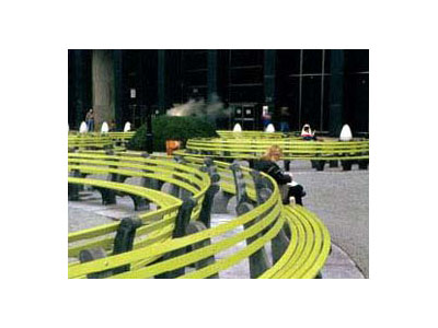 Fig. 8 – Redesign by Martha Schwartz Historical Analysis A short reiteration of the plaza’s history might read like this: Bad architecture and adjoining empty plaza becomes site of minimalist, confrontational sculpture that’s removed after eight years and replaced the same amount of time later by its antithesis, a playful maze of benches and mounds (Fig. 9). It could be argued that what ends this history, what is there today, was created by a chain reaction of events that started with the original, late sixties buildings. The substandard Modernist architecture and empty, leftover open space were the context for Serra’s Tilted Arc, a piece far from perfect but strong in its reaction to and treatment of its context. Schwartz’s redesign of the plaza is the Arc’s antithesis, so the plaza is more accommodating to the public, but in turn it fails to engage its context, as discussed in the mapping section below. This isn’t to say that the only way to engage the context was Serra’s, but by narrowly defining what Schwartz could have done with the space – and choosing a landscape architect who takes a Pop or postmodern approach to design – the outcome was more limited that it would have been otherwise. 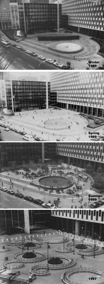 Fig. 9 – Evolution of Javits Plaza Field Observations Observations and mapping of the space involved two site visits, the first one from 10:00am to 11:30am on Friday, April 13 and the second one from 11:45am to 1:00pm on Monday, April 23; each used 15-minute intervals to map the site. The weather on the first visit was cold, cloudy, and windy, so the population of the plaza was noticeably low. The second visit found the weather conditions close to ideal for using the plaza, with temperatures in the 70s, a mild breeze, and a cloudless sky; needless to say, the population was much higher. (Population and movement maps are included in this 1mb PDF file.) What follows is description and analysis broken down into movement, population, and use. |
|
|
PART TWO
Jacob Javits Plaza: Reconsidering Intentions Text © John Hill Field Observations Observations and mapping of the space involved two site visits, the first one from 10:00am to 11:30am on Friday, April 13 and the second one from 11:45am to 1:00pm on Monday, April 23; each used 15-minute intervals to map the site. The weather on the first visit was cold, cloudy, and windy, so the population of the plaza was noticeably low. The second visit found the weather conditions close to ideal for using the plaza, with temperatures in the 70s, a mild breeze, and a cloudless sky; needless to say, the population was much higher. (Population and movement maps are included in this 1mb PDF file.) What follows is description and analysis broken down into movement, population, and use. Movement Mapping For the purposes of the study, movement maps are limited to the areas of and adjacent to the plaza, meaning the sidewalk spaces are not included but paths alongside the two Federal buildings are. The majority of the movement observed was for access in and out of the Javits Building’s entrance located on the west side of the plaza. Access to the Customs Court was minimal and is not included here, though one source of movement was to and from the Javits Building and Customs Court, pointing to potential restrictions in use of the pedestrian bridge that links the two buildings. Additionally, movement across the site also included people cutting through the plaza, mainly from Lafayette to Worth. Given the rise in the sidewalk from south to north, it appears many use the stairs to shorten their climb, moving horizontally across the plaza either on its main north-south path or along the eastern edge of the benches. Five distinct paths (all to and from the Javits Building entrance) were predominant: along the east edge of the building to Worth Street, along the north edge of the Customs Court to Lafayette Street, directly east of the entry to Lafayette Street, and along the north-south spine of the plaza either continuing north to Worth Street or moving on a diagonal through the gap in the benches to the intersection of Lafayette and Worth Streets. Two of the five paths do not deal with the plaza directly, those along the face of the two Federal buildings. The remaining three paths follow the wide paths that are roughly perpendicular to the entries of both buildings. Comparing the “as-built” plan (Fig. 10) to the architect’s conceptual plan (Fig. 11), it is apparent that these paths existed in the original design but were widened to allow for wayfinding across the site. The conceptual plan appears to be envisioned as a destination and restricts movement across its surface. Further changes to the plan include simplification of some of the bench curls, elimination of two mounds, relocation of the remaining six, and a gap added in the southwest corner adjacent to the handicap ramp providing access to the raised podium of the Federal buildings.1 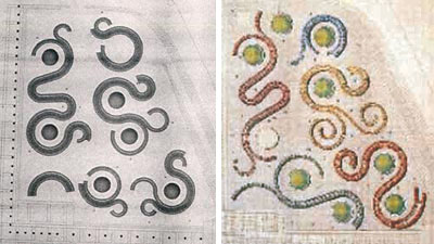 Fig. 10 (left) – "As-built" plaza plan Fig. 11 (right) - Conceptual plan But do these changes enable visitors (especially first-time ones) to create a reasonable cognitive map of the plaza in his or her head? Can visitors traverse the plaza, reaching their destination without confusion? Based on observations, these wide paths (Fig. 12) are helpful in wayfinding – “the mental process of orientation in space” (Correa de Jesus 33) – though it depends upon the person’s starting point and direction of travel. The most notable confusion observed happened when people walked towards the Javits entry from the street intersection on a diagonal line through the gap between the benches in the northeast corner.2 On numerous occasions people continued their diagonal path into the mound area (the dashed lines best seen in the 10:30-10:45 slot on Friday, April 13 - PDF link), having to retrace their steps out of the closed loop and around the benches to the wide path perpendicular to the entrance. This observation, and the fact that most people walked around the whole mound before realizing their predicament, points to a secondary axis (in addition to the two primary ones perpendicular to the building entries) created via the gap between benches, apparently an axis not anticipated by the architects or client. Ironically this illustrates a limitation of movement not unlike Serra’s Tilted Arc, which required one to walk around it in order to traverse the plaza in the north-south direction. 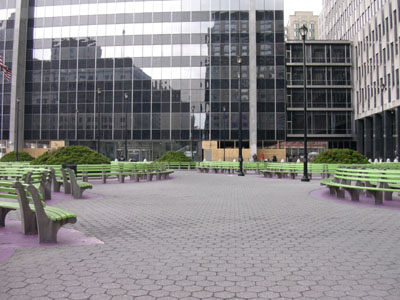 Fig. 12– Primary north-south path This confusion created by the plaza’s plan illustrates the non-site-specific nature of the design. A further indication of this characteristic arises from the observation (documented in the field notes, not the maps) of individuals jay-walking on axis with the two main paths of the plaza, as if these paths extend invisibly across Worth and Lafayette Streets. Regardless of New Yorkers’ predilection for jay-walking, a more site-specific plan would have linked the building entries to the street intersection, something not commensurate with Schwartz’s desire to provide seating in the location of the old fountain, something she called “the only sunny portion of the site” (Schwartz). This assertion is questionable – as is her statement that “people who wish to sit can do so in either sun or shade” (Schwartz) in her plaza lacking trees3 or other shading devices – if we take the primary function of the plaza to be the lunchtime activities of the Federal employees. On sunny days during lunch the plaza is bathed in sunlight, even on Spring and Fall days, due to the low height of the Customs Court and the open eastern edge of the site. It’s not until the sun moves past the Javits Building, after the lunch hours, that the plaza receives shade. 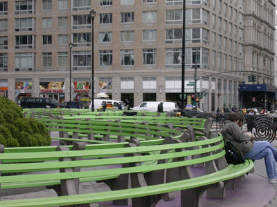 Fig. 13 – View across the plaza space, looking north Outside of the two primary paths in the plaza, perception across the space is a flattened series of green benches (Fig. 13), making cognitive mapping – “a form of mentally structuring the visual/spatial information that we are supplied by our immediate surroundings…assisting us in projecting what spaces beyond our line of sight might be like” (Correa de Jesus 43) – difficult, hindered additionally by the mounds restricting vision of the space and the complex plan (Fig. 14). If cognitive mapping or wayfinding were overriding concerns in the plaza’s design, the results definitely would have been different, though not necessarily appropriate to its goal as a lunchtime spot for Federal employees. Reiterating this intention, the wayfinding and cognitive mapping of the space would be strengthened by repeated use of the plaza and a potential view of the plaza from the offices above. 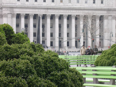 Fig. 14 – View looking east through mounds Population Mapping As mentioned previously, the two days of observation differed greatly in weather and population, so this section of mapping will focus on April 23, the warmer and more populous day. When I arrived 25 people were using the plaza, meaning seated or standing next to an empty or occupied bench; by the time I left 75 minutes later just over 70 people were using the plaza. The distribution of people on or near the benches during my stay was relatively even, though when fewer people occupied the space the population was predominantly on the southern half of the plaza. Given the great amount of benches (again, approximately 1,700 linear feet), a population of 70-75 people appears empty, perhaps stemming from, but not limited to, the even distribution. Using Edward T. Hall’s theory of Proxemics as a model, the closest that strangers might sit is twelve feet (Hall 122), meaning solely individuals (occupying two feet of bench) would render a population of 121 people.4 This population is close to twice the average population of the April 23 visit, though this doesn’t necessarily mean the plaza is not being used successfully. Rather it might mean that the total length of bench is too great for the population willing to use the plaza during lunch. Another means of judging the success of the space might be relative to the architect’s intentions. Schwartz contends that “The double strands of back-to-back benches loop back and forth and allow for a variety of seating – intimate circles for groups and outside curves for those who wish to lunch alone” (Schwartz). Though not explicit in her reasoning, it is assumed here the inside curves allow people to sit in closer proximity, while the outside curves force people apart and beyond one’s peripheral vision. In a few instances groups of three or more people did use the inside curves, though they did not limit themselves to these locations; in some cases groups located themselves on separate benches facing each other across a pathway. Likewise, individuals tended to use inside curves as much as outside ones, counter to Schwartz’s intentions, attributable in some cases to the increased privacy the mounds provide. What this analysis shows is that distribution on the benches is more multifaceted than intended, pointing to flexibility in the design and shading in the human perception of how to use the space, unlike the dichotomous framing of the architect’s intentions. 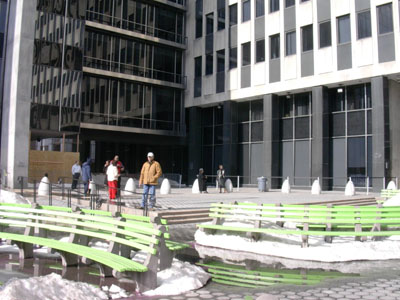 Fig. 15 – Smoker's "stage" in the southeast corner of the plaza Use Analysis From observations on the two visits, it’s apparent that the users of the plaza tend to fall into three categories: those with business in the Federal buildings (including employees and not), those passing through and/or staying for a short amount of time, and those who live in the area (particularly Chinatown). For the first group, the non-employees use the plaza to wait for their appointments. They tend to be Hispanic or other nationalities – due to the building’s function as an Immigration Court – carrying paperwork and sometimes looking through it before moving inside. One individual on a discussion forum indicated that he waited at the plaza four times during his naturalization process and lamented the space’s lack of shade (PDF file). This was reinforced on my second visit to the site, when, walking east on Worth Street, I noticed about 10-15 people sitting on planters along the north side of the Javits Building in its shadow; turning the corner to the plaza proper, I found only a few people using the sun-drenched benches on the northern half of the plaza. The other half of the first group is clearly the plaza’s majority user, the Federal employees from the two buildings. Many smoke in the designated area on the raised portion in the space’s southwest corner (Fig. 15), but many smokers gravitate to the benches. As well, many people smoke along the east façade of the Javits Building, also moving to the benches on occasion. Other uses include eating lunch, reading, talking on a cell phone, and talking with one or more acquaintances. Whatever the use of the space, the duration observed was never more than 30 minutes, apparently long enough for some people to eat, read, and talk on their cell phone! The second group of people is those who use the plaza to cut through from (typically) Lafayette to Worth Street, as mentioned previously. Occasionally people who fit this group will stop and sit for a short duration, sometimes looking at the courthouses across Foley Square, perusing a New York City travel book, or waiting for a friend, usually leaving as soon as their friend appears. The last group observed is residents, assumed to be from nearby Chinatown; in one case two Asian women stretched in one of the bench loops, a morning activity also observed by the other project members. Resident activities also included reading, just sitting, and meeting friends (parting ways immediately after meeting). Uses observed tended to coincide with the planned demographic: Federal employees during lunch hours. An extension to to the rest of the daytime hours has occurred with the smokers spilling over from the designated smoking area. Regardless of the use group, visits tended to be short, due to factors both contextual – the location of the plaza in Lower Manhattan’s Civic Center – and design – the lack of shade and design features beyond seating.5 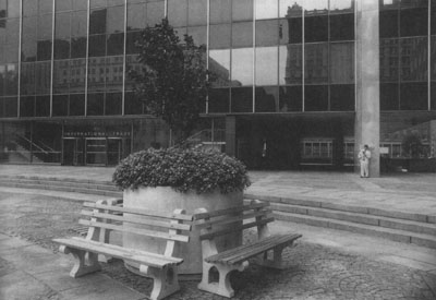 Fig. 16 – Standard NYC park benches and planter after Tilted Arc removal. Aesthetic Analysis Returning to the current design’s relationship to the site’s previous occupants – both the Serra piece and the temporary benches and planters – it is this paper’s contention that the success of the space is dependent upon how Schwartz approached her design in relation to these predecessors and in relation to aesthetics. These two approaches are linked in the way the benches refer to standard New York City park benches but depart from them in their length, their shape (curls), and their color. This can be read as a postmodern treatment, where type is seen as something plastic, to be modified for effect. Schwartz admits that “each element is tweaked slightly from its historic predecessor” (Schwartz), the benches referring to the Olmsteadean tradition of park design (Schwartz), the Federal government’s temporary solution for Javits Plaza (Fig. 16), and the curve of Serra’s Tilted Arc.6 She further refers to French parterres as inspiration. These ornamental gardens with paths defined by trimmed hedges are another reference layered upon the benches, though here landscape becomes furniture, requiring the occasional repainting rather than trimming. Schwartz’s influences are therefore a combination of landscape and art, reinforced by her statement that “full art and landscape architectural design services were required for the transformation [of Javits Plaza] to take place” (Schwartz). Aesthetic responses to the plaza in online discussions are predominantly negative, describing it as ugly, bland and homogenous, cute but kitschy, and ridiculous (PDF file). But these aesthetic descriptions are also related to frustrations arising from the plaza’s function, or apparent lack thereof (lack of shade, poor circumnavigation), a consideration most public art projects would not be subject to.  Fig. 17 – Panorama looking north; click image for larger view Conclusion To determine the success of Jacob Javits Plaza based on purely formal and aesthetic grounds would be incomplete, but to separate the formal morphology of the site from the human use of it is equally so. The plaza’s design is an amalgam of the Federal client’s wishes7, the site’s history, remote historical influences, postmodern theory, and site constraints. These considerations combine into a space the public interacts with, and these interactions help determine if the design as executed is successful. Even though Schwartz aimed to create a “lively open space” (Schwartz), the use of the space as observed is far from lively. If anything, the bright colors and playful forms seem to strive to offset the apparently sedate use of the space.8 If we return to intention as an indicator of the site’s success, then the plaza is fulfilling its intention of serving Federal employees. But if success depends upon use by the greater public, then the plaza is not entirely successful, attributable to the site’s location in the city and the design’s predilection for short-term and limited use. This is related to a lack of considering Proxemics, wayfinding, and cognitive mapping in the design, each linked in the excessive, curling benches. Primarily, the design’s limitations are due to its treatment as both art and landscape. Here art is used as a means of restricting use – in many ways echoing Richard Serra’s Tilted Arc – though here coupled with landscape architecture to provide a friendly, non-confrontational design. Notes 1. For someone in a wheelchair, the only access to the plaza from the sidewalk is via the plaza's northern edge. 2. A similar confusion occurred at other mounded areas, though not nearly as often as the one described. 3. Schwartz ascribes the lack of trees to the fact the plaza sits above an underground parking garage and therefore cannot support the topsoil required for the root balls of trees (Duffy 24), though the interim scheme shows otherwise. 4. Ignoring the individual conditions of each length of bench: 1,700 lf / 2 ft per person = 850 people maximum. Given that one out of every seven 2’ sections will be occupied in this scenario, 850 / 7 = 121 persons. 5. In a Schwartz monograph (Meyer), it is noted that the plaza at one time included drinking fountains. 6. “An architect observed that Martha Schwartz’s new design looked as if Tilted Arc had split and was running around all over the place.” (Senie 178) 7. Although no direct information of the client’s wishes was found, Schwartz “agreed to lower [the height of the mounds] because security officers insisted that they be able to shoot over the tops.” (Senie 99) 8. The constant presence of security – guards, cameras, security booth – as a deterrent to aberrant behavior cannot go without saying, though unfortunately the security presence cannot be addressed at length in the context of this essay. References
:: Mapping (PDF) :: Field Notes (PDF)
:: Text © John Hill
|
|
|
One Woman’s Day at 26 Federal Plaza By William Wendroff At 9:45 on a weekday morning in late October, in the drab fourth-floor offices of the United States Immigration and Naturalization Service in the huge building at 26 Federal Plaza in New York City, a young woman sits in a large hall clutching a white ticket with a number. She is pale. Anxiety is written all over her face. The hall has some four hundred seats and all of them are occupied by people like her – tense and quiet. Some couples are accompanied by young children. There are lots of people standing on line, too, waiting to be called to one of the hall’s many service counters. No one smiles. This isn’t surprising. All of the people have already had to stand in line at least half an hour in the chill morning air of lower Manhattan before getting past the guards and metal detectors at the building’s entrance. Then they had to stand on line at least another hour in Room 4-120 before being issued a service number by a brusque uniformed officer. Since the overhead number displays aren’t working, they are waiting for their number to be announced over a faulty public address system. It isn’t functioning very well either and tends to get drowned out by the buzz of hundreds of people crowded into a single low-ceilinged room. Many will end up waiting three hours or more. Fearful of missing her turn The young woman keeps looking down at her ticket number, then strains to hear what is being announced over the loudspeaker. “If you miss your turn, you have to get a new ticket,” comes to her ears and she shudders inwardly. People are coming and going constantly. They are coughing and sneezing. Children are crying, which makes it even harder to hear the announcements. An armed security officer calls loudly across the hall to people sitting on the low window sills. “You can’t sit there!” His tone and manner wouldn’t be out of place in a prison. It is 11:45 and the young woman needs to use the bathroom. There must be one on the floor, but where is it? Can she risk leaving Room 4-120 and perhaps miss her turn? She decides to take a chance. Finding the fourth-floor ladies room isn’t hard – there is a line of fifteen or so women in the corridor waiting to use it. When her turn comes, she finds there’s only one toilet and the door of the cubicle doesn’t lock. The women are taking turns holding the door shut for each other, a welcome gesture of camaraderie in this cheerless place. The young woman returns to the seat held for her by a couple on her left. Somehow the time passes. Finally her number is called – once. The thought runs through her mind that she is lucky to have heard it clearly. Although she is not at all religious, she approaches window 22 with what is almost a prayer on her lips. A security officer has just taken aside the well-dressed young couple with their child who preceded her. The husband , who had demanded to see a supervisor after getting nowhere with the clerk and been refused, was now making a scene. “We’ve been waiting four years for my wife’s green card,” he insists. “I’m an American citizen.” The wife stands silently by, her little girl clinging to her. The immigration officer behind the window curtly asks the young woman what her problem is. As quickly as she can, she explains what has brought her there. The man behind the window tells her that she needs to fill out two more forms. Only two, she thinks with some relief. And she can send them in by mail with supporting documents plus a ninety-five dollar fee! A response can be expected in ninety days. The young woman goes away resigned to a further delay in a process that has already seemed endless, resigned to another fee she can ill afford, but relieved by the thought that at least she won’t have to return to 26 Federal Plaza with its lines and oppressive atmosphere for a while. An inefficent government agency Why was the young woman treated in this way? Why were the four hundred other legal, law-abiding and tax-paying immigrants in Room 4-120 at 26 Federal Plaza being treated in much the same way, along with tens of thousands of others across the United States every day? Why do they have no choice but to deal with an inefficient government agency in order to stay in the U.S., work here, raise families, and contribute to their communities? There are several answers to this question. The simplest is that the U.S. Immigration and Naturalization Service isn’t given enough money to hire the staff it needs to serve its customers as they should be served, or to properly train the staff it has. As an aide in our local congressional office remarked to me a few months ago, what can one expect when INS employees are overworked and underpaid? According to him, by far the greatest number of problems handled by the Congressman’s office, have to do with immigration. However, the time and money it takes to deal with these problems doesn’t appear in any budget. If they had, they might help to show how much the INS’s inefficiency ends up costing the government and the taxpayer. If, he went on, the real cost of the INS’s treatment of its public were known in dollars and cents, maybe Congress would be more willing to give the agency what it needs to do the job right. A few years ago when jobs were scarcer and there were a few sensationalized stories in the press about crimes committed by illegal aliens, Congress passed laws making it harder for illegal immigrants to enter the country and to stay. The new laws not only gave the INS more power than it had before, they also made it harder for legal immigrants to get permanent-resident status, the so-called green card. (Actually, it is pink.) The bureaucratic abuse of those four hundred people in Room 4-120 squares very poorly with the self-image of America, a nation that has long prided itself on its concern for the politically oppressed. People still express surprise when I tell them that marrying an American – as my wife did three and a half years ago – doesn’t mean automatic receipt of a green card as was the case not so long ago. In fact, it is not even an assurance that a green card will be coming at all. My wife and children’s green-card application – delayed for several months because of the INS’s poor instructions – was finally accepted by the agency for processing in December 1998. In May 1999, we received notice of our all-important green-card interview. The date? March 6, 2001. That’s right 2001! You see, my wife was the young woman in the hall. |
|
|
links |
|