|
New York
Architecture Images-Upper East Side THE SEAGRAM BUILDING |
|
architect |
Ludwig Mies van der Rohe, Philip Johnson (interiors) and Kahn & Jacobs |
|
location |
375 Park Ave. (at 53rd Street) |
|
date |
1958 |
|
style |
International Style II |
|
construction |
The plan of the building is based on a 8.50 m grid, pursued to
unprecedented Miesian accuracy. The elevator core is placed to the back of
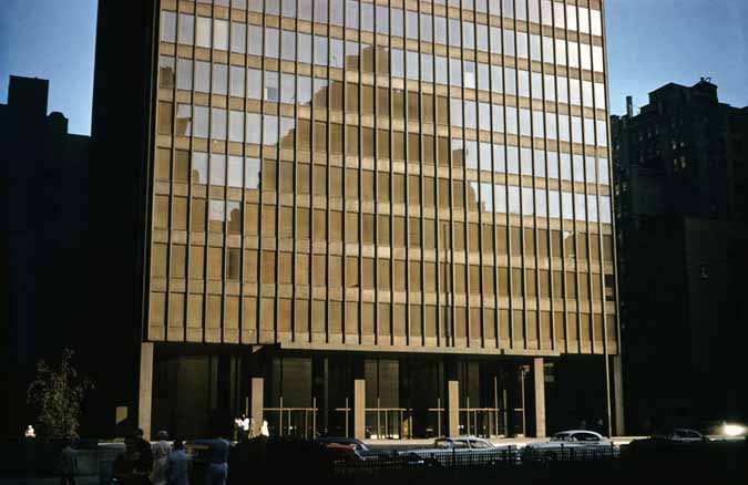
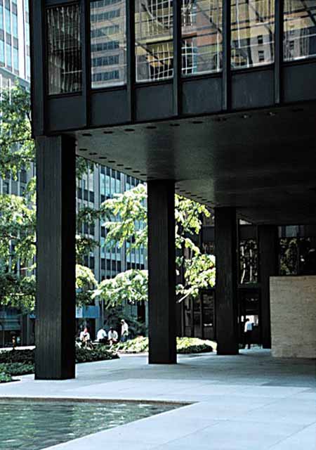
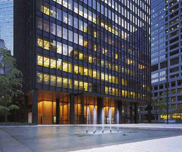
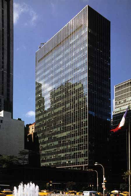
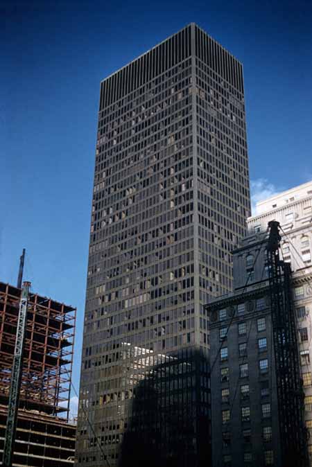
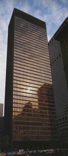
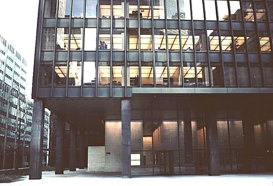
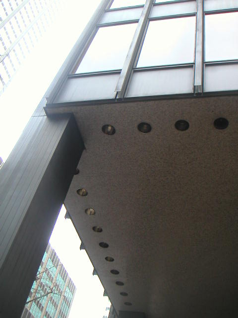
the building, forming the protruding, windowless back wall of the tower. Set on bronze-clad pillars, the 38-storey facade consists of alternating bands of bronze plating and "whisky brown"-tinted glass (the material and colour choices were a result of Bronfman's insistance of having a warmer-toned facade than in the Lake Shore Drive Apts). The building was, notably, the first with floor-to-ceiling windows, making the wall a true curtain of glass, as foreseen by the visionaries of Modern Movement, like Mies himself. Between the windows, there are vertical decorative bronze I-profiled beams attached to the mullions to emphasize the vertical rise of the facade. Van der Rohe personally stated that this was his only building in the United States which met exactly his European standards. |
|
type |
Office Building |
 |
|
  |
|
  |
|
  |
|
  |
|
|
|
  |
|
The fame of the Lever House in the 1950s was
matched by the Seagram Building in the 1960s. This steel skeleton framed
skyscraper, headquarters of the Seagram Liquor Company, established the
basic form of the corporate tower for years to come. Like Lever House,
the curtain wall tower is not built to the edge of the site. It occupies
only 40 percent of the allowable zoning envelope, freeing up space for a
granite-paved public plaza enhanced by two reflecting pools and marble
benches that is widely regarded as one of the most successful in the
city. The plaza is an expensive aesthetic and symbolic gesture,
especially significant in the dense urban environment which surrounds
it.
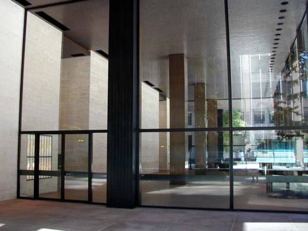
Designed by a famous European architect who immigrated to the United States at the beginning of World War II, this building epitomizes the importation of modernist ideals from Europe to the United States. In its monumental simplicity, expressed structural frame and rational use of repeated building elements, the building embodies Ludwig Mies van der Rohe's oft-repeated aphorisms that "structure is spiritual" and "less is more." He believed that the more a building was pared to its essential structural and functional elements, and the less superfluous imagery is used, the more a building expresses its structure and form. Following these premises, the Seagram Building is meant to confirm Mies' assertion that when modern industrialized building technology is truthfully expressed, architecture becomes transcendent. Ironically, the luxurious materials used (marble for the plaza benches, travertine for the lobby walls and floor, tinted glass and bronze for the curtain wall) and the carefully controlled customized details that pervade the building remind the viewer that this building is far from being the simple result of rationalized industrial production and construction techniques. Additionally, Mies' selective exposure of the function or non-function of various architectural elements is based on illusionism. The building is, in a sense, a structural fiction rather then an honest expression. |
|
|
Much copied but not matched, the Seagram Building is generally recognized as the finest example of skyscrapers in the International Style. Much of the building's success comes from its elegant proportions, and its relation to the overall site: the building is set back from the street by ninety feet, and in from the side by thirty. The forecourt so created uses reflecting pools and a low boundary wall in green marble to set off the building, borrowing heavily from Mies' earlier Pavilion in Barcelona (1929). The building's external faces are given their character by the quality of the materials used - the tinted glass and the bronze 'I-beams' applied all the way up the building. The Seagram Building is the first bronze-colored skyscraper. Mies had first used similar applied I-beams (but in steel) at his 1951 apartment towers at Lake Shore Drive in Chicago, welded to the outside of the structural columns. 'His purported aim was the stiffening of the frame of each bay, but more important was the creation of a surface texture that relieved the potential monotony of a smooth facade, while emphasizing the verticality of the overall form. The architect later explained that he had used the device primarily because, without it, the building simply "did not look right." Carter Wiseman in Shaping a Nation, 1998 In this Mies was, in the most subtle way, adding ornament to his building, for which he was criticized by the Modernist purists. -------------------------------------------------------------------------------- How to visit The building is on the east side of Park Avenue between 52nd and 53rd Streets. It is open to the public, with public spaces inside including the Four Seasons Restaurant (designed by Philip Johnson) and the Seagram Gallery on the Fourth Floor. Tours are conducted weekly, at 3 p.m. on Tuesdays. For further information and opening times call +1 212 572 7000. Subway: 6 to 51st Street; E or F to Lexington Avenue. Bus: M1, M2, M3, M4, M5, M101, M102 to 52nd Street. Parking: On-site lot The Seagram building is directly across Park Avenue from Lever House. |
|
|
links |
|