 |
New York Architecture Images-Gramercy Park
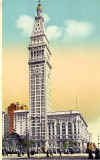
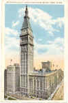
Metropolitan Life Insurance Company |
|
architect |
Napoleon LeBrun & Sons (Pierre L. LeBrun for the new tower) |
|
location |
One Madison Ave., at 23rd St. |
|
date |
East wing 1893; Tower, 1909. |
|
style |
was Renaissance Revival , then became kind of Art Deco |
|
construction |
700 feet (213 meters) |
|
type |
Office Building |
   |
|
  |
|
|
|
    |
|
images |
         |
    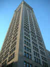 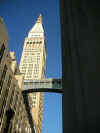 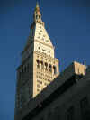 |
|
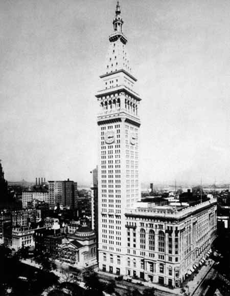 |
|
  |
|
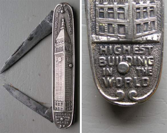
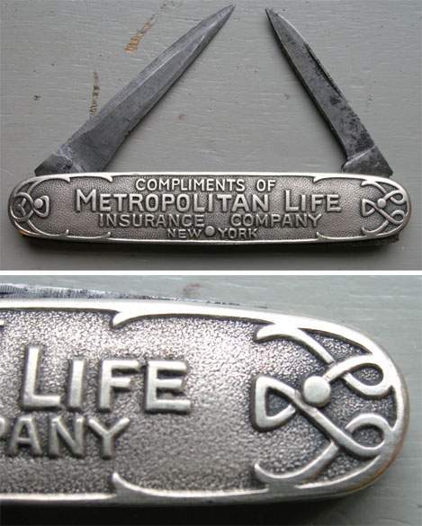
| Above- Images of souvenir pocketknife with thanks to Raymond Schaap of Holland. | |
See also
Metropolitan Life Insurance Company, North Building 
|
|
|
notes |
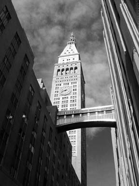
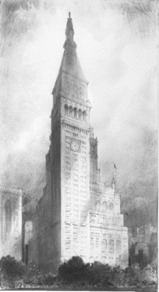
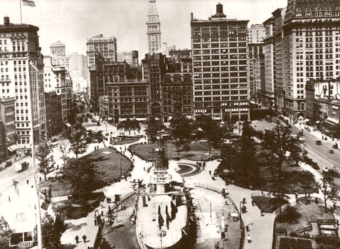
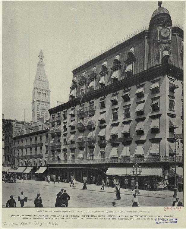
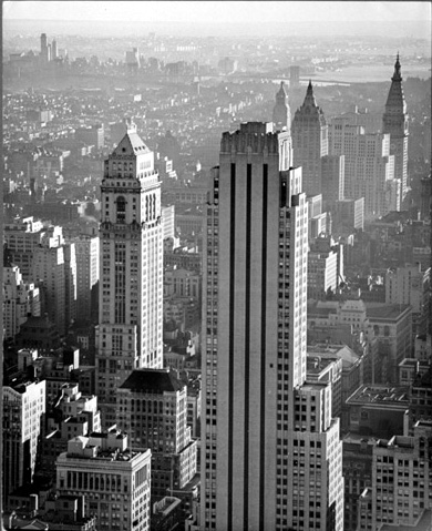
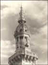
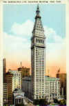
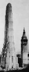
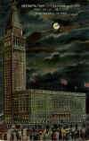
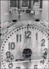
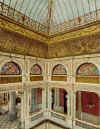
Manhattan, in the early XXth Century -in reason of the new technical improvements (electric-powered elevators, more controlled wind bracing, new fireproof, heating, ventilation and plumbing techniques) and the growing megalomania of powerful companies and trusts- was the theatre of the first fight for height, height meaning supremacy. After the completion of the Flatiron (Fuller Bldg) in 1903 (285 feet) and the fabulous Singer Tower (612 feet) five years later, one of the most important insurance company of the country decided to take up the challenge, by adding a 700-foot tower to the existing building, erected in 1893. The latter was first a 11-story one, then 12 in 1895, with several additions in 1901, 1902 and 1905 which added up to a 83,937 square-foot full block coverage ground area. It was a traditional Neo-Renaissance structure whose façade was covered of series of marble-sheathed arcades and rotundas, topped by a flat roof, fringed by a thick balustrade. To design the new tower, destined to be set into the northwest corner, Napoléon LeBrun was required yet, but the idea to copy in a larger scale the Campanile of San Marco in Venice was a John Hegeman's one, the president of the Metropolitan Life himself. And, effectively, the new tower is quite a carbon copy of the famed Venetian monument, but more than twice the height, and with a façade bored of a multitude of windows. The tower is composed of three main parts, as a Doric column, with a three-arched base in harmony with the old building. Above soars the tower itself, organised in three vertical stripes of windows in groups of three, without any ornamentation than four colossal 4-story high concrete clocks (one per side) with inlaid white and blue mosaic, and rusticated quoins at the corners. The capital can be divided in four parts: a huge five-opening loggia (four for the original Campanile) surmounted by a balustrade surrounding a recessed square block, and the typical pyramidal roof, punctuated by oculus, and headed at last by a cupola lantern, lighted at night. New Otis elevators were conceived, able to cover 600 feet in 60 seconds. But the Metropolitan Life Tower will not stay the highest building in the world for a long time, beaten in 1913 by the Woolworth with 792 feet. Unfortunately, in 1964, an inopportune renovation erased every Renaissance details from the base of the tower and the whole façade of the oldest structure: just a stupid and criminal act! |